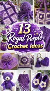
Royal purple can make crochet feel dramatic without requiring an elaborate project. The color works across very different finished objects, from a compact ribbed beanie and phone bag to a textured blanket, long cardigan, floral arrangement, or statement wall hanging.
The important choice is not simply which project looks good in purple. Dense fabric, open lace, dimensional texture, wearable drape, and structured storage all handle a saturated color differently. This collection helps you compare those differences before committing your yarn. Some tutorial samples use colors other than royal purple; they are included because their finished construction provides a strong match for the project and gives you a useful foundation for planning a purple version.
Quick List
- Royal Purple Crochet Ribbon-Lace Scarf
- Royal Purple Crochet Ribbed Beanie
- Royal Purple Crochet Draped Shawl
- Royal Purple Crochet Waffle-Texture Throw
- Royal Purple Crochet Lavender Stem Bouquet
- Royal Purple Crochet Phone Bag
- Royal Purple Crochet Twilight Wall Hanging
- Royal Purple Crochet Round Textured Pillow
- Royal Purple Crochet Octopus Plush
- Royal Purple Crochet Kelp Bucket Hat
- Royal Purple Crochet Granny Square Tote
- Royal Purple Crochet Flower Pot Arrangement
- Royal Purple Crochet Maxi Cardigan with Pockets
How to Keep Royal Purple From Looking Flat
Royal purple has enough visual strength to carry a simple silhouette, but the darkest shades can hide stitch detail when the yarn itself has little surface definition. Texture becomes especially important on ribbing, waffle stitches, raised pillow patterns, and dimensional flowers.
Before buying yarn for a texture-heavy design, look at it in both daylight and indoor light. A nearly black plum may read elegantly from a distance while obscuring smaller stitch details in photographs. A clearer jewel purple usually reveals shadows between raised stitches more easily. For lace or openwork, the opposite can work: saturated color emphasizes the negative space without needing several contrasting shades. If you want variation without changing the overall royal-purple identity, use closely related plum, violet, orchid, or lavender accents instead of unrelated high-contrast colors.
Match Yarn Behavior to the Finished Project
The same purple yarn should not automatically be used for every project. A scarf or shawl benefits from fabric that can move and fold comfortably, while a tote or storage piece needs enough stability to resist excessive sagging. A plush requires fabric dense enough to contain its filling, and a wearable needs enough flexibility for the intended fit.
Color substitution can also change more than appearance when you switch yarn lines to find the exact purple you want. Compare fiber content, yarn weight, recommended care, and the fabric produced by your swatch rather than matching color alone. For sized items such as hats and cardigans, follow the tutorial’s gauge and measurement guidance. For décor, check whether the fabric stands, hangs, stretches, or curls the way the finished object requires.
Decide Where Purple Should Dominate
A monochrome royal-purple project creates the strongest color statement, but it is not the only useful approach. On a granny-square tote, flower arrangement, wall hanging, or blanket, purple can instead function as the dominant color supported by neighboring violet, pink, cream, or muted neutral shades.
Think about visual density before repeating the color everywhere. A large cardigan made entirely in a saturated shade has much more visual weight than a phone pouch or beanie in the same yarn. For large pieces, texture changes, open space, edging, or controlled color blocking can break up the surface without losing the purple theme. For smaller objects, a single uninterrupted royal-purple shade can make the silhouette clearer and keep decorative details from competing with one another.
1. Royal Purple Crochet Ribbon Lace Scarf
 SAVE
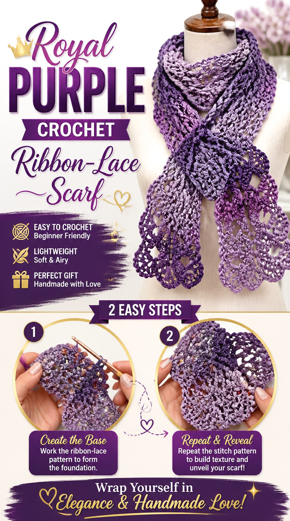
SAVEThis scarf option uses connected ribbon-like lace motifs rather than a conventional solid rectangle. That open construction gives royal purple plenty of contrast because light can pass through the negative spaces, making the motif shape easier to notice. It is a good direction when you want purple to feel decorative and lightweight rather than dense.
The tutorial’s sample uses variegated yarn, so a royal-purple interpretation could stay monochrome or move through related violet shades. Before substituting yarn, consider how the fiber and thickness change the scale and drape of the motifs. A dramatically different yarn can make the same construction feel either delicate or substantially heavier.
Open Lace Changes How the Purple Reads
Large areas of negative space prevent a saturated purple from becoming one continuous dark block. That makes this scarf especially suitable for a deep jewel shade with strong stitch definition.
If you use a multitone purple yarn instead, check whether rapid color changes interrupt individual motifs. Longer transitions may preserve the ribbon shape more clearly, while short, high-contrast changes can make each section look busier.
Plan the Finished Length Around How You Wear Scarves
An open decorative scarf can be worn long, doubled, or loosely wrapped, so the useful finished length depends on styling rather than a universal number. The creator provides information about her sample, but your yarn and motif scale may behave differently.
Pause while the scarf is still adjustable and drape it as you intend to wear it. That gives you a more useful checkpoint than copying another person’s finished length automatically.
2. Royal Purple Crochet Ribbed Beanie
 SAVE
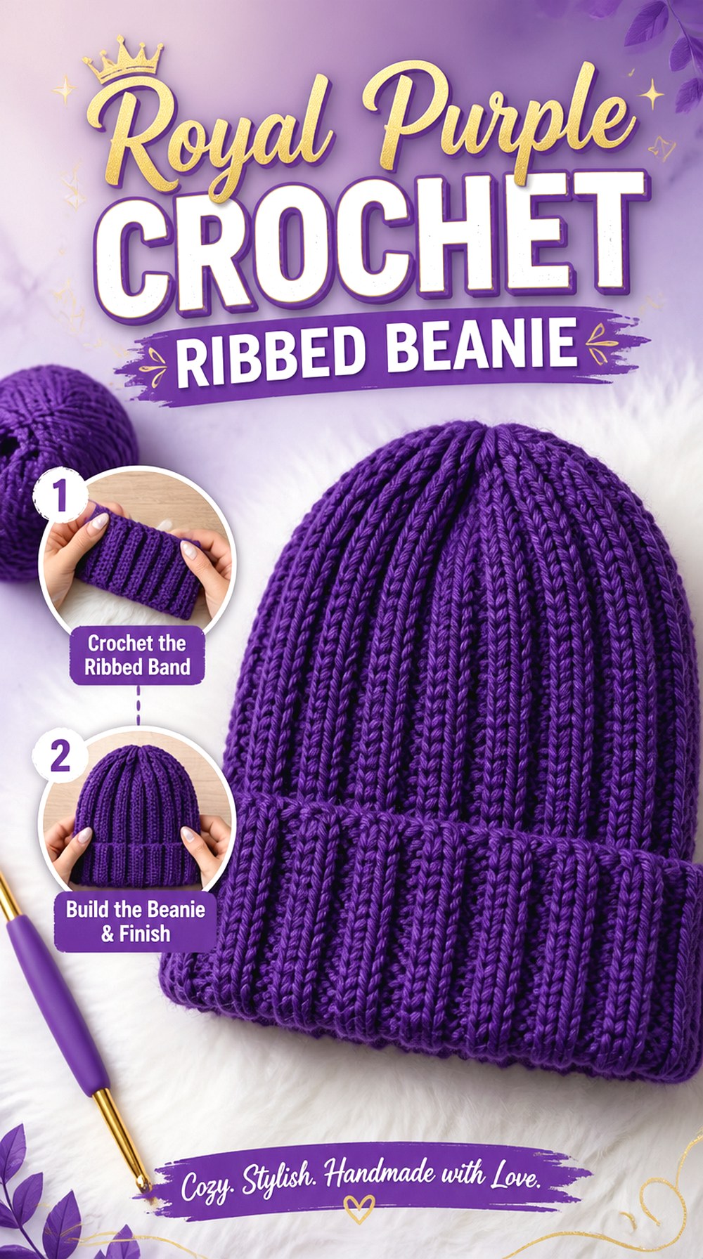
SAVEA ribbed beanie is one of the cleanest ways to use a single royal-purple shade because the surface texture supplies its own variation. Vertical-looking ridges create alternating highlights and shadows, allowing a solid color to feel more dimensional without stripes, motifs, or embellishments.
This option also places fit ahead of decoration. A beautiful purple yarn will not compensate for a hat that is too loose, too tight, or too tall for the wearer. The tutorial includes a sizing and measurement stage as well as finishing at the crown, making it a useful reference when you want a streamlined purple winter accessory rather than a highly decorative hat.
Ribbing Needs Enough Definition to Stay Visible
Very fuzzy or heavily haloed yarn can soften the lines that make a ribbed beanie visually distinctive. If the ridges are the feature you want to emphasize, make a small swatch and look at it from several feet away.
Royal purple already creates strong visual impact, so the yarn does not need extra novelty texture. Clear stitch definition may produce a cleaner result than combining a dark saturated color with an equally dominant fuzzy surface.
Fit Should Be Checked Before the Crown Is Finished
Hat sizing is sensitive to both stitch tension and yarn stretch. Instead of assuming a particular age or head-size label will work, use the tutorial’s measurement guidance and compare the developing fabric with the intended wearer.
Also notice how much the ribbing stretches and recovers. A swatch that stretches easily but stays enlarged afterward behaves differently from one that springs back, and that difference can affect the long-term fit.
Original Tutorial and Creator Credit
Creator: VivCrochets
3. Royal Purple Crochet Draped Shawl
 SAVE
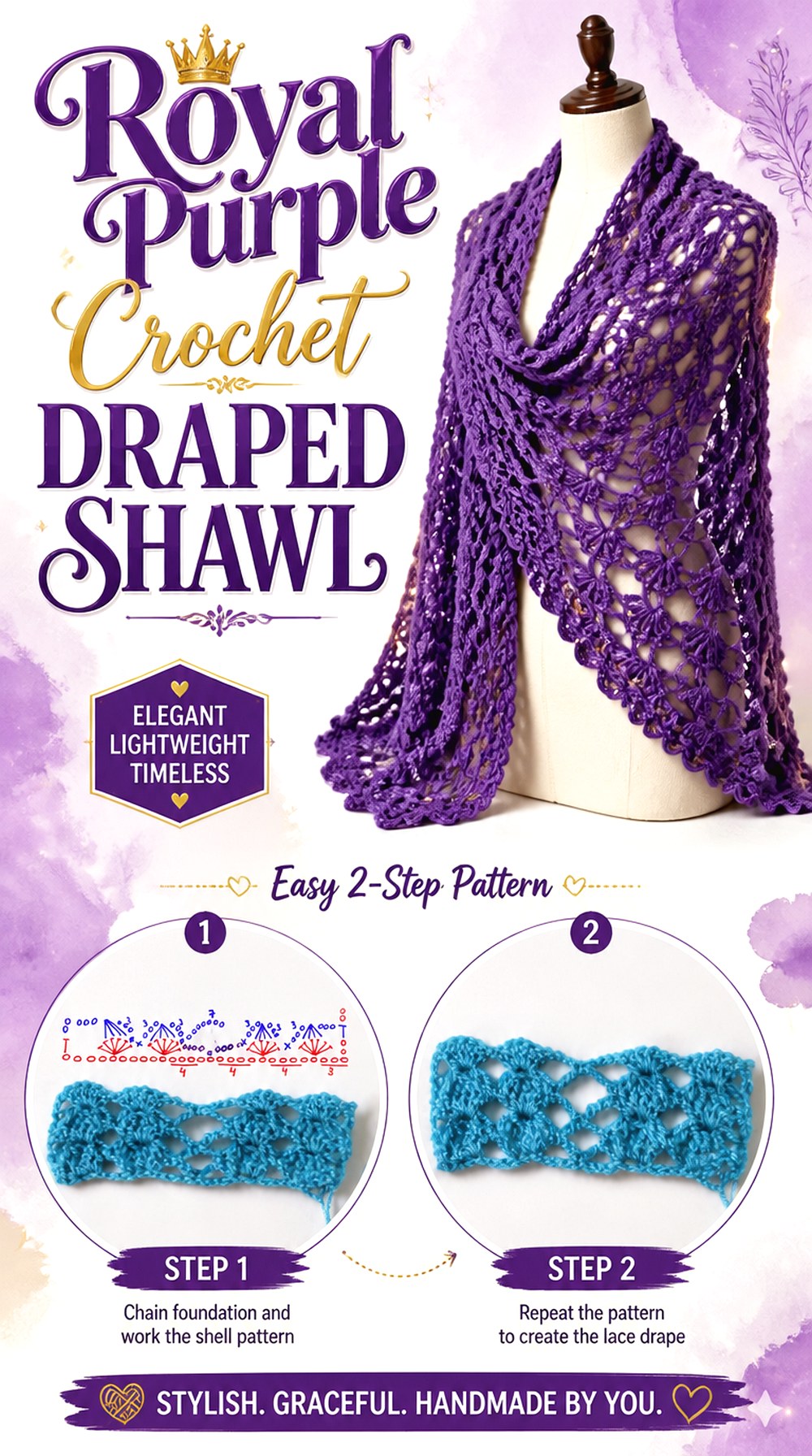
SAVEA shawl gives royal purple a much larger uninterrupted canvas than a hat or scarf. That makes fiber choice particularly noticeable: a soft, flexible fabric can turn the color into flowing folds, while a stiffer yarn can make the same shade look more architectural.
This project works well when the goal is a single statement accessory rather than several small purple accents. Because a shawl may be worn around the shoulders, draped over the arms, or styled as a wrap, evaluate the fabric for comfort as well as appearance. The source video is a direct step-by-step shawl tutorial, so use the creator’s demonstration for the actual construction rather than trying to infer it from the finished shape.
Drape Matters More Here Than Firm Structure
A shawl has to bend around the body, which makes a rigid fabric less forgiving than it would be in a basket or decorative object. When testing a royal-purple yarn, do more than lay the swatch flat.
Lift it, fold it, and let it hang from one edge. This shows whether the material creates the soft movement you want or remains too stiff for your preferred way of wearing the shawl.
Check Purple Under the Clothes You Will Pair With It
Large purple accessories interact strongly with the colors underneath them. Black, charcoal, cream, denim, and warmer neutrals can all make the same shade of purple appear slightly different.
If the shawl is intended for a particular coat or dress, place the yarn against that garment before committing. This simple comparison is more reliable than judging the skein by itself under store lighting.
Original Tutorial and Creator Credit
Creator: Hecho entre encinas
4. Royal Purple Crochet Waffle Texture Throw
 SAVE
SAVEA chunky waffle-texture throw lets royal purple work through shadow as much as color. The raised grid creates deeper and lighter areas across the surface, so even a mostly solid palette can look complex from across a room. TL Yarn Crafts’ Molly Waffle Blanket tutorial demonstrates a textured throw with a border and uses multiple coordinated colors in the source project.
For a royal-purple version, you could keep the entire throw in one jewel shade or use closely related violet and plum sections. Because this is a substantial textile rather than a small accessory, think about overall weight, washing requirements, and how strongly the saturated color will affect the room where it is used.
Waffle Texture Can Consume More Visual and Physical Weight
Raised texture creates a thicker-looking surface than a flat stitch pattern. In a large throw, that means the yarn choice influences not only warmth and drape but also how bulky the finished blanket feels when folded or stored.
Before changing the yarn specified by the designer, compare weight, fiber behavior, and gauge. A substitute that looks similar in the skein may produce a noticeably different blanket fabric.
A Purple Color Family Can Replace Hard Contrast
You do not need a neutral stripe simply to make sections visible. Royal purple, dark plum, medium violet, and a softened orchid can create separation while maintaining a unified palette.
Lay the skeins next to each other and photograph them in grayscale. If they merge into the same value, the color changes may be subtle; if their lightness differs clearly, the section changes will remain more obvious from a distance.
Border Choice Affects the Final Purple Frame
The tutorial includes a border, which matters because the outer edge acts like a frame around a large field of texture. In a monochrome version, that border can quietly define the perimeter without introducing another color.
If you choose a contrasting purple tone instead, sample a short section first. A very light edge can visually dominate a dark blanket, while a nearby violet shade creates a gentler transition.
Original Tutorial and Creator Credit
Creator: TL Yarn Crafts
5. Royal Purple Crochet Lavender Stem Bouquet
 SAVE
SAVELavender is one project where purple is part of the subject rather than simply a color substitution. Individual flower stems can be grouped into a compact bouquet, mixed with other crochet flowers, or displayed sparsely in a narrow vase. The finished form is vertical and delicate, providing a useful contrast to the larger wearables and home textiles in this collection.
The tutorial uses green for the stem and lavender-colored yarn for the flowers, with support inside the stem construction. Keep the exact construction with the creator; your main planning decision is how many stems to display and whether you want one consistent flower shade or a subtle mixture of royal purple and lighter lavender.
Mix Purple Values Without Losing the Lavender Look
A bouquet can contain more than one purple without appearing multicolored. Try keeping the stem structure consistent while varying the flower yarn from deep royal purple to a softer violet.
The useful checkpoint is balance. If one very dark shade appears only once, it may look accidental. Repeating each major shade across several stems creates a more intentional arrangement while preserving the recognizable lavender theme.
Support and Display Determine the Final Silhouette
Crochet flowers do not automatically stand like fresh-cut stems. This tutorial specifically incorporates a support element into the stem, so pay attention to that portion rather than judging the flowers only by their crocheted surface.
Before making a full bouquet, decide on the vase or container. Its opening and height affect how closely the stems cluster and how much of the green stem remains visible.
Original Tutorial and Creator Credit
Creator: realizing erin
6. Royal Purple Crochet Phone Bag
 SAVE
SAVEA phone bag turns royal purple into a compact functional accessory instead of a large color statement. Its narrow body makes it well suited to a strong saturated shade, and the project can be easier to coordinate with clothing than a full-size purple tote.
The Chenda DIY tutorial demonstrates a dedicated crochet phone bag and lists DK-weight milk cotton for the creator’s version. If you substitute another purple yarn, do not assume that equal-looking yarn labels will produce exactly the same dimensions. The phone itself is the most useful sizing reference. Check the developing pouch against the device and remember that the opening still needs enough room for comfortable insertion and removal.
Size the Pouch Around the Actual Device
Phone models vary in width, height, thickness, and case size, so a generic finished measurement is less useful than checking the object that will go inside. If the phone normally stays in a protective case, measure or test with that case attached.
Leave enough functional room for the phone to slide in without forcing the crochet fabric to stretch excessively. A very loose pouch, however, can allow the device to shift more than intended.
Strap Length Changes the Way the Bag Functions
Decide whether you want the phone pouch to sit high on the torso, at the hip, or somewhere between. That preference should influence the strap plan instead of treating strap length as decorative.
Crocheted straps can also lengthen under load depending on their construction and fiber. Before finishing permanently, hang the bag with a comparable lightweight object inside and observe how the strap behaves.
Original Tutorial and Creator Credit
Creator: Chenda DIY
7. Royal Purple Crochet Twilight Wall Hanging
 SAVE
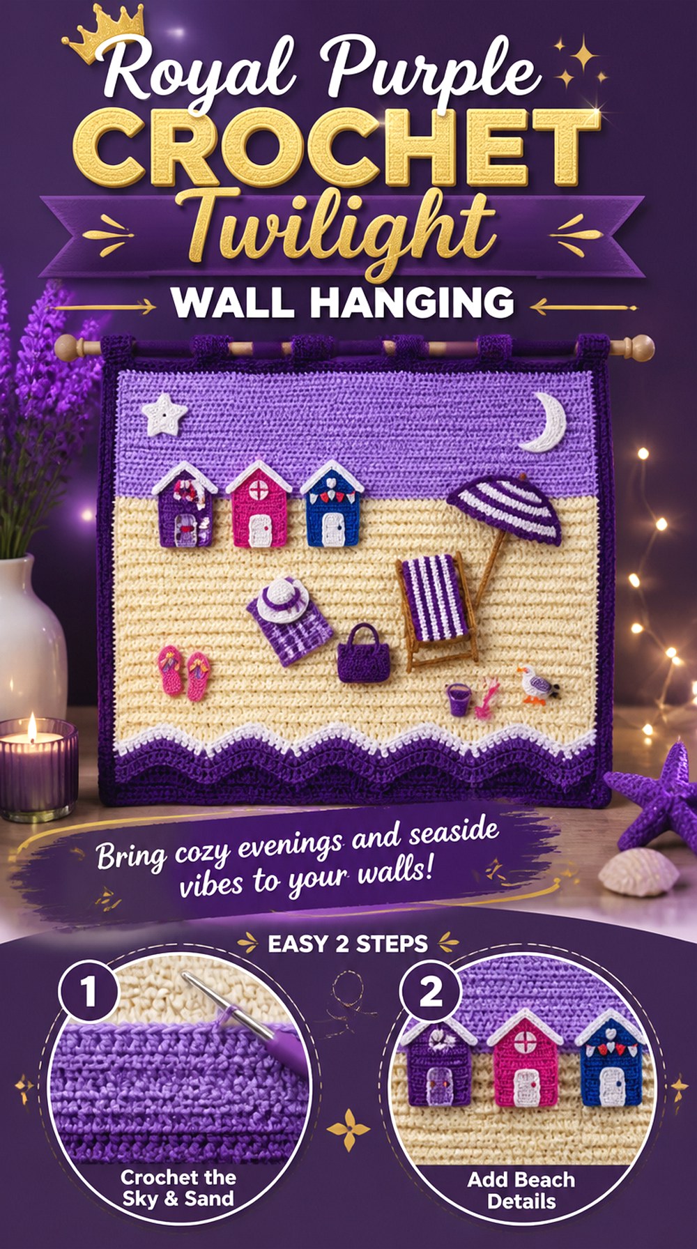
SAVEKerri’s Crochet demonstrates a beach-scene wall hanging with waves, sand, sky, border, and a hanging finish. Rather than copying its original blue-and-sand palette, a royal-purple interpretation could treat the scene as twilight: deep plum water, violet sky, muted mauve accents, and a restrained neutral section where contrast is needed.
This project differs from a blanket because it is viewed vertically and primarily from a distance. Small color changes that seem obvious while crocheting may merge once the piece is hanging. Plan the palette in strips or blocks before beginning, and consider the wall color behind the finished piece. Purple against a cool gray wall reads differently from the same textile on cream or warm beige.
Test the Palette From Across the Room
Lay your proposed yarn colors next to one another, then move several feet away. This reveals whether the scene still separates into recognizable areas or turns into one dark mass.
Royal purple can anchor the composition, but every neighboring color does not need to be equally saturated. Lighter violet or muted neutral sections can create breathing room and make the deepest purple look more intentional.
Hanging Hardware Is Part of the Finished Object
The source design uses bamboo and twine for hanging, so the top support is visually exposed rather than hidden inside the textile.
If you adapt the palette, choose a support that works with the purple rather than treating it as an afterthought. Also consider the finished textile’s weight and use an appropriate wall fixing for your own wall and hanging hardware.
Keep the Lower Edge Visually Controlled
Vertical crochet displays make uneven edges more noticeable because gravity gives the eye a clear reference line. Before hanging, inspect the lower edge and border on a flat surface.
If the fabric has developed waviness, first determine whether it comes from tension, edging, or the natural behavior of the yarn. Avoid forcing a severe correction without checking the fiber’s care and blocking recommendations.
Original Tutorial and Creator Credit
Creator: Kerri’s Crochet
8. Royal Purple Crochet Round Textured Pillow
 SAVE
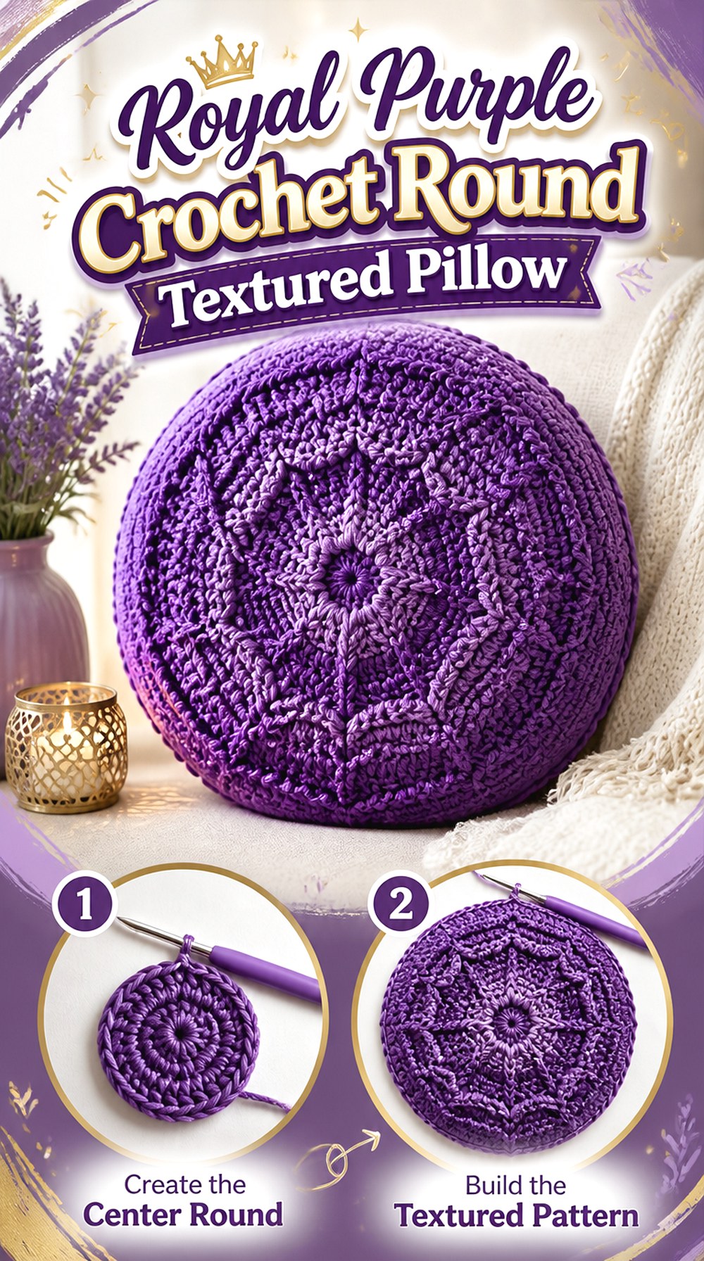
SAVEA round pillow gives royal purple a sculptural role. Yarnspirations’ Be-Spoke Pillow tutorial uses a round pillow form and works outward from the middle, with front-post texture producing a spoke-like surface. That geometry is particularly effective in a solid dark color because shadows radiate from the center.
Unlike a flat cushion cover, this project needs to work with a three-dimensional insert. If you substitute yarn to obtain a particular royal-purple shade, pay close attention to gauge and fabric flexibility. An overly loose cover can lose the intended shape, while a cover that is too small may stretch the stitches enough to change the appearance of the raised texture.
The Center Becomes the Visual Focal Point
Because the design radiates outward, the eye naturally lands near the middle of the pillow. That makes inconsistent tension or a poorly defined center more noticeable than it might be on a rectangular cushion.
Choose purple yarn that shows the raised spoke texture clearly, and periodically lay the work flat to inspect whether the circular form remains visually balanced as it grows.
Match the Cover to the Intended Pillow Form
The creator’s project is designed around a round pillow form, so treat the insert as a structural component rather than an optional finishing detail.
If you use a different insert, compare its diameter and depth with the pattern requirements before making assumptions about fit. Stuffing a mismatched form into the cover can distort both the outer edge and the central texture.
Original Tutorial and Creator Credit
Creator: Yarnspirations
9. Royal Purple Crochet Octopus Plush
 SAVE
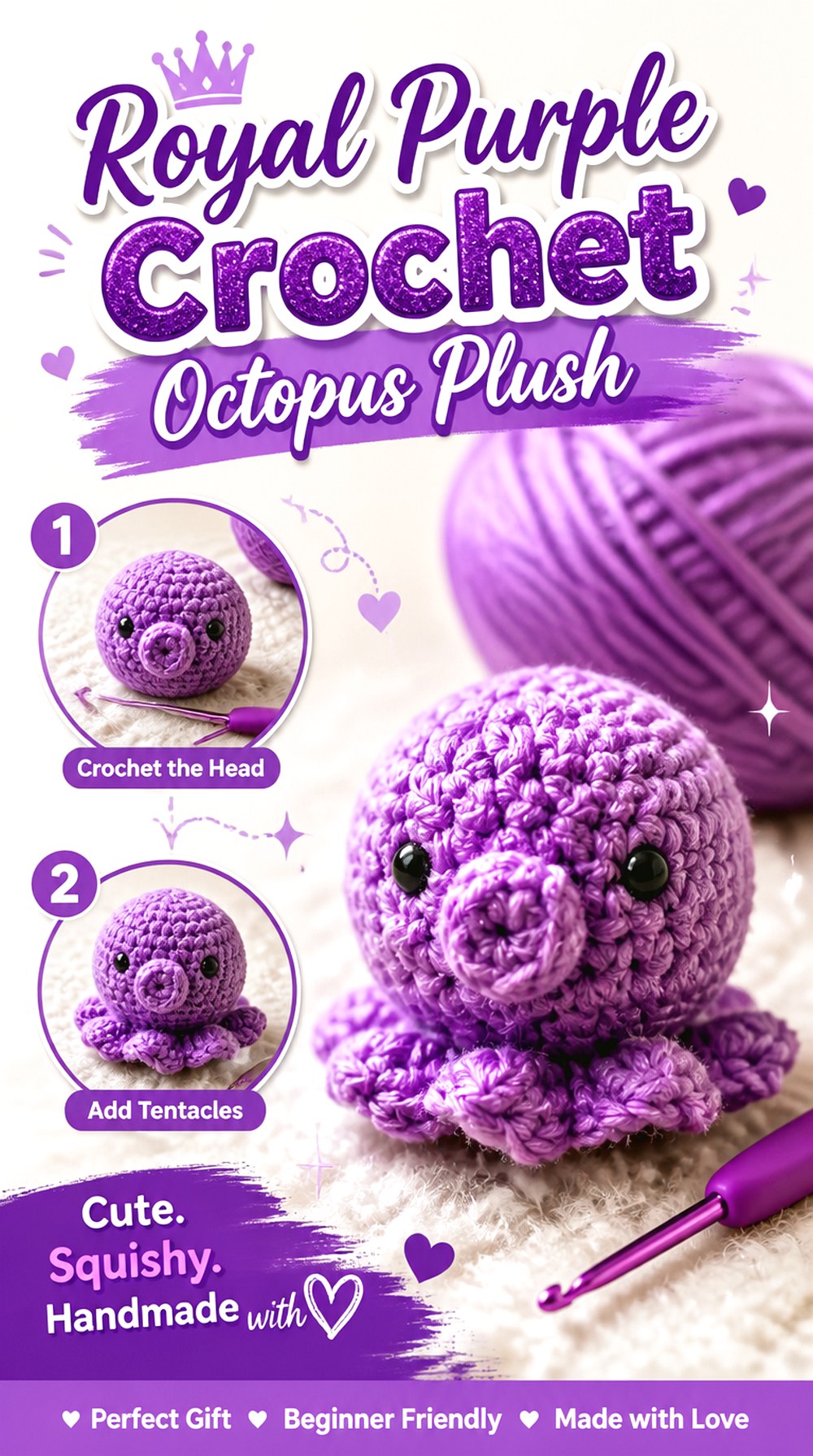
SAVEPurple suits an octopus plush naturally because the color can be playful, dramatic, or slightly whimsical depending on the shade. This project also introduces a completely different construction concern from wearables and décor: the crocheted fabric has to contain stuffing and maintain a recognizable three-dimensional form.
Jae Jasmine’s tutorial demonstrates an amigurumi octopus rather than a flat appliqué. For your purple version, focus first on fabric density and secure finishing. A smooth royal-purple yarn can make the shape clear, while very fuzzy yarn may soften details. If the finished item is intended for a young child or pet, loose or detachable decorative elements require special consideration.
Dense Fabric Helps Keep Stuffing Concealed
An amigurumi surface is different from an airy scarf or shawl. Open gaps become much more obvious once pale stuffing sits behind a dark royal-purple fabric.
Make a small test section if you change yarn or hook from the tutorial. Stretch it slightly under normal hand pressure. If large openings appear between stitches, reconsider the fabric density before completing the entire plush.
Face Details Need to Match the Intended Recipient
Decorative eyes and embellishments may be appropriate for display but not for every recipient. For items intended for babies, young children, or pets, avoid assuming that a component is safe simply because it is commonly sold for craft use.
Select and secure details according to the intended use, and consider embroidered features when you want to eliminate detachable decorative parts.
Stuffing Distribution Controls the Shape
Purple draws attention to the outline, so uneven stuffing can change the character of the finished octopus more than expected. Add filling gradually and compare the form from several angles instead of correcting the silhouette only at the end.
The goal is not maximum firmness. Follow the tutorial’s construction while distributing the stuffing consistently enough for the intended form to remain recognizable.
Original Tutorial and Creator Credit
Creator: Jae Jasmine
10. Royal Purple Crochet Kelp Bucket Hat
 SAVE
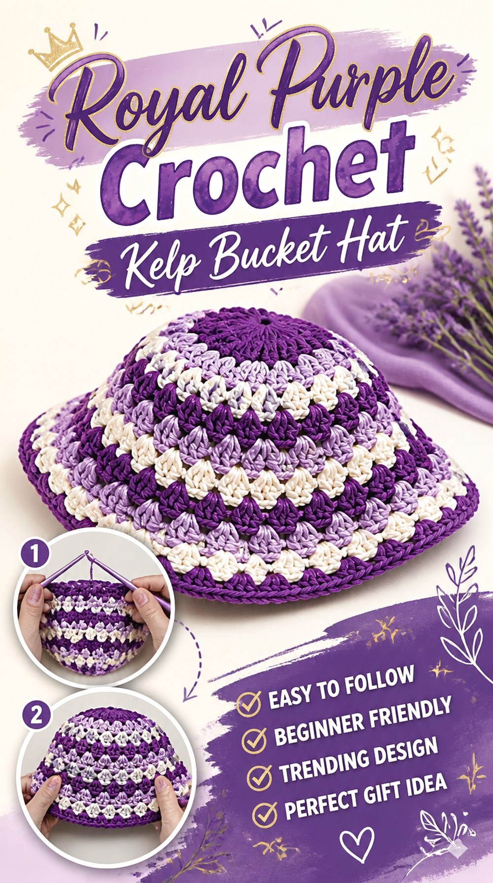
SAVEThe Kelp Bucket Hat offers a different headwear shape from the close-fitting ribbed beanie. Its crown, sides, and brim create a stronger silhouette, giving royal purple more presence around the face. The tutorial also provides gauge information, making fit something to check rather than guess.
A bucket hat is a useful choice if you want purple to read as part of an outfit instead of mainly as cold-weather gear. Before substituting yarn, consider what the new fiber will do to the brim. A softer fabric may droop more, while a firmer fabric can hold a more defined outline. Neither is automatically wrong, but they create noticeably different finished hats.
Brim Behavior Changes the Entire Silhouette
The brim is one of the first things people notice on a bucket hat. If it collapses, flares, or curls differently from the source project, the hat can look like a different design even if the crown fits.
Make your yarn substitution carefully and watch the developing brim rather than assuming blocking will correct every structural difference later.
Purple Near the Face Is Worth Checking in Daylight
A royal-purple skein can lean slightly blue, red, or muted depending on the dye. Because a hat sits directly beside the face, that undertone is more noticeable than it would be in a floor basket or blanket.
Hold the yarn near the intended wearer in indirect daylight. This is a simple styling check, not a rule about which undertones anyone should wear.
Follow Gauge Before Judging the Labeled Hat Size
The creator includes a gauge measurement in the tutorial description. Use that as part of your fit check, particularly if you have changed yarn.
A royal-purple substitute that produces a larger or smaller fabric at the same stitch count can alter the crown circumference and brim proportions. Correcting the mismatch early is usually more useful than relying on a size label alone.
Original Tutorial and Creator Credit
Creator: PassioKnit Kelsie
11. Royal Purple Crochet Granny Square Tote
 SAVE
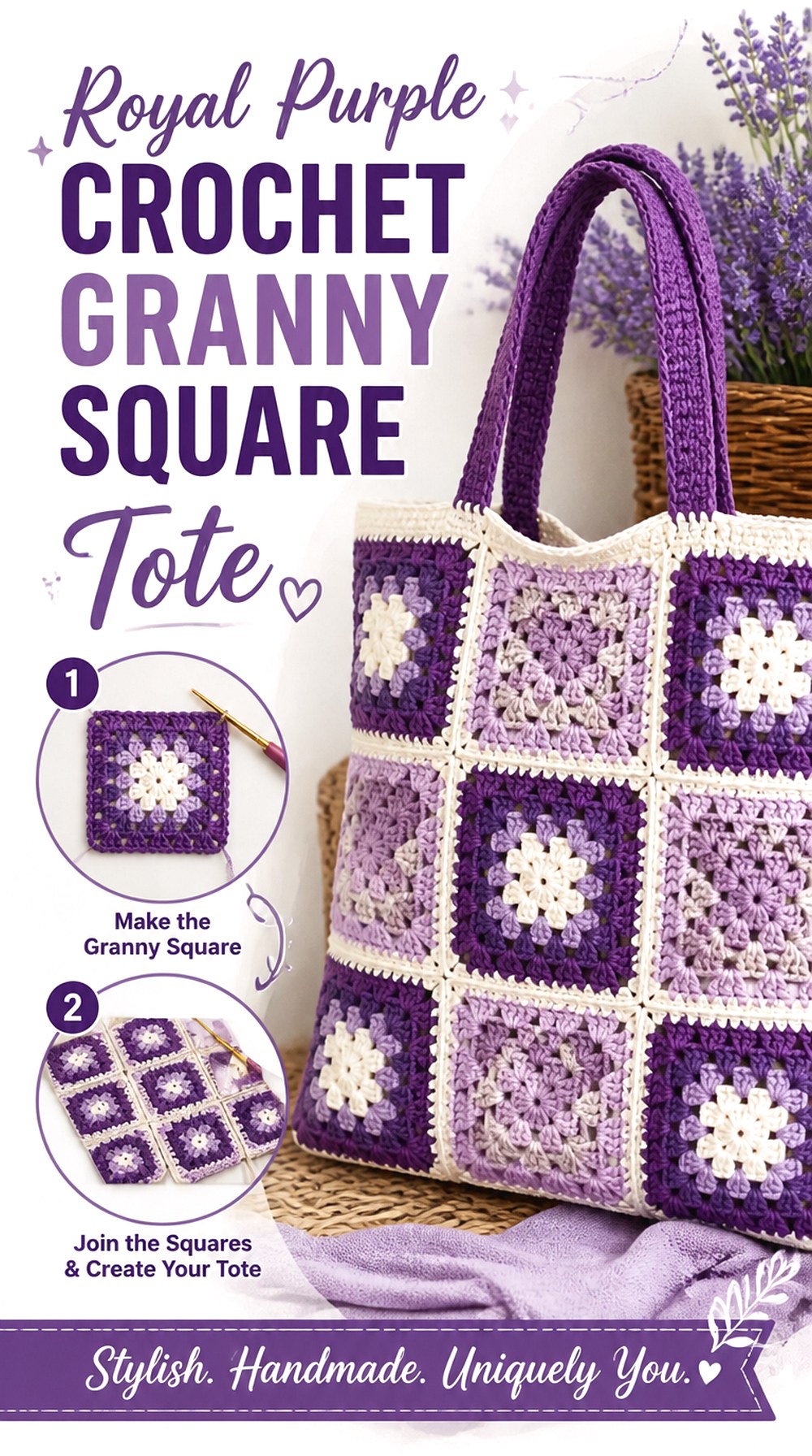
SAVEA granny-square tote gives you much more control over purple placement than a one-piece bag. Leelee Knits’ tutorial demonstrates a tote built by joining dense single-crochet granny squares and then adding the bag’s strap.
For a royal-purple interpretation, the squares could be completely monochrome, alternate royal purple with a neighboring violet, or use purple as the dominant shade with a restrained neutral. Because the motifs become structural pieces of a functional bag, consistency matters. Block or compare the squares before assembly so small size differences do not accumulate into uneven seams. Also remember that changing fiber can affect stretch, especially once the bag carries contents.
Square Consistency Matters More Than Perfect Color Repetition
When several motifs form one bag body, differences in blocked dimensions can pull the joined fabric out of alignment. Compare the squares before the final assembly instead of discovering the mismatch after every seam is complete.
If you are mixing multiple purples, decide whether the colors will follow a deliberate placement plan or appear randomly. Both can work, but an intentional layout makes it easier to distribute the darkest squares evenly.
Dense Motifs Reduce Gaps but Do Not Eliminate Stretch
The source project specifically uses dense single-crochet granny squares rather than a very open traditional motif. That affects both appearance and function.
Even so, crocheted bags can change shape depending on fiber, strap construction, and what they carry. If your intended use requires additional structure or a lining, plan that before final finishing rather than assuming every crochet tote behaves the same way.
Treat the Strap as a Load-Bearing Part
A decorative strap and a bag strap have different jobs. Watch for how much your chosen purple yarn stretches under the weight you realistically expect to carry.
If the strap lengthens more than you want, consider whether a more stable construction or suitable reinforcement fits your project. Avoid making unsupported weight-capacity claims; actual performance depends on yarn, construction, seams, and use.
Original Tutorial and Creator Credit
Creator: Leelee Knits
12. Royal Purple Crochet Flower Pot Arrangement
 SAVE
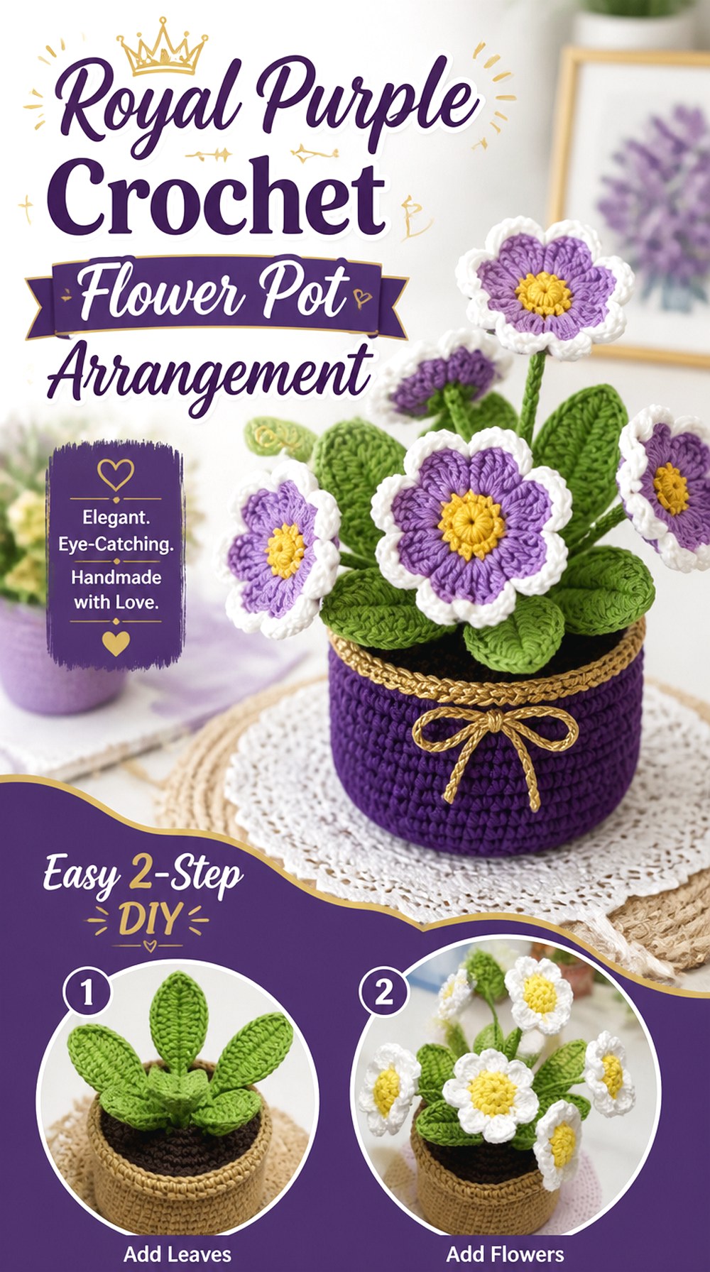
SAVEThis potted arrangement combines several visual elements—flowers, leaves, stems, and the pot—so royal purple can be concentrated in the blooms while green and a quieter container color keep the composition balanced. Shelen Crochet’s tutorial demonstrates the flower center, petals, stems, leaves, pot, and final assembly as one finished decorative project.
That makes it different from the lavender bouquet, which emphasizes tall individual stems. Here the pot creates a compact base and the flowers form a fuller tabletop arrangement. Before selecting shades, decide whether you want one royal-purple flower color repeated throughout or a more garden-like combination of violet values.
Keep the Pot From Competing With the Flowers
A purple flower arrangement already has a strong focal color. Using the same intense shade for the pot can merge the container and blooms into one visual block.
A quieter plum, cream, muted gray, or another compatible shade can separate the base from the flowers. If you want an all-purple composition, vary value: pair very dark purple blooms with a noticeably lighter violet container or reverse the relationship.
View Flower Placement From Every Display Angle
A tabletop arrangement may be seen from the front only, or it may sit where people walk around it. Decide which situation applies before final assembly.
For an all-around display, distribute flowers and leaves so one side does not receive every dominant royal-purple bloom. For shelf display, concentrating detail toward the visible front can make more sense than forcing perfect symmetry.
Original Tutorial and Creator Credit
Creator: Shelen Crochet
13. Royal Purple Crochet Maxi Cardigan with Pockets
 SAVE
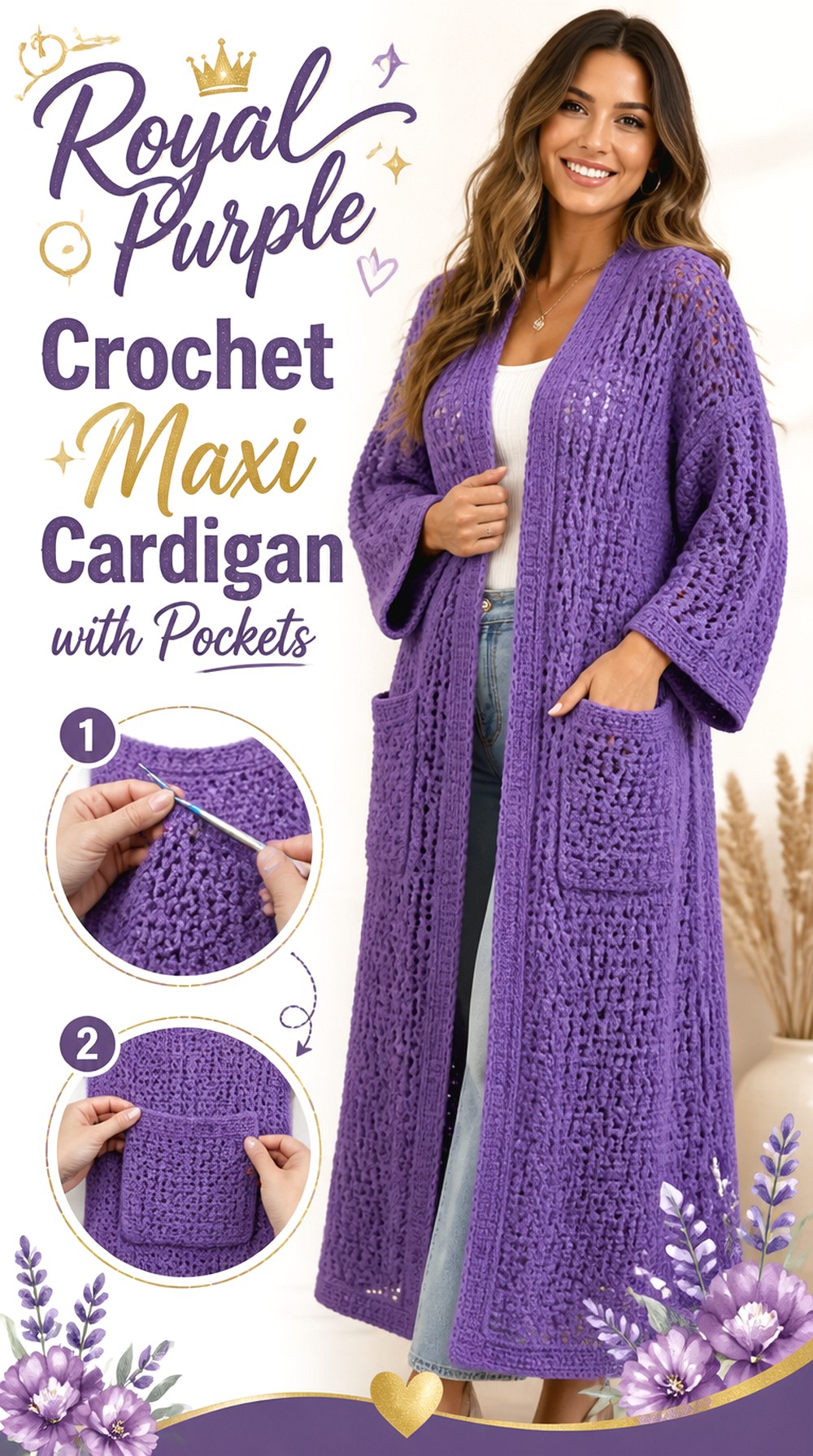
SAVEA long cardigan is the largest wearable statement in this collection, and royal purple will dominate an outfit far more than it does on a beanie or phone pouch. Nirvana Crochet’s tutorial demonstrates a maxi-style cardigan jacket with pockets and discusses measuring as part of the project.
Because a cardigan has to fit across several areas at once, do not choose yarn only because its purple shade is perfect. Weight, drape, gauge, and fiber behavior influence how the garment hangs from the shoulders and how heavy a longer length feels. If you substitute yarn, make a useful swatch and compare it with the tutorial requirements before investing in the full amount needed for a long garment.
Long Length Amplifies Yarn Weight
A yarn that feels light in one skein can become substantial when used across a full-length cardigan. That matters at the shoulders, along the front opening, and anywhere the fabric is unsupported.
When comparing royal-purple yarns, handle a reasonably sized swatch rather than judging softness alone. If the fabric feels unusually heavy or rigid at swatch scale, multiplying it across a long garment may not give the drape you expect.
Pocket Placement Should Work With Your Body
Pockets create both function and visual interruption on a large field of purple. Their location should be comfortable to reach and should sit where you want the extra fabric and visual weight.
Before attaching or finalizing pocket placement according to the tutorial, try the garment on if the construction allows. A useful pocket is more important than copying placement that was proportioned for someone else’s body.
Check Layering Room, Not Just Bust Width
A cardigan may be worn over a thin top, shirt, or thicker layer. Decide which use matters before judging the fit.
Compare the developing garment with the clothing you expect to wear underneath it. The right amount of room is a styling choice as well as a measurement issue, so avoid assuming that more ease or less ease is universally preferable.
Original Tutorial and Creator Credit
Creator: Nirvana Crochet
Which Royal Purple Project Should You Choose?
For a small wearable accent, the ribbed beanie or bucket hat gives royal purple strong visibility without requiring the commitment of a large garment. The ribbon-lace scarf and draped shawl suit readers who want more movement and open fabric, while the maxi cardigan turns the color into the central part of an outfit.
For functional crochet, compare the compact phone bag with the motif-based tote. The phone bag has a narrowly defined purpose; the tote requires more thought about motif alignment, strap behavior, and fabric stretch.
For home décor, the waffle throw and round pillow create useful soft furnishings, while the wall hanging, flower pot, and lavender bouquet are primarily display pieces. The octopus sits between décor and gifting, with additional attention needed when it is intended for children or pets.
Conclusion
These 13 royal purple crochet ideas show how much the finished object changes the effect of one strong color. Choose the ribbed beanie or phone bag when you want a concentrated accent, the lace scarf or shawl when drape and open space matter, and the cardigan or waffle throw when you want purple to occupy a much larger visual area.
For structured or dimensional projects, pay closer attention to yarn behavior: the tote needs controlled stretch, the pillow needs to suit its insert, and the plush must hold stuffing securely. Floral and wall décor give you the most freedom to combine royal purple with neighboring violet shades. Once you choose a direction, use the original creator tutorial for its exact construction details.
Frequently Asked Questions
What yarn color actually counts as royal purple for crochet?
There is no universal yarn-industry shade called royal purple. In practical terms, look for a saturated medium-to-deep violet that reads clearly purple rather than nearly black, burgundy, or pastel lavender. Dye names vary considerably between yarn brands, so compare the actual yarn instead of relying on the color name. If texture matters, inspect the shade in daylight to make sure raised stitches remain visible.
Can I use royal purple yarn when the tutorial uses another color?
Usually, color alone can be changed without altering the construction, provided the substitute yarn still meets the project’s material and gauge requirements. The important part is not matching the creator’s color but matching the fabric behavior the project needs. A different fiber or yarn weight chosen solely for its purple shade may change size, drape, stretch, structure, or stitch definition.
Which royal purple crochet ideas show texture most clearly?
Ribbing, waffle texture, and raised pillow stitches create strong light-and-shadow changes that can make a single purple shade look dimensional. The granny-square tote also provides visible structural lines through its joins. Very dark purple can conceal finer stitch details, however, so swatch the yarn and view it under normal room lighting before choosing it for a texture-heavy project.
How can I combine royal purple with other purple shades without making the project look random?
Start with royal purple as the dominant shade and choose one or two related colors that differ clearly in either lightness or undertone. Plum can deepen the palette, while violet or lavender can create lighter separation. Repeat each secondary shade intentionally rather than introducing it only once. For motif projects, arrange completed pieces before joining so the darkest areas do not cluster accidentally.
Should I use the same royal purple yarn for the cardigan, tote, and blanket?
Not necessarily. These projects ask the fabric to do different things. A cardigan needs wearable drape and appropriate gauge, a tote benefits from controlled stretch and structural stability, and a textured throw has its own weight, warmth, and care considerations. Choosing the same color family is reasonable, but select yarn according to the function of each finished object rather than trying to force one yarn into every project.
How do I photograph very dark purple crochet without losing stitch detail?
Use bright indirect natural light and avoid underexposing the image. Place the project against a lighter, uncluttered background so the edges remain distinct. Side lighting can help raised texture cast small shadows, which is useful for ribbing and waffle stitches. If the yarn photographs almost black even though it appears purple in person, a slightly clearer or lighter royal-purple shade may reproduce more accurately.
Which of these ideas is easiest to adapt without changing the construction?
Color-focused adaptations are most straightforward on projects where royal purple simply replaces the creator’s original yarn color, such as the beanie, scarf, bucket hat, phone bag, pillow, or octopus. Projects involving several colors—especially the wall hanging, flowers, blanket, and granny-square tote—need more palette planning. For sized wearables and structured bags, maintain the tutorial’s gauge and functional requirements rather than assuming a color substitution makes every yarn interchangeable.