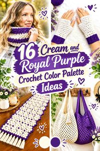
Cream and royal purple create a crochet palette with a naturally clear visual hierarchy. Royal purple has enough intensity to command attention, while cream gives it a much lighter background or supporting color. That difference can make borders, granny-square centers, stripes, ribbing, and textured stitches easier to distinguish.
The important decision is how much royal purple you want to see. A small amount against a large cream field can act almost like an outline or focal accent. Increasing the purple coverage changes the project considerably, giving it a richer and more dramatic appearance while cream becomes the shade that breaks up darker areas.
These 16 ideas use different proportions and placements rather than repeating the same cream body with a purple edge. The tutorials support the crochet project concepts; the cream-and-royal-purple color plans are independent adaptations.
Quick List
- Cream And Royal Purple Granny Square Crochet Blanket
- Cream And Royal Purple Crochet Pillow
- Cream And Royal Purple Crochet Tote Bag
- Cream And Royal Purple Crochet Scarf
- Cream And Royal Purple Crochet Beanie
- Cream And Royal Purple Crochet Shawl
- Cream And Royal Purple Granny Square Crochet Vest
- Cream And Royal Purple Crochet Bucket Hat
- Cream And Royal Purple Crochet Bunny
- Cream And Royal Purple Crochet Storage Basket
- Cream And Royal Purple Crochet Market Bag
- Cream And Royal Purple Crochet V Neck Sweater
- Cream And Royal Purple Crochet Table Runner
- Cream And Royal Purple Crochet Poncho
- Cream And Royal Purple Crochet Fingerless Gloves
- Cream And Royal Purple Crochet Cowl
Use Cream to Control the Strength of Royal Purple
Royal purple can become the visual focus even when it covers less area than cream. For that reason, you do not need a 50/50 color split to make both shades important.
On a pillow, bag, or garment, cream can cover the majority of the surface while royal purple appears in a border, stripe, motif, or finishing section. Because the purple is much stronger visually, those smaller sections can still be noticeable.
If you want a richer finished piece, reverse that balance. A royal-purple body with cream edging creates a darker result while still preserving strong definition around important crochet features.
Let Cream Separate Small Royal Purple Crochet Details
Cream and royal purple usually offer much more value separation than two medium muted colors, which makes the pairing useful for motifs and repeated colorwork.
That does not mean every detail needs maximum contrast. Broad stripes can accommodate softer transitions, while granny-square centers, checkerboard elements, narrow borders, and small decorative motifs benefit more from clear separation.
When planning detailed colorwork, look at the yarns together before making many repeats. Cream should remain light enough to distinguish the purple shapes you want the viewer to notice.
Repeat Royal Purple Instead of Adding More Crochet Colors
A two-color palette stays connected when the smaller color reappears in several logical places. Royal purple on cardigan cuffs can repeat at the neckline. Purple tote handles can connect with a purple base. A purple blanket border can repeat colors already used inside its motifs.
This repetition is often more useful than introducing a third accent color simply because one section feels empty. With cream and royal purple, changing proportions and placement already provides substantial variety.
1. Cream And Royal Purple Granny Square Crochet Blanket
 SAVE
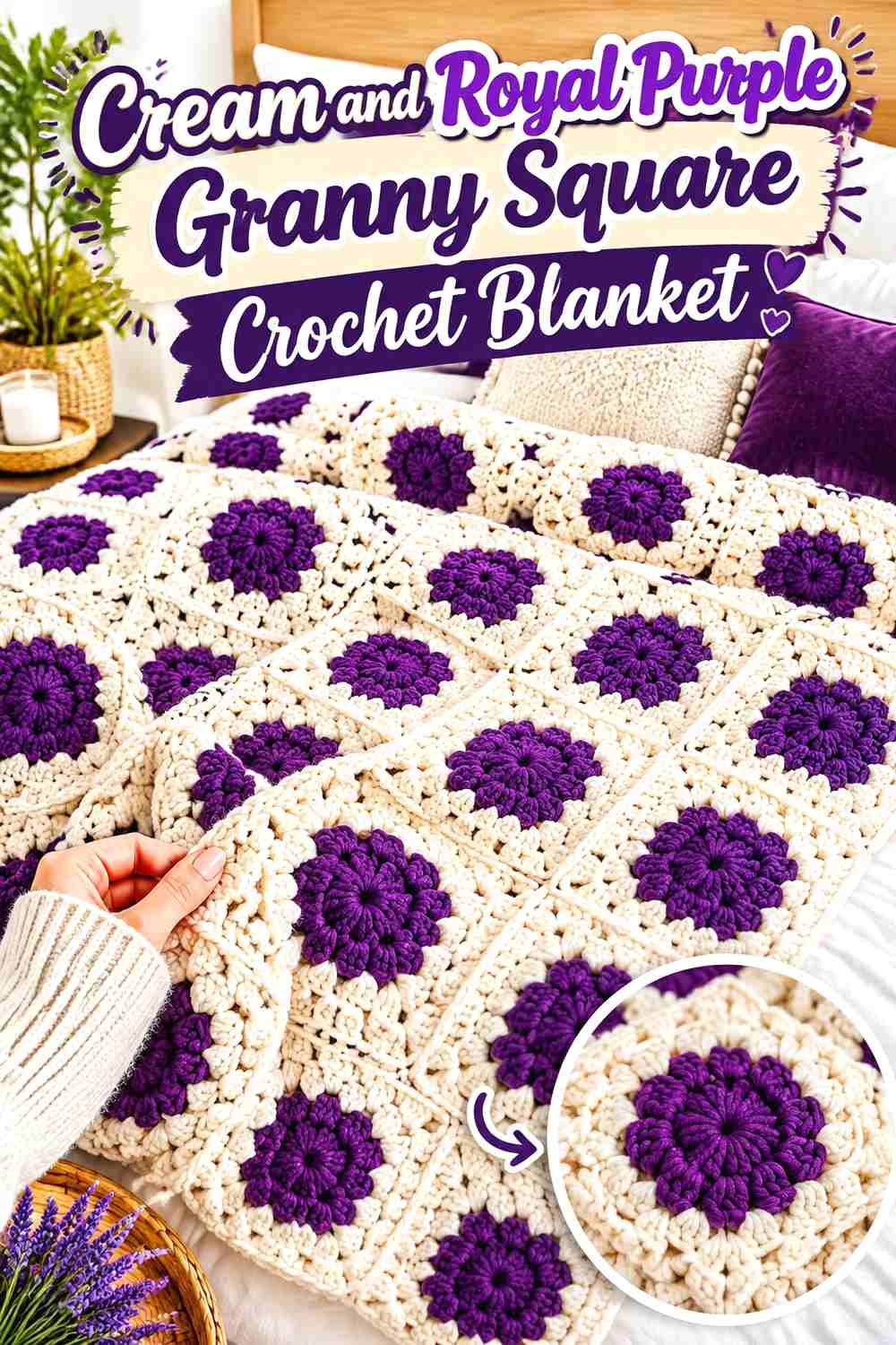
A granny square blanket gives cream and royal purple plenty of opportunities to exchange dominant roles. Royal purple can fill the motif centers while cream surrounds each square, or cream centers can sit inside wider purple rounds. Using one consistent outer color is especially useful when the inner arrangement changes from square to square.
Cream Can Connect Royal Purple Granny Square Motifs
Cream around the outer parts of multiple squares can create a light framework that separates strong purple centers. This placement also prevents neighboring purple areas from merging into one large dark block after the motifs are joined.
Lay several finished squares together before making the full set. If the blanket already looks heavily purple, keep more cream in the remaining outer rounds instead of adding another color.
Royal Purple Needs Planned Repetition Across the Cream Blanket
Royal purple is strong enough that one concentrated patch can draw disproportionate attention. Spread purple motifs through the blanket rather than grouping all of them in one corner unless an asymmetrical layout is intentional.
You can also alternate cream-led and purple-led squares while repeating the same two yarns. The changing dominance creates variety without expanding the palette.
Creator Credit: Danii’s Ways
2. Cream And Royal Purple Crochet Pillow
 SAVE
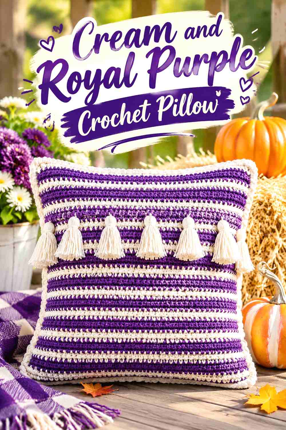
A pillow provides one broad surface where contrast can do most of the visual work. Cream can dominate the pillow face while royal purple forms a wide band, repeated geometric area, tassel detail, or defined section instead of being scattered in tiny amounts.
Cream Keeps Royal Purple Pillow Details Easy to Read
Using cream behind a purple design gives small crochet details plenty of separation. This is useful when the pillow incorporates raised texture or surface patterns that could become less noticeable in a darker solid color.
Do not automatically fill every open area with purple. Leaving uninterrupted cream between major details gives each purple feature more definition.
Royal Purple Can Give the Cream Crochet Pillow a Clear Focal Area
Instead of a thin purple line on every edge, concentrate royal purple in one purposeful region such as a central band or broad lower section. The stronger color will naturally draw attention there.
View the pillow panel from across the room before assembly. If the purple section completely overwhelms the cream field, reduce its surface area rather than introducing a third balancing shade.
Creator Credit: Yarn and Chai
3. Cream And Royal Purple Crochet Tote Bag
 SAVE
A tote can divide the palette through its structure. Royal purple works well across the base and lower body, while cream can cover the upper portion before purple reappears at the handles. That repetition keeps the darker color connected from bottom to top.
Royal Purple Can Anchor the Cream Crochet Tote Base
Placing royal purple low on the bag gives the color a substantial visual role without requiring it to cover the entire tote. A broad base section also remains easier to read than several narrow purple stripes.
Consider how the tote changes when it is filled. A very small purple band near the bottom may become visually compressed as the fabric expands or folds.
Cream Gives Royal Purple Tote Handles More Separation
Cream across the upper bag body creates a light background for royal purple handles. Repeating the purple from the base at the handles makes the color plan look connected rather than decorative only at one end.
If you want a cream-led tote, keep the purple handle attachment areas controlled so they do not spread into another large dark block.
Creator Credit: Hopeful Turns
4. Cream And Royal Purple Crochet Scarf
 SAVE
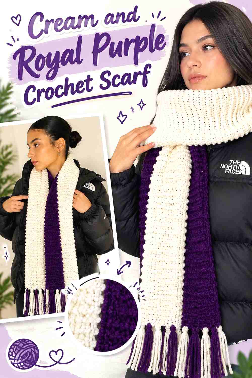
A scarf provides enough length to use substantial color sections rather than constantly alternating yarn. Cream can occupy the center while royal purple appears toward both ends, or the entire arrangement can be reversed for a darker scarf.
Cream Can Keep the Crochet Scarf Center Visually Lighter
A long cream center gives stitch texture a bright continuous field and prevents royal purple from dominating when the scarf is wrapped several times.
Before deciding where to switch colors, consider which portions are likely to hang freely. Details placed only in the central section may disappear once the scarf is wrapped around the neck.
Royal Purple Can Frame Both Ends of the Cream Scarf
Matching royal purple sections at each end create an easy-to-read two-color structure. The repetition also distributes the darker shade more evenly than placing one large purple block at only one end.
If adding fringe, compare cream and royal purple fringe separately. Repeating purple can extend the framing effect, while cream fringe keeps the ends from becoming too visually heavy.
Creator Credit: crochet daniela
5. Cream And Royal Purple Crochet Beanie
 SAVE
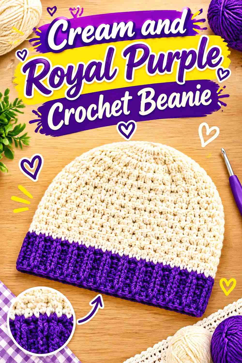
A beanie works well with a straightforward hierarchy because its surface is compact. Royal purple can cover the crown and upper body while cream forms a substantial lower band or folded brim.
Royal Purple Can Keep the Crochet Beanie Crown Unified
Using royal purple continuously through the crown avoids breaking the shaping with unnecessary color changes. It also gives the strongest shade one clean, recognizable area.
If you want the purple to dominate, carry it far enough down the beanie that the cream brim does not visually split the project into equal halves.
Cream Can Define the Royal Purple Crochet Beanie Brim
Cream around the lower section creates a strong light edge against the purple body. A folded brim makes the cream area visually more substantial, so check the finished fold depth before deciding the overall ratio.
If the cream brim already provides enough contrast, additional cream stripes higher on the crown may make the design feel unnecessarily segmented.
Creator Credit: Crochet Jewel
6. Cream And Royal Purple Crochet Shawl
 SAVE
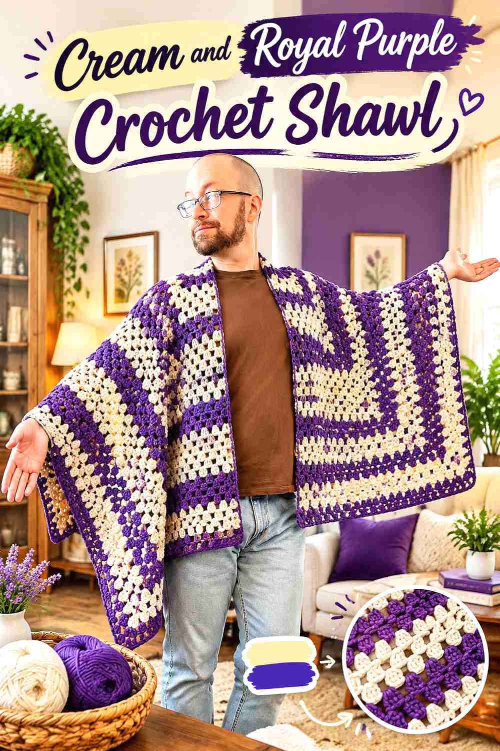
A shawl lets color placement follow its expanding shape. Cream can begin around the upper center, with royal purple gradually taking more space toward the lower edge and border.
Cream Can Keep the Crochet Shawl Center Open and Light
Starting with cream places the lightest color close to the neckline and central shaping. It also creates enough uninterrupted space for stitch texture or openwork to remain visible.
Do not change to purple too quickly if you want cream to remain noticeable once the shawl is wrapped or folded.
Royal Purple Can Frame the Cream Crochet Shawl Edge
Royal purple is particularly effective around a wide outer section because the dark color traces the final shawl shape. A broader purple band creates more drama, while a narrow band keeps cream firmly dominant.
Spread the shawl out before extending the border. On an expanding shape, each additional purple section occupies considerably more visual area than earlier sections.
Creator Credit: Fiber Spider
7. Cream And Royal Purple Granny Square Crochet Vest
 SAVE
Granny-square garments need color planning across the entire body rather than motif by motif. Cream can form the outer sections of the squares while royal purple fills the centers, giving the garment a light overall framework with concentrated purple details.
Cream Can Keep Royal Purple Vest Motifs From Becoming Too Dense
Repeating cream around larger sections of each square leaves visible space between purple centers after the motifs are joined.
Arrange enough squares to represent the front and back before final assembly. A layout that works on one panel can become heavily purple when the entire garment is viewed together.
Royal Purple Centers Can Organize the Cream Crochet Vest
Using royal purple in consistent motif positions gives the eye a repeated focal point across the vest. The purple does not need to cover much of each square because its intensity already creates emphasis against cream.
If the vest needs more purple, enlarge repeated motif areas rather than adding isolated purple patches between otherwise cream squares.
Creator Credit: The Crocheting
8. Cream And Royal Purple Crochet Bucket Hat
 SAVE
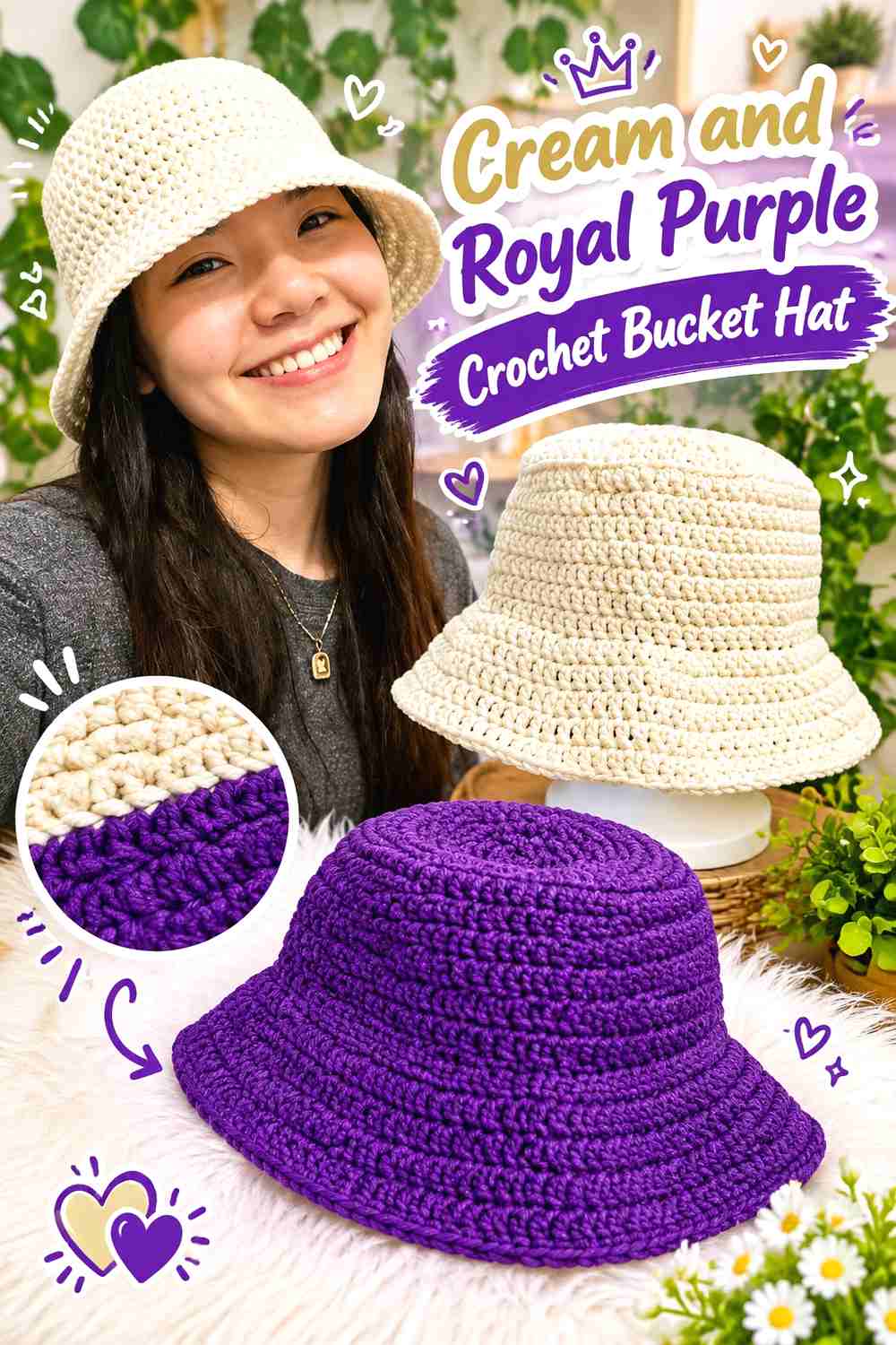
A bucket hat has three natural areas for color planning: crown, side, and brim. Cream can cover the crown and side section while royal purple defines the brim, creating a color change where the silhouette already changes.
Cream Can Keep the Crochet Bucket Hat Crown Bright
A cream crown provides a continuous light field and lets the shaping remain visually simple. Continuing cream down the sides gives it enough coverage to remain the dominant color.
Check the hat from above as well as from the front because the crown remains visible from multiple viewing angles.
Royal Purple Can Give the Cream Bucket Hat a Strong Brim
Royal purple around the brim forms a defined dark edge. Because a bucket-hat brim extends outward, it can appear more prominent than its actual amount of yarn suggests.
If you want cream to remain dominant, begin the purple only at the brim instead of carrying it substantially into the side section.
Creator Credit: VivCrochets
9. Cream And Royal Purple Crochet Bunny
 SAVE
Amigurumi offers a useful way to assign each color to a recognizable part rather than distributing colors randomly. Cream can cover the bunny body while royal purple appears in clothing, a bow, or another clearly separate accessory.
Cream Can Keep the Crochet Bunny Body Consistent
Using cream across the head, body, ears, and limbs gives the bunny one clear base color. This allows shaping to remain easy to follow visually without unnecessary body-color changes.
Before choosing other facial details, make sure they remain visible against cream. The cream-and-purple palette does not need to determine every small feature.
Royal Purple Can Give the Cream Bunny a Defined Clothing Color
Royal purple works effectively on a dress, hat, or other separate accessory because the physical boundary already explains the change in color.
If the purple accessory covers much of the body, leave enough cream visible around the head and limbs so the project still reads as a two-color combination instead of a mostly purple toy.
Creator Credit: SambrosisCrochet
10. Cream And Royal Purple Crochet Storage Basket
 SAVE
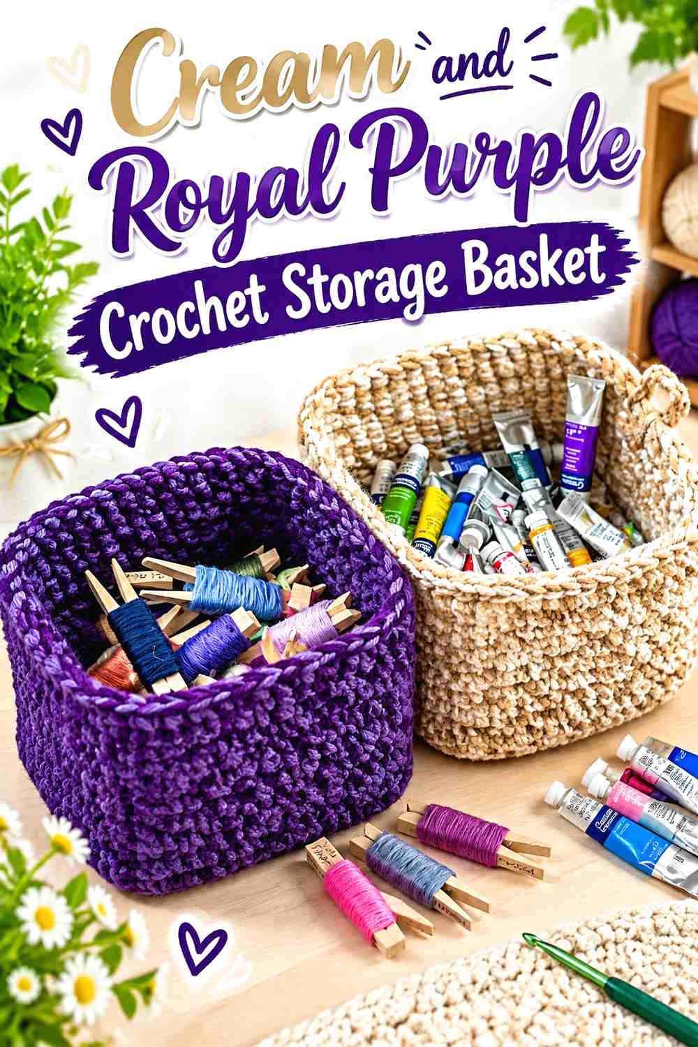
A storage basket provides broad sides that suit large color blocks. Royal purple can cover most of the body, while cream appears around the rim and upper section to brighten the opening.
Royal Purple Can Give the Crochet Basket Body a Strong Base
Keeping royal purple across the main basket wall avoids interrupting a simple container shape with numerous narrow stripes.
If the stitch texture is important to you, examine a sample under the lighting where the basket will be used. Darker purple can reduce the visibility of subtle raised details.
Cream Can Separate the Royal Purple Basket Rim and Handles
Cream around the rim creates a clear light edge, and repeating it on handles can make the whole upper section feel connected.
Avoid making the cream band excessively wide if you want a purple-dominant basket. Because the upper edge is highly visible, a smaller cream section can provide plenty of contrast.
Creator Credit: Ophelia Talks Crochet
11. Cream And Royal Purple Crochet Market Bag
 SAVE
Openwork gives this palette a different appearance because the surroundings can show through the stitches. Cream can dominate the mesh body while royal purple stays concentrated around the base, upper band, or handles where the crochet fabric is visually denser.
Cream Can Keep the Crochet Market Bag Openwork Easy to See
Using cream through a large mesh section makes the stitch structure more apparent against many backgrounds. It also keeps the center of the bag from becoming one visually heavy purple area.
Remember that the appearance changes once objects are placed inside the bag, so do not judge the color balance only while it is empty.
Royal Purple Can Reinforce the Visual Edges of the Cream Market Bag
Royal purple at the base and handles gives the darker shade two strong points of repetition. The color then frames the lighter openwork instead of appearing randomly inside it.
If you add purple through the mesh as well, use controlled sections so the bag still has a recognizable cream field.
Creator Credit: Let’s Go Crochet
12. Cream And Royal Purple Crochet V Neck Sweater
 SAVE
A sweater has enough surface area to let royal purple dominate without overwhelming every detail. Purple can cover the body and sleeves while cream traces the V-neck, cuffs, or hem.
Royal Purple Can Lead the Crochet Sweater Body
A largely royal-purple torso creates one uninterrupted field and avoids visually cutting the body panels into too many sections.
If the crochet stitch has significant texture, work a sample first and check it under normal lighting. Dark saturated yarn can make subtle stitch differences less noticeable than they would be in cream.
Cream Can Trace the Royal Purple V-Neck Clearly
Cream around the neckline creates an immediate light outline against the purple body. Repeating cream at the cuffs or lower ribbing keeps the neckline from becoming an isolated accent.
Keep related finishing areas reasonably consistent in visual weight. An extremely wide cream neckline combined with almost invisible cream cuffs can make the sweater feel unbalanced toward the top.
Creator Credit: forthefrills
13. Cream And Royal Purple Crochet Table Runner
 SAVE
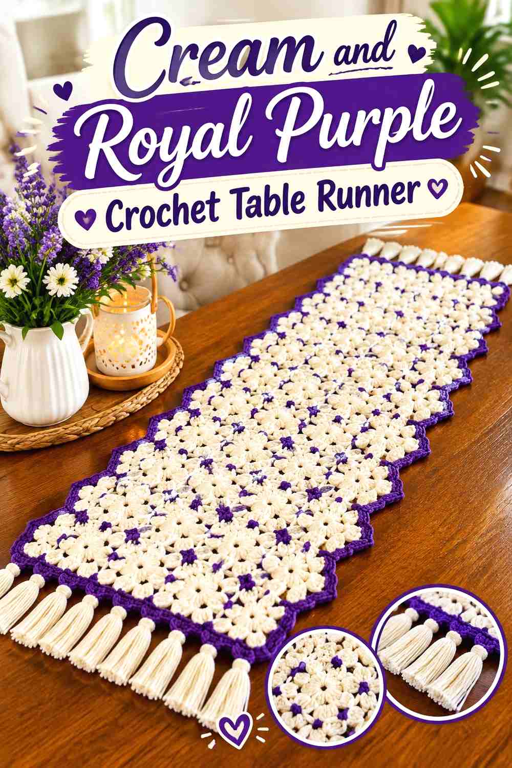
A table runner benefits from color placement that reinforces its long shape. Cream can fill most of the center while royal purple forms matching end sections or a controlled border.
Cream Can Keep the Crochet Table Runner Center Continuous
A broad cream center gives lace, openwork, or textured repeats a consistent background. It also prevents strong purple stripes from visually shortening the runner.
Place the work on the intended table or a similar surface before finalizing the palette. Cream can look very different against light wood, dark wood, or a pale tablecloth.
Royal Purple Can Frame Both Ends of the Cream Table Runner
Matching purple ends create symmetry and make the accent feel intentional from either side of the table.
If the runner includes tassels or fringe, decide whether they should extend the royal-purple frame or return to cream. Purple fringe creates a stronger endpoint, while cream keeps the overall effect lighter.
Creator Credit: cc crochet
14. Cream And Royal Purple Crochet Poncho
 SAVE
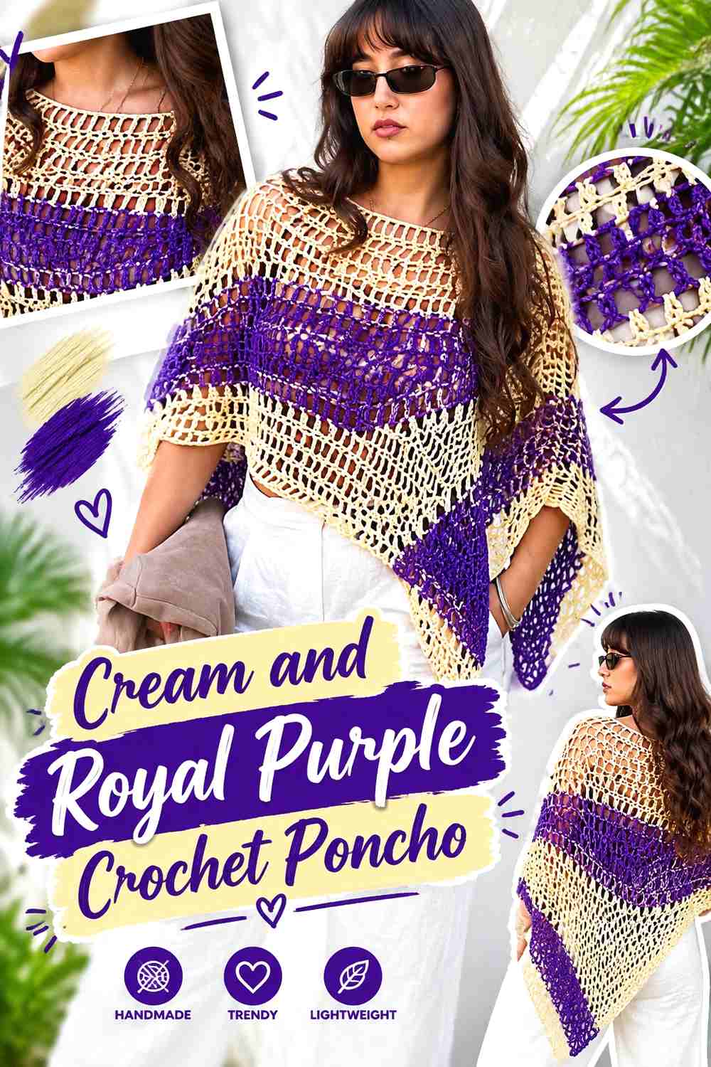
A poncho offers large panels where a strong color contrast can easily become too fragmented. Cream can cover most of the main fabric while royal purple appears in wider lower bands or along the neckline and outer edge.
Cream Can Keep the Crochet Poncho Panels Visually Connected
Using cream through the largest panel areas creates continuity across the front and back. This is useful when the stitch pattern or shaping already adds substantial visual movement.
Instead of changing colors frequently, allow the cream sections to remain broad enough that the poncho shape stays clear.
Royal Purple Can Define the Cream Crochet Poncho Edges
Royal purple around the neckline or lower edge gives the second color a structural location. Repeating purple in more than one edge area makes the palette look deliberate.
Judge the lower purple band while the poncho is hanging rather than lying flat. A dark section can appear substantially heavier once it runs around the full garment.
Creator Credit: Lorena
15. Cream And Royal Purple Crochet Fingerless Gloves
 SAVE
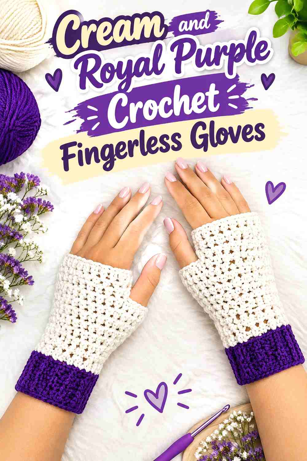
Fingerless gloves have limited surface area, so large blocks and matching placement usually work better than complicated color sequences. Royal purple can cover most of each glove while cream highlights the cuffs and upper edges.
Royal Purple Can Keep Both Crochet Gloves Visually Consistent
Use royal purple in the same major locations on both gloves so the pair reads together. A strong color like royal purple makes mismatched placement especially noticeable.
If the stitch texture is detailed, avoid interrupting it with several narrow cream bands unless striping is part of the intended design.
Cream Can Define Royal Purple Crochet Glove Cuffs
Cream cuffs create a clean light boundary at the wrist and can make a small project feel distinctly two-colored without needing cream across the entire hand.
You can repeat a narrow cream detail near the upper edge if the cuff otherwise feels disconnected, but keep the repetition restrained so royal purple remains the main color.
Creator Credit: Cherilyn Q
16. Cream And Royal Purple Crochet Cowl
 SAVE
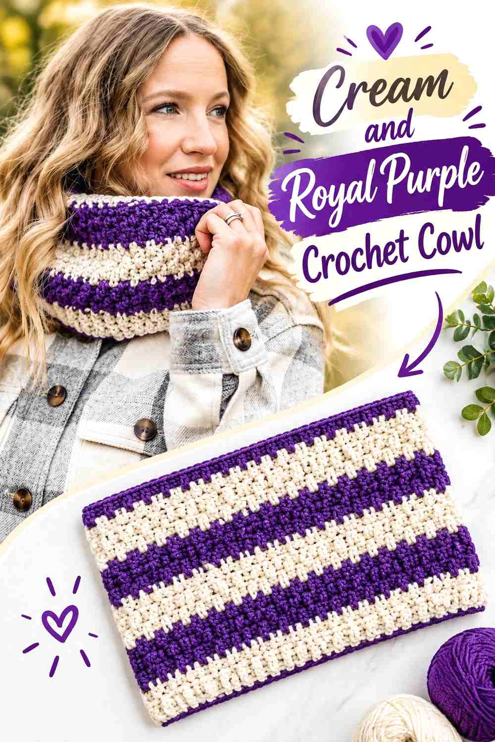
A cowl can use the palette differently from a long scarf because its colors are viewed in a compact loop. Cream can take the largest section, while royal purple forms one substantial band that remains visible when the cowl folds around itself.
Cream Can Give the Crochet Cowl Texture More Separation
A cream main field is useful when raised or dimensional stitches are part of the cowl’s appearance. The lighter shade allows shadows around the stitch texture to create additional definition.
Keep enough uninterrupted cream around textured sections instead of inserting purple every few rows simply to increase color changes.
Royal Purple Can Create a Clear Band Around the Cream Cowl
One wider royal-purple section can be more effective than several thin stripes because the cowl naturally folds and overlaps during wear.
Consider where that purple block will sit once the cowl is looped or scrunched. If it disappears inside a fold, shift or enlarge it so both colors remain visible in normal use.
Creator Credit: The Turtle Trunk
Comparing Cream and Royal Purple Crochet Color Directions
For the lightest overall result, start with the granny square blanket, pillow, scarf, bucket hat, market bag, table runner, or poncho. These projects allow cream to occupy large surfaces while royal purple provides concentrated definition.
For a royal-purple-dominant direction, the beanie, basket, V-neck sweater, and fingerless gloves give the darker color larger uninterrupted areas. Cream then works especially well on rims, necklines, cuffs, and other finishing details.
Choose the granny square blanket or vest when you want repeated purple-and-cream motifs. These constructions make it possible to alternate dominance without introducing another color.
The shawl is useful when you prefer a gradual change in color proportion, while the bunny gives each shade a clearly different object-based role.
Conclusion
Cream and royal purple work particularly well when each color has a specific job. Cream can create the background, open up large surfaces, and keep texture visible. Royal purple can define borders, motifs, cuffs, bases, handles, and other areas that need stronger emphasis.
If you want a lighter piece, begin with cream and add purple in repeated structural details. For a richer result, make royal purple the main field and let cream define the edges. Motif projects can move closer to equal distribution as long as the placement repeats consistently.
Before committing to a large project, make enough fabric to judge the colors as crochet rather than relying only on how the yarn looks in a skein. The construction tutorials can guide the project itself, while the cream and royal purple distribution can be adapted independently.
Frequently Asked Questions
Do cream and royal purple work well together for crochet?
Yes. Cream provides a much lighter neutral next to the stronger royal purple, so the combination can create clear separation between motifs, bands, borders, and other crochet details.
Should cream or royal purple be the main crochet color?
Either can lead. Choose cream when you want a lighter overall project with strong purple accents. Choose royal purple when you want a deeper result and use cream to define edges, cuffs, borders, or motifs.
How much royal purple should I use with cream?
The colors do not need equal coverage. Royal purple has strong visual presence, so a smaller amount can still be prominent. Start by deciding which project areas need emphasis and place purple there instead of trying to divide the yarn evenly.
Can I use cream for joins in a royal purple granny square project?
Yes. Cream joins can create visible separation between purple-heavy motifs. If the individual squares already contain a lot of cream, however, a purple join may provide stronger definition. Lay several squares together before deciding.
What color can replace cream in a royal purple crochet palette?
Ivory, soft white, oatmeal, or another light neutral can play a similar role. Preserve the substantial light-and-dark difference if contrast is important to the project’s motifs or texture.
What can replace royal purple in this crochet palette?
A deep violet, saturated purple, or darker plum can fill a similar role, but the visual direction will change. Choose a shade that remains clearly darker and stronger than the cream if you want to preserve the original hierarchy.
How do I stop royal purple from overpowering cream?
Reduce the amount of purple rather than immediately adding more colors. Concentrate it in borders, cuffs, handles, motif centers, or another repeated detail and leave larger cream areas uninterrupted.