Chartreuse and burgundy create a crochet palette built on contrast without relying on black or white. Chartreuse is bright and yellow-green, while burgundy is much deeper and redder. That difference gives each shade a clear visual role: chartreuse can illuminate motifs and large surfaces, while burgundy can anchor borders, ribbing, joins, straps, cuffs, and other areas that need definition.
The most useful way to work with this combination is to avoid treating the two colors as interchangeable. A chartreuse cardigan with burgundy cuffs behaves very differently from a burgundy vest with chartreuse edging. Changing which color dominates can make the same two-color palette feel brighter, darker, more graphic, or more blended.
These 17 projects explore different proportions and placements so you can decide where chartreuse and burgundy belong before adapting a crochet tutorial.
Quick List
- Chartreuse And Burgundy Crochet Cardigan
- Chartreuse And Burgundy Crochet Granny Square Tote
- Chartreuse And Burgundy Crochet Bucket Hat
- Chartreuse And Burgundy Crochet Striped Blanket
- Chartreuse And Burgundy Crochet Pillow
- Chartreuse And Burgundy Crochet Scarf
- Chartreuse And Burgundy Crochet Beanie
- Chartreuse And Burgundy Crochet Vest
- Chartreuse And Burgundy Crochet Tank Top
- Chartreuse And Burgundy Crochet Crossbody Bag
- Chartreuse And Burgundy Crochet Frog
- Chartreuse And Burgundy Crochet Flower Coasters
- Chartreuse And Burgundy Crochet Wall Hanging
- Chartreuse And Burgundy Crochet Skirt
- Chartreuse And Burgundy Crochet Sweater
- Chartreuse And Burgundy Crochet Poncho
- Chartreuse And Burgundy Crochet Fingerless Gloves
Decide Whether Chartreuse or Burgundy Should Lead
Choosing the dominant color first makes this palette much easier to control. If chartreuse occupies most of a cardigan, pillow, skirt, or hat, burgundy can act as a visual frame. Its depth helps define edges without introducing another neutral.
A burgundy-led project creates a different result. Chartreuse becomes much more noticeable when confined to cuffs, motif centers, straps, ribbing, or small geometric sections against the darker background. This can be useful when you like chartreuse but do not want it covering the entire item.
For projects with repeated motifs or stripes, decide whether the colors should alternate evenly or follow a hierarchy. Equal areas create a strong two-color effect, while unequal areas establish a clearer dominant-and-accent relationship.
Use Light-and-Dark Contrast Between Chartreuse and Burgundy
Chartreuse and burgundy differ in hue, but their light-and-dark relationship is just as important. Placing the lighter-looking chartreuse around smaller motifs can help them separate from a burgundy background. Burgundy can do the opposite by defining the outer edge of a bright chartreuse surface.
Texture can affect that balance. On ribbing, raised stitches, or openwork, shadows already add darker areas to the fabric. A project may therefore need less burgundy than expected if chartreuse is carrying a lot of texture.
Before starting a large project, make a small sample and view the colors together from a distance. A grayscale photo can also help you judge whether the value difference is strong enough for the borders, motifs, or stripes you have planned.
Plan Burgundy Borders Carefully Around Chartreuse
Burgundy is particularly effective as an edge color, but using it around every possible boundary can make a chartreuse-led project much darker.
Choose the structural areas that most need definition. A cardigan may only need burgundy at the cuffs and front bands. A pillow can handle a complete burgundy frame because it is viewed as a compact rectangle. A skirt might use burgundy at the waist and hem to create two deliberate horizontal anchors.
The placement should respond to the item instead of following one formula.
1. Chartreuse And Burgundy Crochet Cardigan
 SAVE
SAVEUse chartreuse across the main cardigan panels and reserve burgundy for cuffs, front edging, or the lower border. The bright body keeps chartreuse dominant, while burgundy gives the garment darker boundaries at natural construction points.
Let Chartreuse Cover the Main Crochet Cardigan Panels
Large chartreuse front and back panels give the color enough uninterrupted space to establish the cardigan’s identity. This is especially useful when the crochet fabric has texture that could become visually fragmented by frequent color changes.
If you want more burgundy, add it around structural areas rather than inserting narrow dark stripes through every panel.
Use Burgundy to Define the Chartreuse Crochet Cardigan Edges
Burgundy cuffs and front bands can connect the sleeves to the cardigan opening without competing with the chartreuse center. Check the lower hem before adding another deep band; if burgundy already appears strongly at the cuffs and front, the hem may only need a narrow repeat.
Creator Credit: TCDDIY
2. Chartreuse And Burgundy Crochet Granny Square Tote
 SAVE
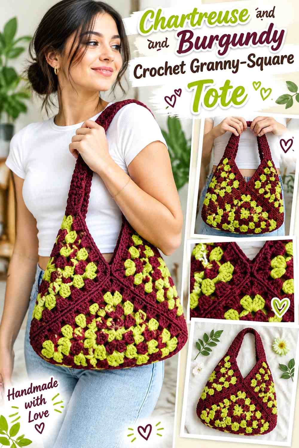
SAVEA granny-square tote lets both colors repeat without requiring equal proportions. Chartreuse can form the motif centers while burgundy surrounds the squares and carries the joins, giving the bag a clear grid and darker structure.
Repeat Chartreuse Through the Burgundy Crochet Granny Squares
Placing chartreuse consistently near the center of each motif creates repetition across the bag. Even when burgundy occupies more of each square, the brighter center remains easy to identify from motif to motif.
Before joining, arrange the squares flat and make sure the chartreuse distribution feels balanced across the front and back.
Let Burgundy Organize the Chartreuse Crochet Tote Joins
Using burgundy around motif edges or for joining can separate the chartreuse centers clearly. This works particularly well when you want the individual squares to remain visible after assembly rather than blending into one multicolor surface.
Creator Credit: Kenikse Crochet
3. Chartreuse And Burgundy Crochet Bucket Hat
 SAVE
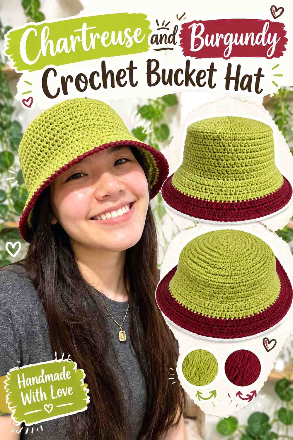
SAVEA bucket hat has a natural color break between crown, sides, and brim. Keep the crown and side section chartreuse, then switch to burgundy for the brim so the darker shade creates a defined base.
Keep Chartreuse Continuous Across the Crochet Bucket-Hat Crown
Chartreuse works well across the top and sides because those surfaces are visible from several angles. Keeping them one color also prevents the hat from becoming overly striped when the brim already supplies a strong contrasting section.
Use Burgundy to Ground the Chartreuse Crochet Bucket-Hat Brim
A burgundy brim gives the lower part of the hat more visual weight. Because the brim can be relatively wide, check its depth before extending burgundy farther upward; too much may shift the design from chartreuse-led to nearly equal color blocking.
Creator Credit: VivCrochets
4. Chartreuse And Burgundy Crochet Striped Blanket
 SAVE
SAVEA blanket provides enough surface for repeated stripes, but equal bands are not the only option. Wider burgundy sections with narrow chartreuse stripes produce a darker throw, while wide chartreuse bands separated by burgundy create a brighter result.
Make Burgundy the Stable Base Between Chartreuse Crochet Blanket Stripes
Burgundy can occupy the wider bands when you want the blanket to feel deep and grounded. Chartreuse then works as a repeated interruption that keeps the palette from becoming visually heavy.
Keep the chartreuse stripes at intentional intervals so the brighter color looks connected across the full blanket.
Use Chartreuse to Break Up Wide Burgundy Crochet Blanket Areas
If a burgundy section starts feeling too dominant, a chartreuse stripe can divide it without introducing a third color. The brighter band also gives the eye a repeated checkpoint across a long blanket surface.
A burgundy border can work, but keep it proportional to the amount of burgundy already used inside.
Creator Credit: Bella Coco Crochet
5. Chartreuse And Burgundy Crochet Pillow
 SAVE
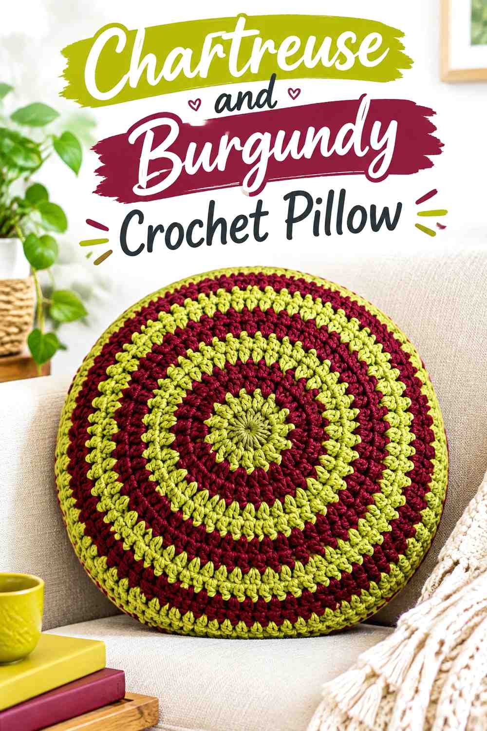
SAVEA pillow makes it easy to treat chartreuse as the main decorative field and burgundy as a complete frame. This is useful when the center contains raised texture, since the bright surface remains uninterrupted while the dark red edge clearly contains it.
Let Chartreuse Carry the Crochet Pillow Texture
Use chartreuse across the largest part of the pillow face when bobbles, raised stitches, ridges, or another surface detail are the main attraction. Frequent burgundy changes through the center can divide that texture into smaller visual blocks.
Frame the Chartreuse Crochet Pillow With Burgundy
A burgundy border can function like a picture frame around the chartreuse center. Because pillows are relatively compact, even a narrow dark border can look substantial.
If burgundy already appears inside the front design, reduce the width of the outer frame so the pillow does not become dark around every edge.
Creator Credit: Yarnspirations
6. Chartreuse And Burgundy Crochet Scarf
 SAVE
SAVEReverse the hierarchy for a scarf by using burgundy through most of its length and chartreuse at the ends. The long dark center makes the brighter end blocks more deliberate and avoids creating dozens of small color changes.
Let Burgundy Run Through the Main Crochet Scarf Length
A long burgundy center creates visual continuity and gives any stitch pattern room to repeat without interruption. It also means a relatively small amount of chartreuse can still have a noticeable role.
Make Chartreuse Crochet Scarf Ends Deep Enough to Matter
Very narrow chartreuse finishing rows may look like incidental trim. Give each end enough color to form a recognizable block, or extend chartreuse into tassels or fringe if those details are part of your version.
Creator Credit: ElyseCrochets 💌
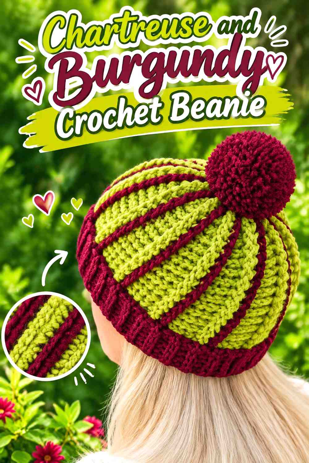
7. Chartreuse And Burgundy Crochet Beanie
 SAVE
SAVEA chartreuse beanie with a burgundy folded or ribbed brim uses color at a natural structural boundary. This keeps the crown bright while the deeper shade creates a strong lower band.
Keep Chartreuse Dominant on the Crochet Beanie Crown
An uninterrupted chartreuse crown is especially useful when the beanie has visible vertical ribbing or post-stitch texture. The continuous color helps those lines remain readable.
Let Burgundy Define the Chartreuse Crochet Beanie Brim
Burgundy can make the brim visually heavier than the body, so judge the color balance with the brim folded into its final position. If the dark section occupies too much of the hat, reduce its depth instead of adding more chartreuse stripes above it.
Creator Credit: Di’s Handicrafts (Crochet and Knitting)
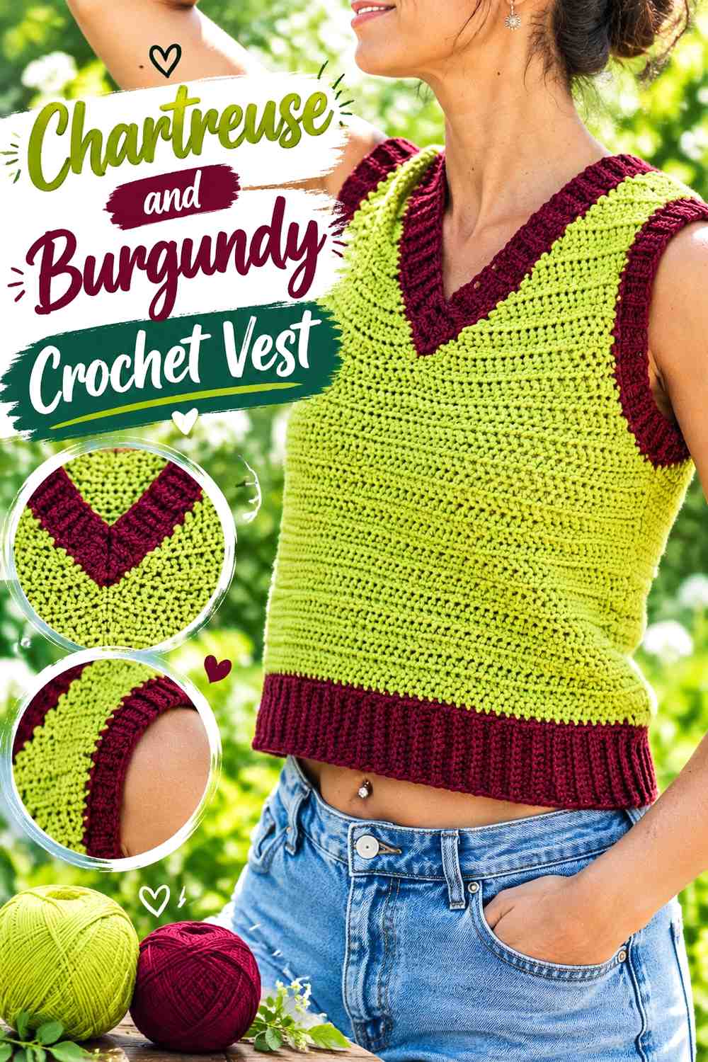
8. Chartreuse And Burgundy Crochet Vest
 SAVE
SAVEMake burgundy the main vest color and use chartreuse for neckline, armhole, and hem ribbing. The bright trim can outline the garment openings without taking over the larger torso panels.
Use Burgundy Across the Main Crochet Vest Panels
Burgundy gives the front and back of the vest one deep, continuous field. This is useful if you want a darker wearable but still want chartreuse to remain part of the design.
Check textured stitches in burgundy before committing, since very dark yarn can make subtle surface changes less visible.
Carry Chartreuse Around the Burgundy Crochet Vest Openings
Repeating chartreuse at the neckline and armholes connects separate parts of the garment. Adding it at the hem creates a complete outline; leaving the hem burgundy concentrates the brighter color around the upper body instead.
Creator Credit: Leelee Knits
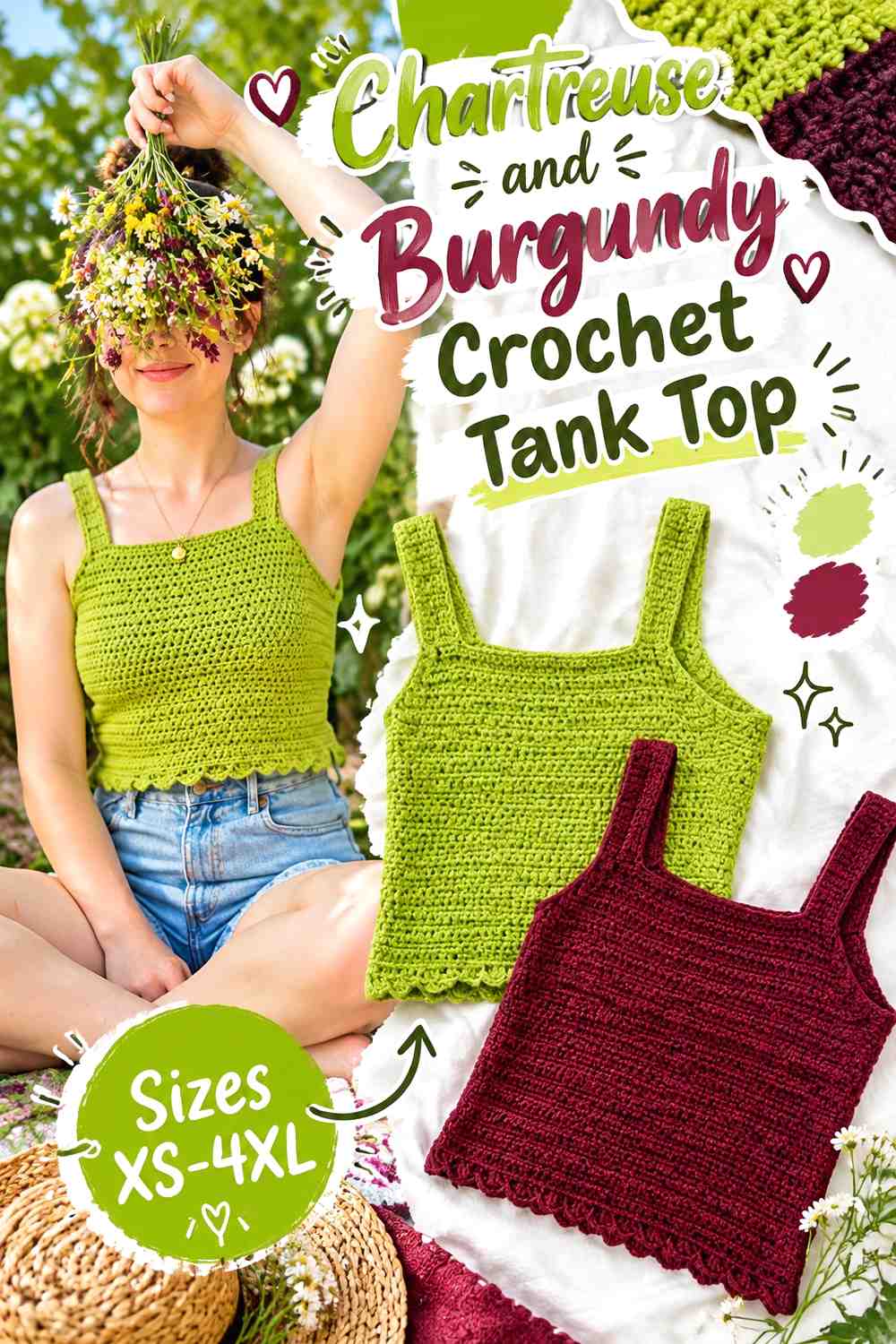
9. Chartreuse And Burgundy Crochet Tank Top
 SAVE
SAVEA chartreuse tank top can use burgundy around straps, neckline, or the lower edge. Because those areas already form boundaries in the garment, the darker red looks purposeful rather than scattered.
Keep Chartreuse Across the Crochet Tank-Top Body
Let chartreuse occupy most of the torso panels if you want the garment to remain bright. This also gives openwork or decorative stitches more continuous space to show.
For an open fabric, consider how the clothing layer underneath will interact visually with both colors.
Use Burgundy Around the Chartreuse Crochet Tank-Top Trim
Burgundy straps and neckline edging can create a connected outline. If the straps are wide, keep the lower burgundy border relatively restrained unless you want strong color blocking at both top and bottom.
Creator Credit: Hayhay Crochet
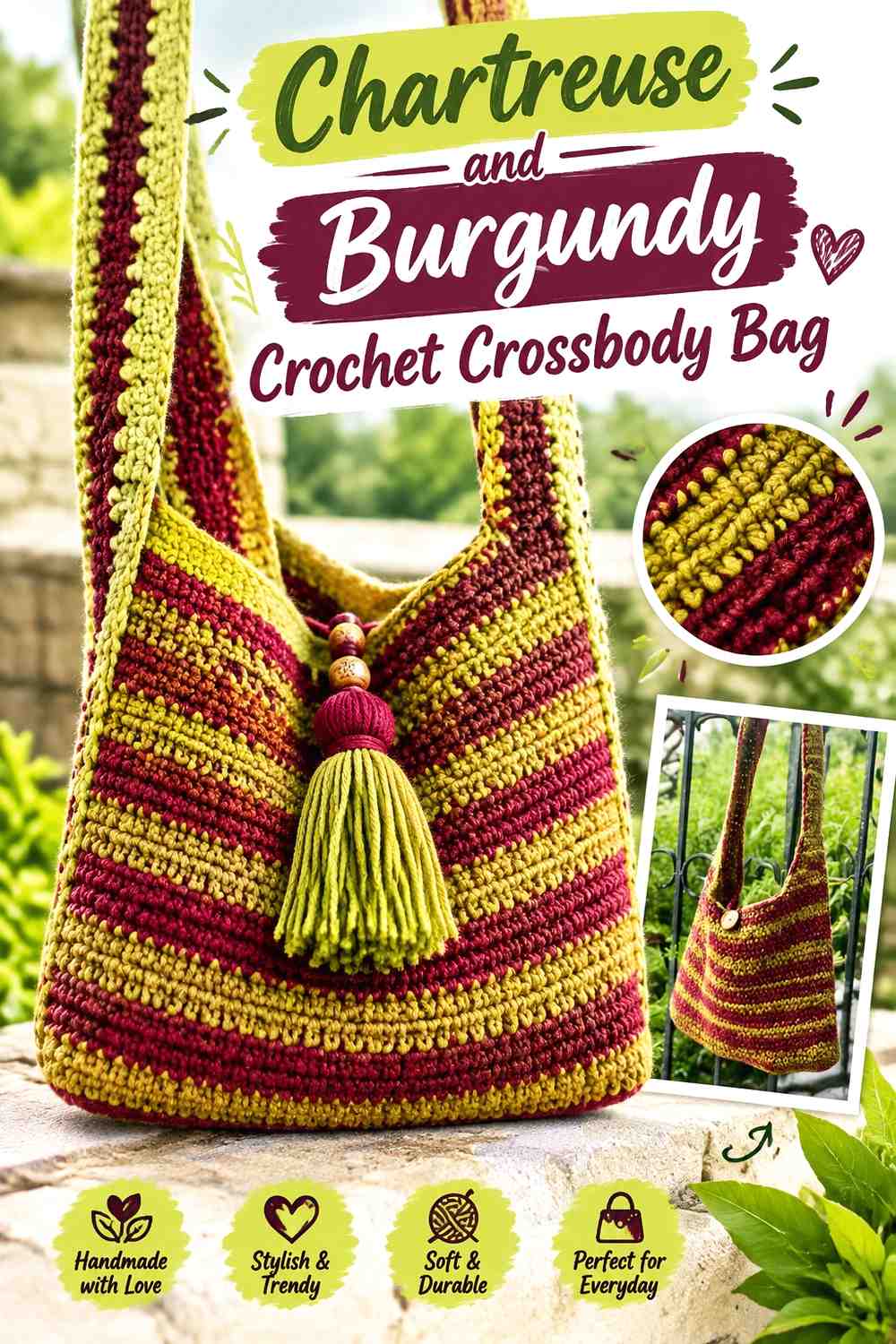
10. Chartreuse And Burgundy Crochet Crossbody Bag
 SAVE
SAVEUse burgundy for most of the crossbody bag body, then place chartreuse on a front band, motif, flap detail, or selected strap section. A concentrated accent usually works better here than scattering chartreuse around every seam.
Let Burgundy Anchor the Crochet Crossbody Bag Body
A burgundy body creates a strong background for the brighter color. It also leaves closures, straps, and edges visually quieter if the front already includes a chartreuse focal area.
Place Chartreuse Where the Burgundy Crochet Bag Needs Focus
A centered chartreuse panel or motif draws attention to the main face of the bag. Repeat a smaller amount near the strap attachment or upper edge if the first accent feels isolated.
Avoid placing chartreuse around every boundary; doing so can remove the single focal point that makes this layout useful.
Creator Credit: Jolie Knots Crochet
11. Chartreuse And Burgundy Crochet Frog
 SAVE
SAVEFor amigurumi, use chartreuse as the main frog body and treat burgundy as a small decorative accent rather than an equal second color. The three-dimensional shape already provides plenty of visual interest.
Keep Chartreuse Continuous Across the Crochet Frog Body
A mostly chartreuse body makes the frog shape easy to read. Breaking the torso and limbs into alternating chartreuse and burgundy sections can distract from the silhouette unless color blocking is specifically intended.
Limit Burgundy on the Chartreuse Crochet Frog Details
Burgundy can work for small accents, clothing-like details, or decorative features. Because it is much darker than chartreuse, a little can be enough.
If separate embellishments are attached, make sure they are secured appropriately for the intended use, particularly when the finished item may be handled frequently.
Creator Credit: One Cent Crochet
12. Chartreuse And Burgundy Crochet Flower Coasters
 SAVE
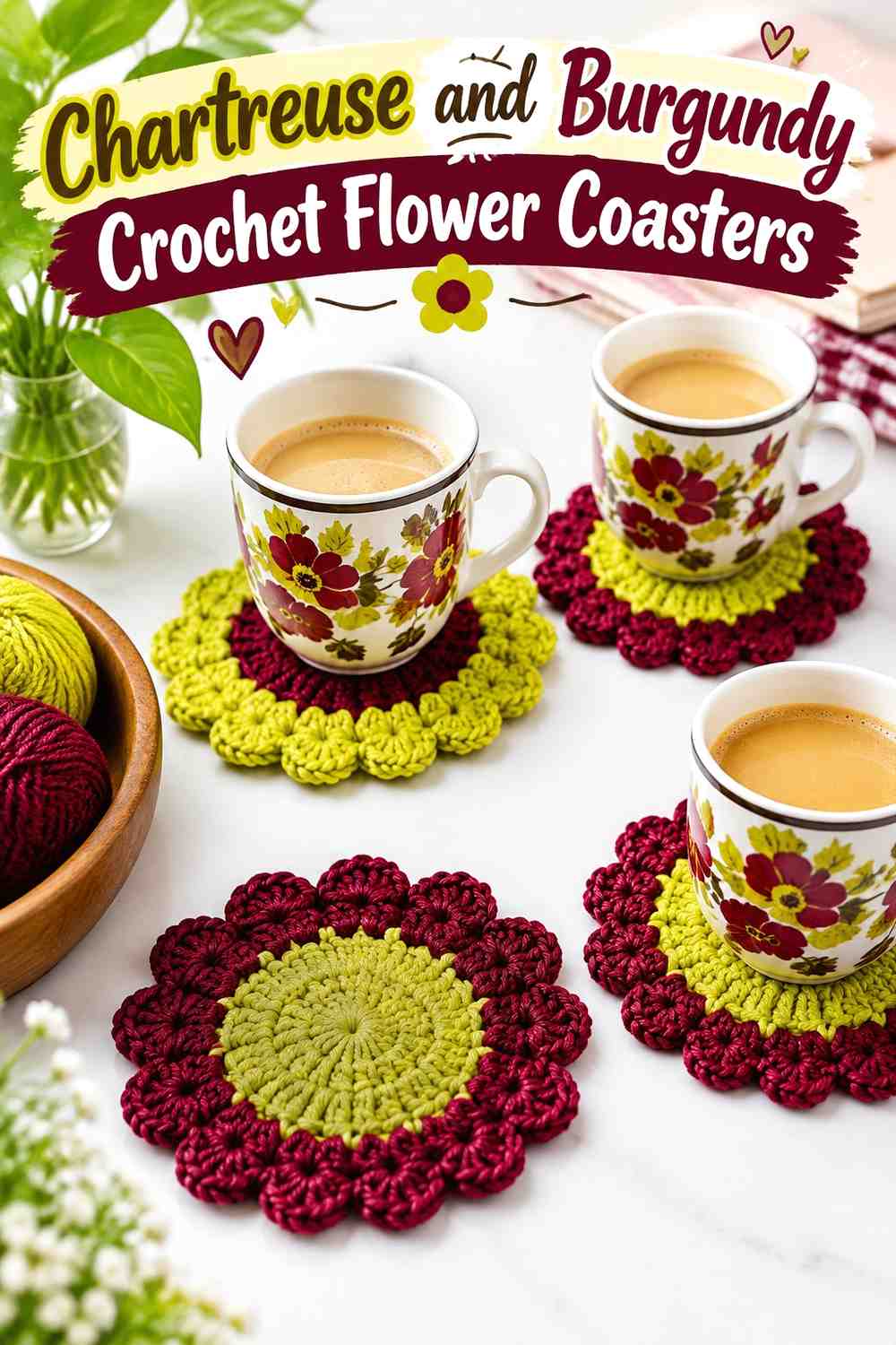
SAVESmall coasters allow chartreuse and burgundy to be used in tighter color areas than a garment or blanket. Try chartreuse petals with burgundy centers, or reverse the placement to create a deeper flower with a bright focal point.
Use Chartreuse to Brighten Burgundy Crochet Coaster Motifs
Chartreuse works especially well in repeated petal or leaf areas because the color remains visible even when each coaster is small. Keep the placement consistent across a set if you want the coasters to look coordinated.
Let Burgundy Define the Chartreuse Crochet Coaster Centers or Edges
Burgundy centers can visually anchor bright petals, while a burgundy outer edge can give each chartreuse coaster a clear boundary.
Avoid using both a very large burgundy center and a thick burgundy border unless a darker overall coaster is the goal.
Creator Credit: Brunaticality
13. Chartreuse And Burgundy Crochet Wall Hanging
 SAVE
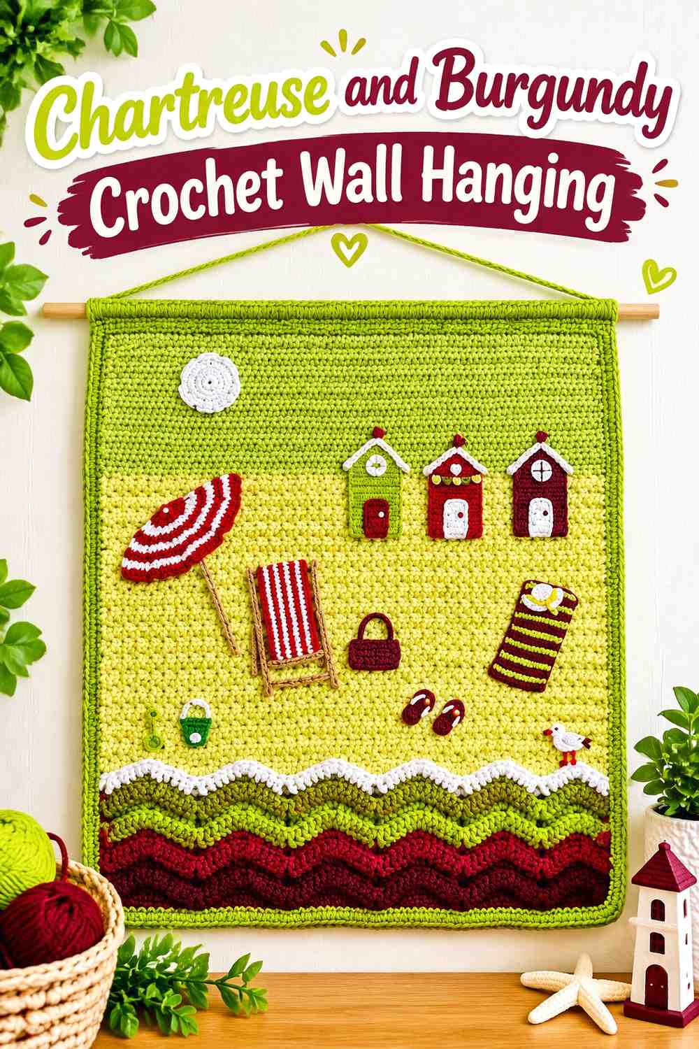
SAVEA wall hanging can use the palette more graphically because it is viewed as a flat composition. Burgundy can become the background or negative space, while chartreuse creates motifs, blocks, lines, or landscape-inspired details.
Give Chartreuse Clear Shapes on the Burgundy Crochet Wall Hanging
Chartreuse is easier to read when it forms recognizable areas instead of many isolated stitches. Use larger blocks or repeated motifs so the color retains its identity from across the room.
Leave Burgundy Space Around Chartreuse Crochet Motifs
Burgundy negative space can separate individual chartreuse shapes. If the bright motifs touch everywhere, they may merge into one irregular area rather than reading as separate parts of the design.
Plan the basic color distribution before crocheting the full hanging.
Creator Credit: Kerri’s Crochet
14. Chartreuse And Burgundy Crochet Skirt
 SAVE
SAVEA skirt provides natural horizontal zones for a two-color treatment. Keep most of the body chartreuse and use burgundy at the waistband and lower edge to create a dark frame from top to bottom.
Let Chartreuse Run Through the Main Crochet Skirt Body
A long chartreuse center keeps the skirt bright and allows vertical or open stitch patterns to continue without repeated color changes.
Adding many burgundy stripes would create much stronger horizontal divisions, so save that approach for a deliberately striped version.
Balance the Burgundy Crochet Skirt Waistband and Chartreuse Hem Area
A burgundy waistband can be visually substantial. If you repeat burgundy at the hem, compare the two bands together so the lower edge does not become much heavier than the waist.
A narrow burgundy hem is often enough to connect the bottom of the skirt back to the top.
Creator Credit: Chenda DIY
15. Chartreuse And Burgundy Crochet Sweater
 SAVE
SAVEFor a darker sweater, let burgundy cover the torso and sleeves while chartreuse appears at cuffs and neckline. This distributes the bright color around the edges of the garment instead of concentrating it in one large panel.
Keep Burgundy Across the Main Crochet Sweater Panels
Burgundy creates a continuous base and gives chartreuse accents more impact. It is a useful choice when you want the palette to feel deep overall rather than predominantly fluorescent.
Test any pronounced stitch texture in burgundy first to make sure the surface remains as visible as you want.
Repeat Chartreuse Around the Burgundy Crochet Sweater Openings
Chartreuse cuffs give both sleeves matching accents, while a chartreuse neckline ties them back to the torso. Adding chartreuse at the hem completes the outline but increases the bright color considerably, so it is optional rather than necessary.
Creator Credit: forthefrills
16. Chartreuse And Burgundy Crochet Poncho
 SAVE
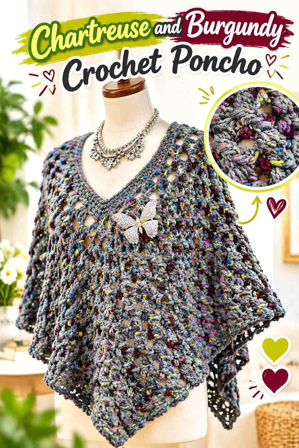
SAVEA poncho provides a large uninterrupted field where chartreuse can dominate, while burgundy can define the neckline and lower border. This keeps the brighter color broad and flowing instead of chopping the garment into many dark sections.
Give Chartreuse Most of the Crochet Poncho Surface
The wide poncho body benefits from a clear main color. Chartreuse across the central fabric allows the construction and stitch pattern to remain continuous from shoulder toward the lower edge.
If you want burgundy inside the body, use a limited repeated stripe rather than changing colors unpredictably.
Use Burgundy to Contain the Chartreuse Crochet Poncho Edges
A burgundy neckline can create a dark focal boundary near the face, while a matching lower border visually finishes the garment.
Because a poncho hem can have a large circumference, even a narrow burgundy border may contribute a substantial amount of dark color.
Creator Credit: Bag-O-Day Crochet
17. Chartreuse And Burgundy Crochet Fingerless Gloves
 SAVE
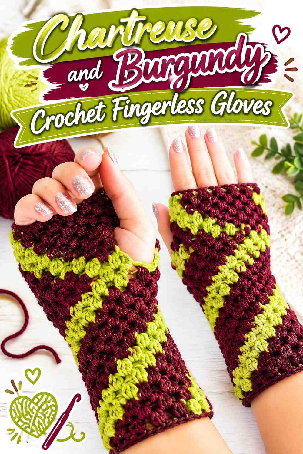
SAVEFingerless gloves give the palette a compact wearable format. Use burgundy across the hand and make chartreuse the cuff color, or reverse the scheme if you want the brighter shade to occupy more visible space.
Let Burgundy Cover the Main Crochet Fingerless Gloves
A burgundy hand section gives texture and shell-like stitch patterns a deeper background while keeping the gloves relatively dark overall.
Using the same color placement on both gloves creates the most consistent pair, especially when the stitch pattern itself already has plenty of surface detail.
Make Chartreuse Cuffs Stand Out Against Burgundy Crochet Gloves
Chartreuse cuffs create a bright boundary at the wrist and can remain visible even when most of the glove is burgundy. Keep the cuff depth proportional to the hand section so it reads as an accent rather than half of the project.
If you want more chartreuse, repeat a narrow section closer to the fingers rather than widening the cuff indefinitely.
Creator Credit: Hooked by Robin
Comparing the Chartreuse and Burgundy Crochet Palette Ideas
For the brightest overall result, the cardigan, bucket hat, pillow, beanie, tank top, frog, skirt, and poncho give chartreuse the largest visual area. Burgundy mainly defines edges, openings, or selected details.
The scarf, vest, crossbody bag, wall hanging, sweater, and fingerless gloves place more emphasis on burgundy. These are useful when you want the deep red to control the project while chartreuse acts as a vivid accent.
The granny-square tote, striped blanket, and flower coasters allow the two colors to repeat more evenly. These projects benefit most from planning the distribution before starting because small changes to motif centers, joins, stripe widths, or borders can quickly shift which color appears dominant.
Conclusion
Chartreuse and burgundy work particularly well when each shade has a specific job. Chartreuse can create the main bright field, highlight motif centers, or bring attention to cuffs and trim. Burgundy can frame those areas, organize granny squares, anchor garment openings, and add deeper visual weight.
If you prefer a bright project, start with chartreuse as the dominant color and add burgundy only where the item naturally needs definition. For a darker wearable or accessory, reverse that relationship and let chartreuse appear in concentrated accents.
For motif and stripe projects, plan the full color distribution before joining or repeating large sections. The tutorials provide the construction concepts, while the chartreuse-and-burgundy placements can be adapted independently to suit the balance you want.
Frequently Asked Questions
Should Chartreuse or Burgundy Be the Dominant Crochet Color?
Choose based on the finished visual weight you want. Chartreuse dominance creates a brighter project, while burgundy dominance creates a deeper overall surface with high-visibility chartreuse accents. On garments, think in terms of panels and trim; on decor, compare the main field with borders and motifs.
Does Burgundy Create Enough Contrast With Chartreuse Crochet?
It generally creates a noticeable hue and light-dark difference, but yarns can vary considerably. Compare the exact yarns together and make a small crochet sample. A grayscale photo can help you see whether the values separate clearly enough for detailed motifs or narrow stripes.
Where Should Burgundy Go on a Chartreuse Crochet Garment?
Cuffs, necklines, hems, waistbands, front bands, straps, and armhole edging are useful starting points because they are already structural boundaries. You do not need burgundy on every edge. Choose two or three connected areas so the trim feels intentional.
How Can I Stop Chartreuse and Burgundy Crochet From Looking Too Busy?
Give one color more visual area. On a granny-square tote, for example, chartreuse might repeat only in the centers while burgundy controls the outer rounds and joins. On a blanket, use one color for wide bands and the other for narrower separators.
Can I Substitute a Different Green for Chartreuse With Burgundy?
Yes. Preserve the role of the chartreuse rather than searching only by color name. Choose a green that remains noticeably brighter or lighter than the burgundy if you want similar contrast. Moving toward olive or forest green will make the palette more muted and reduce the original bright-versus-deep effect.
Can I Replace Burgundy With Another Dark Red in Chartreuse Crochet?
Yes. A deep wine, oxblood-like red, or another muted dark red can fill a similar role if it remains clearly darker than the chartreuse. Compare the yarns directly because some reds are brighter or more saturated and may compete more strongly with chartreuse.
Should I Add a Third Color to Chartreuse and Burgundy Crochet?
You can, but it is not necessary. If you add one, use it to solve a specific problem—for example, a small neutral separator between motifs—rather than distributing all three colors equally by default. Keeping chartreuse or burgundy dominant will preserve the identity of the original palette.