
Chartreuse and black create one of the clearest high-impact directions for crochet because the colors can take very different jobs. Chartreuse can cover the main surface when you want the project to feel bright and energetic, while black can outline edges, divide motifs, define garment trim, or create a dark background that makes smaller chartreuse areas easier to notice.
The balance matters. Equal amounts of chartreuse and black can create strong graphic color blocking, but many projects benefit from letting one color clearly dominate. A cardigan may use chartreuse across the body with black confined to cuffs and edging, while a granny-square bag can reverse that balance and use black as the joining framework around chartreuse motifs.
The 15 ideas below use different placements, proportions, textures, and finished items so the palette does more than repeat the same two colors.
Quick List
- Chartreuse And Black Crochet Cardigan With Dark Trim
- Black And Chartreuse Crochet Granny Square Tote Bag
- Chartreuse Crochet Bucket Hat With A Black Brim
- Chartreuse And Black Crochet Striped Blanket
- Chartreuse Crochet Pillow With Black Framing
- Black Crochet Scarf With Chartreuse End Blocks
- Chartreuse Crochet Beanie With A Black Folded Brim
- Black Crochet Vest With Chartreuse Ribbing
- Black Crochet Crossbody Bag With Chartreuse Accents
- Chartreuse Crochet Frog With Black Details
- Chartreuse Crochet Coasters With Black Borders
- Black And Chartreuse Crochet Wall Hanging
- Chartreuse Crochet Skirt With A Black Waistband And Hem
- Black Crochet Sweater With Chartreuse Cuffs And Neckline
How to Balance Chartreuse and Black in Crochet
Chartreuse has enough visual intensity to remain noticeable even when it occupies less area than black. That makes the palette useful for projects where you want a dark base but do not want the brighter color to disappear. A black bag, vest, sweater, or wall hanging can carry relatively small chartreuse sections and still maintain a clear two-color identity.
Reversing the balance changes the effect. When chartreuse covers most of a cardigan, pillow, hat, or skirt, black becomes a framing color. Keeping black around cuffs, borders, joins, straps, and hems can give the project visible boundaries without breaking the chartreuse surface into too many small sections.
Before committing to a large project, compare the yarns side by side and look at how they behave in the actual stitch texture you plan to use. The bright-versus-dark difference may be obvious in the skeins, but wide black stripes, dense joins, or heavy edging can occupy more visual space once crocheted.
Keep Chartreuse Texture Visible Against Black
Strong color contrast does not automatically guarantee that every crochet detail will remain equally visible. Raised texture usually reads differently from openwork, ribbing, simple flat fabric, or a granny-square layout, so decide whether color contrast or stitch texture should be the main visual feature.
If chartreuse is carrying bobbles, ribs, shells, or another noticeable surface treatment, avoid scattering black through every small detail unless you intentionally want a highly segmented look. Larger chartreuse areas generally give the texture more uninterrupted space.
Black is especially useful around separate crochet sections. A black join between chartreuse granny squares, a black border around a pillow, or black trim around garment openings can create visible separation without requiring additional colors.
Decide Where Black Should Frame the Chartreuse
Borders deserve deliberate planning with this palette because black can become visually heavy when it surrounds every edge. On a pillow, black around all four sides can work as a clear frame. On a garment, however, black around the neckline, cuffs, hem, front bands, and every seam may compete with the chartreuse body.
Choose the structural areas that benefit most from definition. Cuffs and neckline trim can connect a sweater palette. A dark bag strap can relate to a black base. Black joining yarn can organize repeated chartreuse motifs. A single dark blanket border can contain bright stripes without interrupting them internally.
The following projects show different ways to make those decisions.
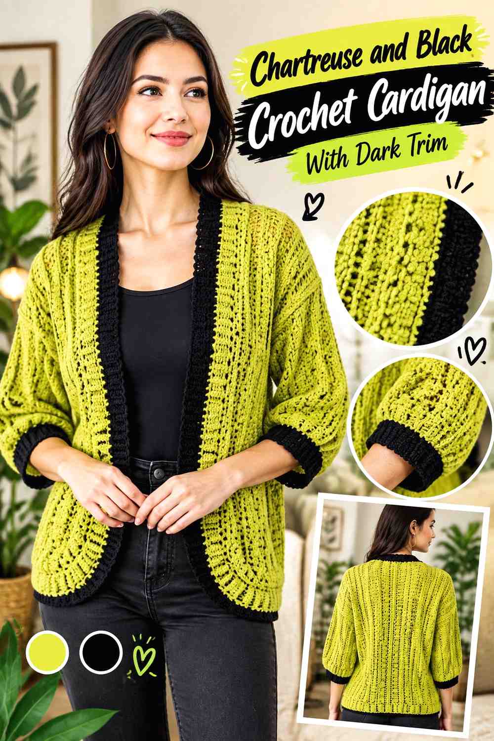
1. Chartreuse And Black Crochet Cardigan With Dark Trim
 SAVE
SAVELet chartreuse cover most of the cardigan body and sleeves, then use black where the garment naturally changes direction: cuffs, lower edging, and the front opening. This keeps the cardigan unmistakably chartreuse while allowing black to define its outline. If black occupies too much of the sleeves or front panels, the design can start reading as broad color blocking rather than a chartreuse-led cardigan.
Let Chartreuse Lead the Crochet Cardigan Panels
Large cardigan panels give chartreuse enough uninterrupted area to become the main color rather than a narrow accent. Keeping the front and back predominantly chartreuse also lets stitch texture remain visible across the garment instead of being repeatedly broken by dark stripes.
If you want more black without changing the basic balance, add it to smaller structural sections rather than widening it through the center of the panels.
Use Black to Connect the Chartreuse Cardigan Cuffs and Edging
Repeating black at the cuffs and front edging gives separate parts of the cardigan a visual connection. This is especially useful on an open-front design, where dark front bands can create two strong vertical lines while the chartreuse body stays continuous.
Keep an eye on the hem. If the cuffs and front bands already carry substantial black, a very deep black lower border may make the bottom of the cardigan feel much darker than the upper half.
Keep Black Away From Too Much Chartreuse Cardigan Texture
When the cardigan has raised or strongly defined stitchwork, using chartreuse across the textured areas can make the surface easier to read. Black can then act as a cleaner boundary around those details instead of competing inside them.
For a softer variation, replace pure black with a very dark charcoal while preserving a clear light-and-dark difference from chartreuse.
Creator Credit: TCDDIY
2. Black And Chartreuse Crochet Granny Square Tote Bag
 SAVE
SAVEA granny-square tote gives the palette a completely different structure. Instead of treating black only as outer trim, use it as the repeated framework around chartreuse motif centers. The black joins and outer rounds can visually organize multiple squares, while chartreuse remains the recurring focal color throughout the bag.
Put Chartreuse in the Crochet Granny-Square Centers
Chartreuse works well in motif centers because repeating the same bright color from square to square immediately connects the bag. The centers do not need to occupy most of each square to remain noticeable against a black outer round.
If the motifs include additional rounds, keep the chartreuse placement consistent unless you deliberately want a scattered layout.
Let Black Organize the Chartreuse Crochet Tote Motifs
Using black near motif edges or joins can separate individual squares clearly. That is useful on a tote because the viewer can still read the grid after the motifs are assembled rather than seeing one uninterrupted bright surface.
Avoid adding a third dark color too close to black unless the values are different enough to remain distinct after joining.
Repeat Chartreuse Near the Black Crochet Tote Handles
If the body is heavily framed in black, a small return of chartreuse near the upper edge or handle attachment can keep the top of the bag connected to the motifs below. Alternatively, use black handles for a stronger dark frame and let the chartreuse squares remain the main decorative area.
The choice depends on whether you want the handles to blend into the structure or continue the brighter palette.
Creator Credit: Kenikse Crochet
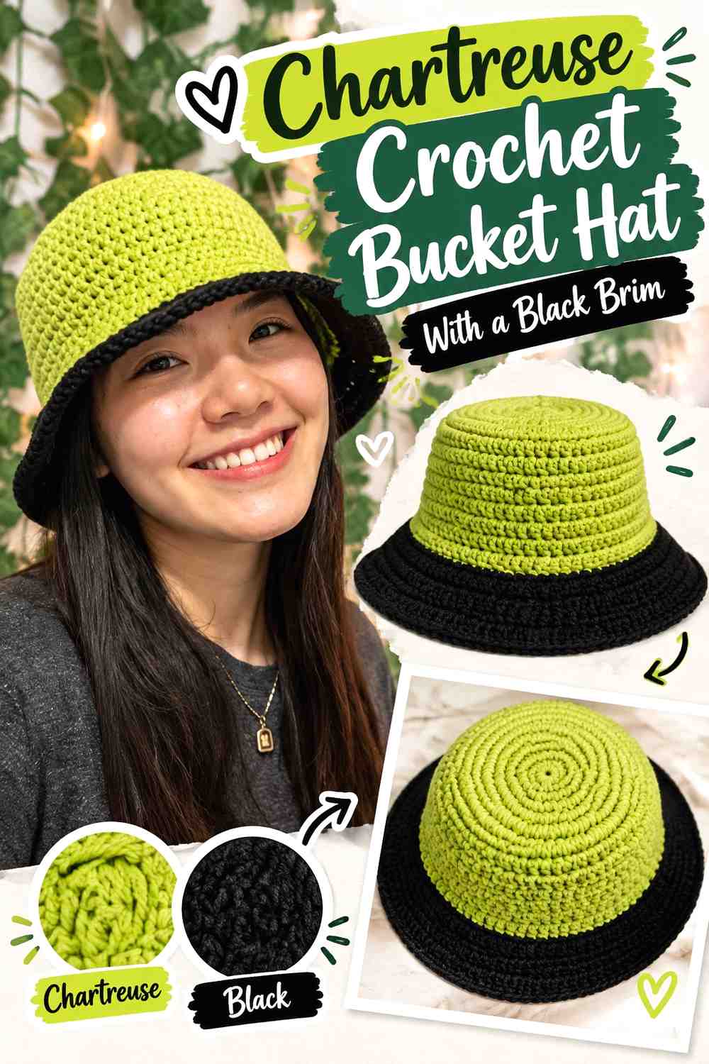
3. Chartreuse Crochet Bucket Hat With A Black Brim
 SAVE
SAVEA bucket hat offers one of the clearest two-part placements for this palette. Make the crown and sides chartreuse, then switch to black for the brim. The change happens at a natural structural point, so the colors look intentional without requiring complex colorwork.
Keep Chartreuse Across the Crochet Bucket-Hat Crown
Using chartreuse from the top through the sides creates a single bright field that is visible from several angles. That uninterrupted section is useful if the hat has subtle stitch texture because the color does not change in the middle of the crown.
A black top with chartreuse sides is also possible, but it creates a more segmented look.
Use Black to Give the Chartreuse Crochet Hat a Defined Brim
A black brim creates a strong lower boundary and puts the darkest color around the widest portion of the hat. Because the brim projects outward, it can occupy more visual area than expected, so check the balance before making it unusually deep.
If the brim feels too dominant, work only part of it in black or return to chartreuse near the outer edge.
Repeat Black Sparingly Above the Chartreuse Bucket-Hat Brim
A narrow black band between the chartreuse sides and black brim can reinforce the transition, but additional black stripes higher on the crown may reduce the clean two-zone effect.
For this design, restraint is useful: chartreuse gets the crown and walls, while black gets the framing role at the bottom.
Creator Credit: VivCrochets
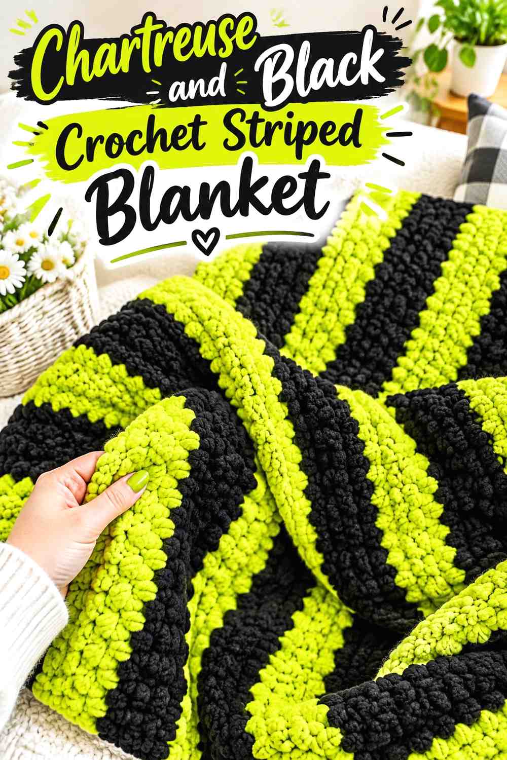
4. Chartreuse And Black Crochet Striped Blanket
 SAVE
SAVEA blanket can carry far more repeated color than a small accessory, so stripe proportion becomes important. Rather than automatically alternating equal chartreuse and black bands, decide which color should establish the overall field. Wider chartreuse bands with narrower black separators keep the blanket bright; equal bands create a more graphic result.
Use Chartreuse as the Wider Crochet Blanket Stripe
Wider chartreuse sections give the eye more space to follow stitch texture across the blanket. Narrower black stripes can separate those areas without turning the entire throw into a strict checkerboard of equal visual weight.
This approach is especially useful when the stitch pattern itself has texture that deserves room to show.
Keep Black Crochet Blanket Stripes Consistent Around Chartreuse
When black acts as a divider, consistent stripe widths can help the blanket look deliberate. Randomly switching between very narrow and very wide dark areas can work, but it changes the project from a controlled two-color scheme into a more irregular graphic layout.
If you prefer variety, change the chartreuse widths while keeping the black separators relatively steady.
Frame the Chartreuse and Black Crochet Blanket Without Overloading Black
A black border can finish a chartreuse-heavy blanket cleanly, but consider how much black already appears inside the stripes. If dark stripes are frequent, a thick black border may add more visual weight than the design needs.
A chartreuse outer round or a narrow black edge can preserve the stripe balance more closely.
Creator Credit: Bella Coco
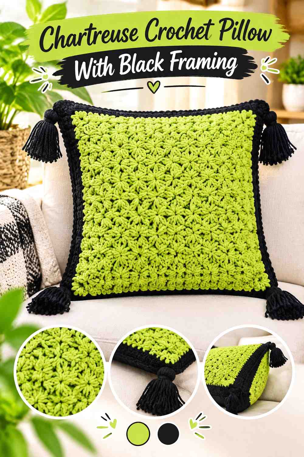
5. Chartreuse Crochet Pillow With Black Framing
 SAVE
SAVEA pillow is a useful place to let chartreuse carry both color and texture. Work most of the front surface in chartreuse, then bring black into the outer frame or selected geometric sections. Because a pillow is viewed front-on, the location of the dark color strongly affects whether the piece reads as chartreuse decor or an equal two-color graphic.
Let Chartreuse Cover the Main Crochet Pillow Face
Keeping the central pillow face chartreuse gives raised stitches, ripples, cables, or other texture a continuous background. It also makes the pillow easier to coordinate with black accents elsewhere in a room without turning the entire cushion dark.
If the center contains a motif, keep enough uninterrupted chartreuse around it to prevent the face from becoming visually crowded.
Use Black Around the Chartreuse Crochet Pillow Edge
A black outer border can function like a frame, clearly separating the crochet face from the surrounding furniture or bedding. The border does not need to be especially wide because black already has strong value contrast against chartreuse.
If you want a softer edge, reduce the black to the final rounds rather than building a deep dark band.
Check Black Against Chartreuse Crochet Pillow Texture
Texture can create shadows of its own, especially on raised surfaces. Add black where it clarifies the pillow layout rather than placing it over every raised detail.
A useful checkpoint is to view the pillow from several feet away. If the dark areas dominate before the chartreuse texture is visible, reduce the amount of black in the face.
Creator Credit: Professora Simone Eleotério (Lifebaby Sapatinhos)
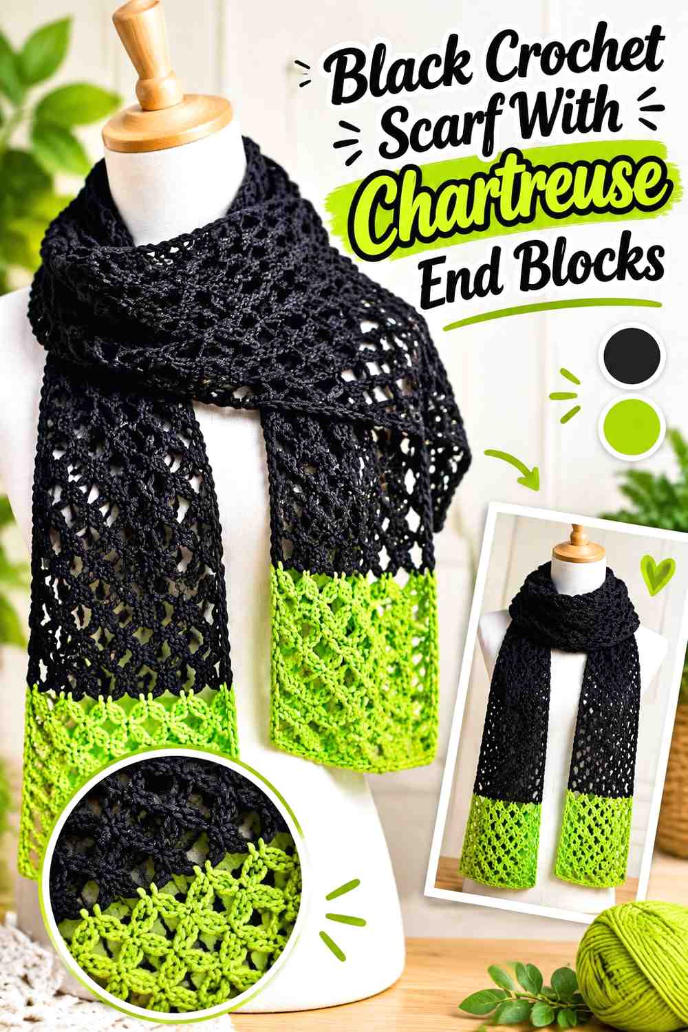
6. Black Crochet Scarf With Chartreuse End Blocks
 SAVE
SAVEThis idea reverses the usual balance and lets black dominate. Work most of the scarf in black, then use chartreuse at both ends so the bright color appears in controlled, repeated sections. The long shape naturally separates the accents, making this a good option for readers who like chartreuse but do not want it covering the entire accessory.
Let Black Form the Main Crochet Scarf Length
A mostly black scarf creates a continuous dark center that can coordinate easily with neutral outerwear. It also gives the chartreuse ends a clear job rather than scattering bright stripes along the entire length.
If the stitch pattern is very lacy or open, test whether black gives enough stitch definition for the effect you want before committing to the full scarf.
Make Chartreuse Crochet Scarf Ends Large Enough to Look Intentional
A very thin chartreuse stripe at each end may read like accidental trim rather than a planned color block. Give the bright sections enough depth to establish a repeated design element.
The two chartreuse ends do not need to be identical if you prefer asymmetry, but matching blocks create the clearest relationship.
Use Black Between Chartreuse Scarf Details to Protect Contrast
If you add fringe, tassels, or another finishing detail, decide whether it should extend the chartreuse block or return to black. Chartreuse fringe makes the ends appear even brighter, while black fringe creates a dark finish beyond the color block.
Either direction can work; the important point is to treat the finishing as part of the color distribution rather than an afterthought.
Creator Credit: Handwork diy
7. Chartreuse Crochet Beanie With A Black Folded Brim
 SAVE
SAVEA chartreuse beanie with a black brim uses color where the hat naturally changes texture or direction. The body can remain bright from crown to lower edge, while a black folded or ribbed brim creates a dark band around the face without interrupting the upper portion.
Keep Chartreuse Dominant Across the Crochet Beanie Crown
Chartreuse across the crown makes the hat read clearly from a distance and works especially well when the body has ribbing or another vertical texture. Keeping that area one color prevents frequent changes from breaking the lines created by the stitches.
If you prefer a darker hat, reverse the colors and reserve chartreuse for the brim.
Let Black Define the Chartreuse Crochet Beanie Brim
Black is useful at the brim because the change sits at an obvious structural boundary. The darker color can also make the lower section look more substantial than a narrow decorative stripe would.
Before finalizing the depth, fold or position the brim as it will actually be worn. A deep black band can occupy a surprisingly large portion of the finished hat.
Repeat Chartreuse Rather Than Adding More Black to the Crochet Beanie
Once the brim establishes black strongly, the upper beanie does not necessarily need additional dark stripes. Keeping the crown chartreuse preserves a simple two-zone design.
If you want one more connection, a small black top detail can echo the brim without dividing the chartreuse body into multiple bands.
Creator Credit: Di’s Handicrafts (Crochet and Knitting)
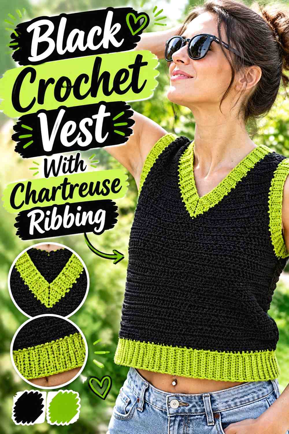
8. Black Crochet Vest With Chartreuse Ribbing
 SAVE
SAVEFor a darker wearable, make black the main vest color and bring chartreuse into the neckline, armhole edging, and lower ribbing. Because these areas surround the openings of the garment, a relatively small amount of chartreuse can still create a complete visual outline.
Use Black Across the Main Crochet Vest Panels
Black front and back panels make this one of the most neutral-heavy ideas in the collection. The large dark field also allows chartreuse edging to stand out without needing additional motifs or stripes through the center.
If the vest has prominent texture, inspect it in your chosen black yarn before making the whole garment because very dark shades can make subtle surface changes less obvious.
Carry Chartreuse Around the Black Crochet Vest Openings
Repeating chartreuse around the neckline and armholes links separate parts of the vest. This placement is more integrated than adding a single isolated bright stripe near the hem.
Keep the edging widths related. A very broad chartreuse neckline combined with extremely narrow armhole trim can make one opening feel disconnected from the rest.
Decide Whether the Black Crochet Vest Hem Needs Chartreuse Too
Adding chartreuse at the lower edge completes a full bright outline around the black body. Leaving the hem black keeps the color concentrated closer to the upper garment.
Both options are useful. Choose based on whether you want chartreuse to frame the whole vest or simply emphasize the neckline and armholes.
Creator Credit: Leelee Knits
9. Black Crochet Crossbody Bag With Chartreuse Accents
 SAVE
SAVEA crossbody bag is a good place to make black the practical-looking base while chartreuse identifies the decorative sections. Use chartreuse on a central band, flap detail, small motif, or selected strap section rather than splitting the bag into equal halves.
Let Black Anchor the Crochet Crossbody Bag Body
A predominantly black body gives the bag one clear dark mass, which makes smaller chartreuse accents easier to notice. It also keeps the color layout from competing with closures, straps, seams, or other visible construction details.
If the stitch texture is important, check it in good light before deciding how much of the surface should remain black.
Put Chartreuse Where the Black Crochet Bag Needs a Focal Area
A centered chartreuse band or motif can draw attention to the main face of the bag. Placing the bright color too close to every edge may weaken the effect because the eye no longer has one clear focal point.
For a simpler design, use one chartreuse feature and repeat it once near the strap or closure.
Use Black for the Crochet Crossbody Strap When Chartreuse Is Already Strong
A black strap connects naturally with a black body and lets the chartreuse accent remain concentrated on the bag itself. A fully chartreuse strap creates a much brighter overall look because the color continues across a long vertical or diagonal line when the bag is worn.
If you want that stronger effect, repeat chartreuse on the body so the strap does not feel isolated.
Creator Credit: Jolie Knots Crochet
10. Chartreuse Crochet Frog With Black Details
 SAVE
SAVEChartreuse fits naturally into a frog-inspired amigurumi palette, while black is most effective in small, deliberate details. Keep the body chartreuse and reserve black for facial features or limited accents so the toy does not lose its bright main color.
Keep Chartreuse Continuous Across the Crochet Frog Body
Using one chartreuse shade for most of the body gives the frog a clear silhouette. This is especially useful for amigurumi because too many alternating dark and bright sections can distract from the shape itself.
If you use a second green, keep it clearly distinguishable from chartreuse and decide which one has the supporting role.
Use Black Carefully on Small Chartreuse Crochet Frog Details
Black can define eyes, mouth details, or other small features, but it does not need much area to remain visible against chartreuse. Oversized black sections can quickly become the strongest part of a small amigurumi piece.
Keep decorative details proportional to the finished shape rather than increasing them simply because the contrast is attractive.
Check Black Attachments Securely on a Chartreuse Crochet Frog
If black appears in separate sewn or attached features rather than embroidered details, finishing quality matters as much as the palette. Loose dark pieces will be highly visible against chartreuse.
For a display item, choose the detailing method you prefer. For anything intended for a young child, consider the suitability and security of small attached components before use.
Creator Credit: One Cent Crochet
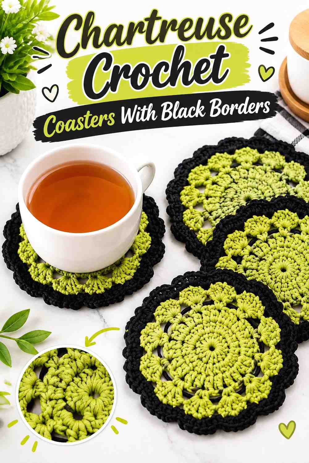
11. Chartreuse Crochet Coasters With Black Borders
 SAVE
SAVECoasters are small enough that a simple two-color layout can be more effective than complicated colorwork. Use chartreuse for the main coaster surface and black for the final outer edge, allowing the dark color to define each piece when several coasters are placed together.
Let Chartreuse Fill Most of the Crochet Coaster Surface
Keeping the center chartreuse makes the set visibly bright even when a mug covers part of each coaster. A small project also gives you a useful way to test the palette before committing to a larger home-decor piece.
If the coaster has strong radial or geometric texture, one continuous chartreuse field helps preserve that pattern.
Use Black as a Narrow Chartreuse Crochet Coaster Border
Because the coaster is small, a few dark rounds can occupy a large percentage of the finished surface. Start with a restrained black edge if chartreuse is meant to dominate.
A thicker black border creates a more graphic look and may be useful when the table surface is light.
Repeat Black Consistently Across the Chartreuse Crochet Coaster Set
Using the same black border treatment on every coaster keeps a set visually connected, even if the chartreuse centers vary slightly in shade.
If you want variation, change the chartreuse tone while keeping the black outer edge consistent rather than changing both parts at once.
Creator Credit: Brunaticality
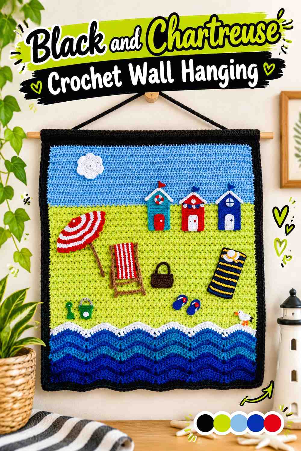
12. Black And Chartreuse Crochet Wall Hanging
 SAVE
SAVEA wall hanging can handle a more graphic use of the palette because it is viewed as a flat composition. Start with a black field or large black sections, then use chartreuse for a geometric shape, landscape element, lettering-like form, or repeated motif. The strong contrast helps the design remain legible from farther away.
Give Chartreuse a Clear Shape on the Black Crochet Wall Hanging
Chartreuse is most effective here when it forms recognizable areas rather than being scattered as many unrelated small stitches. A strong central block, repeated geometric line, or clearly separated motif can hold its own against a black background.
Before committing, sketch the approximate light-and-dark distribution so the finished hanging does not become black-heavy by accident.
Let Black Create Negative Space Around Chartreuse Crochet Motifs
Black does not have to function only as a border. On a wall piece, it can become the surrounding negative space that separates chartreuse shapes.
Leave enough black between bright sections for each motif to remain distinct. If chartreuse areas touch everywhere, the piece can start reading as one large irregular shape rather than a composed design.
Repeat Chartreuse Near the Black Crochet Wall-Hanging Edges
A small return of chartreuse near an outer edge can prevent all the bright color from clustering in the middle. Keep those repeats secondary to the main motif so they support rather than compete with it.
A black outer border can then frame the entire composition without introducing another color.
Creator Credit: Kerri’s Crochet
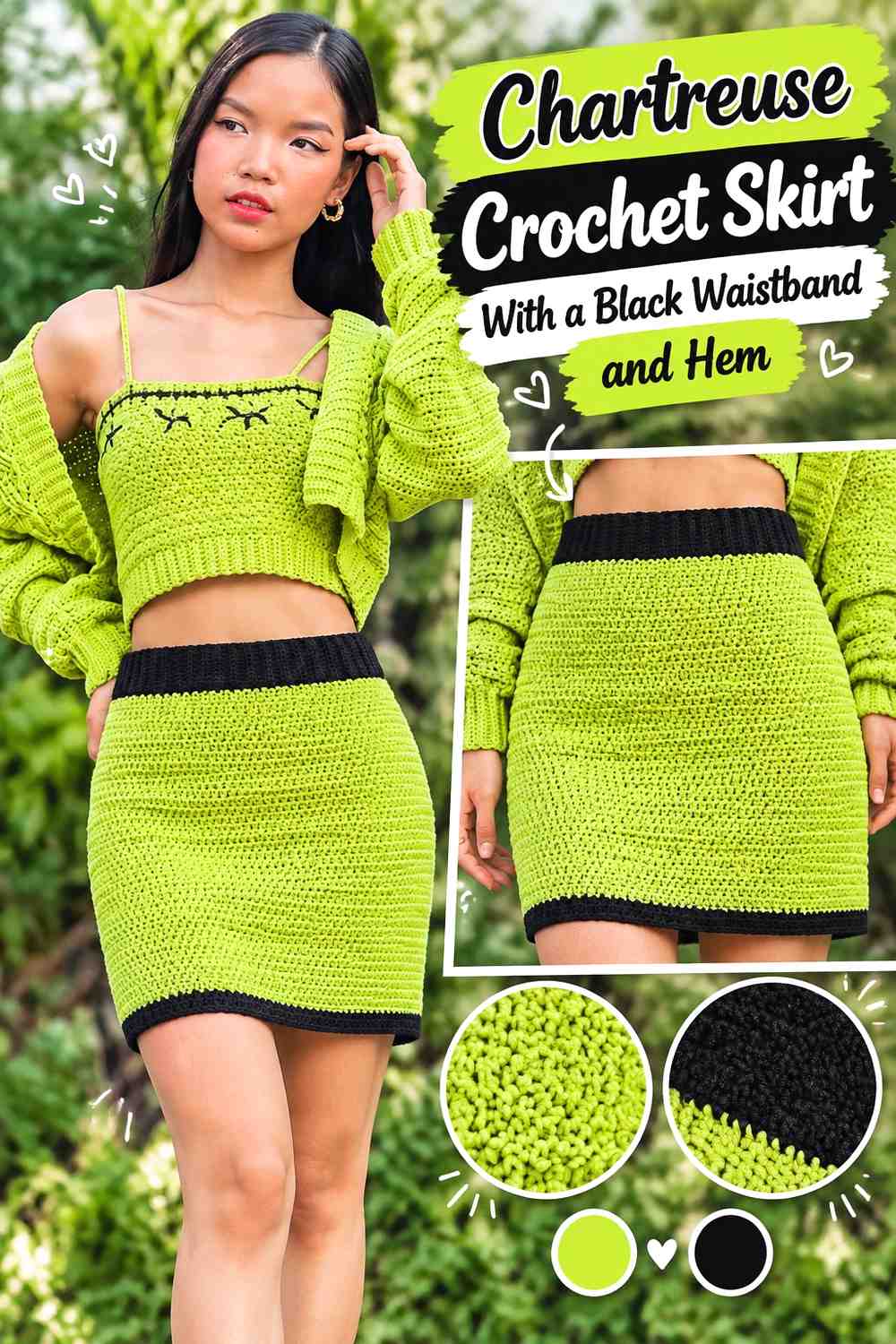
13. Chartreuse Crochet Skirt With A Black Waistband And Hem
 SAVE
SAVEA skirt creates long horizontal boundaries where black can be used without interrupting the central chartreuse fabric. A black waistband anchors the top, while a narrower black hem can repeat the color at the bottom and create a finished two-color frame.
Let Chartreuse Carry the Main Crochet Skirt Length
Keeping most of the skirt chartreuse preserves one continuous vertical area between waist and hem. This can be particularly useful when the crochet fabric has visible ribbing, openwork, or another repeating texture.
Frequent black stripes would create a very different horizontal emphasis, so reserve them for a deliberately striped version.
Use Black to Define the Chartreuse Crochet Skirt Waist
The waistband is a natural place for the darkest shade because it already forms a separate structural zone. A black waistband creates strong contrast without cutting through the main chartreuse body.
If the waistband is wide, you may not need much additional black near the top of the skirt.
Keep the Black Crochet Skirt Hem Proportional to Chartreuse
A black hem connects the lower edge to the waistband, but it can make the skirt look bottom-heavy if it is much deeper than the black section above.
For a balanced frame, compare the two dark bands visually while the garment is laid out rather than judging each section separately.
Creator Credit: Chenda DIY
14. Black Crochet Sweater With Chartreuse Cuffs And Neckline
 SAVE
SAVEFinish the collection with a black-led sweater that uses chartreuse only around the garment’s openings. A black body and sleeves create the darkest idea in the list, while chartreuse cuffs and neckline provide repeated high-contrast accents that are visible without turning the sweater into broad color blocking.
Let Black Cover the Main Crochet Sweater Panels
Keeping the torso black gives the sweater a solid visual base. This also means chartreuse can be limited to small sections without disappearing.
If the sweater uses pronounced ribbing or another texture, make a sample first to decide whether the dark yarn shows enough surface detail for your preference.
Use Chartreuse to Link the Black Crochet Sweater Cuffs
Matching chartreuse cuffs create repetition on both sleeves and prevent the bright color from feeling like a one-off accent. Because the cuffs sit away from the torso, they add color at the outer edges of the silhouette.
Keep the cuff depth consistent unless asymmetry is part of the design.
Carry Chartreuse Into the Black Crochet Sweater Neckline
Repeating chartreuse at the neckline connects the upper body to the cuffs. The result is a three-point accent arrangement rather than a single bright section.
You can stop there for a restrained palette. Adding chartreuse at the hem creates a complete set of bright openings, but it also increases the total share of chartreuse noticeably.
Creator Credit: forthefrills
Comparing the Chartreuse and Black Crochet Directions
For a chartreuse-dominant project, the cardigan, bucket hat, pillow, beanie, top, coasters, and skirt keep the brighter shade across the largest surface area. Black works mainly as framing, trim, edging, or a structural boundary.
The scarf, vest, crossbody bag, wall hanging, and sweater reverse that relationship. These ideas are useful when you want chartreuse to remain obvious but prefer a project with a darker overall appearance.
The granny-square tote and striped blanket sit closer to the middle because both colors can repeat throughout the project. With these designs, proportion becomes especially important. Widening one color or changing the join and border colors can shift the finished balance considerably without changing the crochet construction.
The frog uses the smallest share of black. That makes it a useful example of how a few dark details can be enough when chartreuse covers a compact three-dimensional shape.
Conclusion
Chartreuse and black can create much more than a single high-contrast look. The outcome changes substantially depending on which shade gets the largest surface and where the second color appears.
For a brighter result, keep chartreuse across cardigan panels, hat crowns, pillow faces, skirt bodies, or coaster centers and let black define edges. For a darker direction, reverse the hierarchy and place chartreuse around the neckline, cuffs, motifs, or other focal areas of a black project.
Motif-based projects such as the granny-square tote benefit from using black to organize repeated chartreuse sections, while flat projects such as blankets and wall hangings give you more freedom to experiment with stripe width and negative space.
Before beginning a large piece, test the two yarns together in the intended stitch pattern and evaluate both the color balance and texture visibility. Then use the linked tutorials for the creators’ exact construction instructions while treating the chartreuse-and-black placement as your own color adaptation.
Frequently Asked Questions
Should Chartreuse or Black Be the Main Color in a Crochet Project?
Either can lead. Choose chartreuse when you want the finished project to read as primarily bright, then use black around borders, cuffs, joins, or trim. Choose black when you prefer a darker base and want chartreuse to function as the focal accent. The finished item often helps determine the better balance.
How Much Black Should I Use With Chartreuse Crochet?
There is no fixed percentage. Black has strong light-and-dark contrast against chartreuse, so even a relatively narrow border or trim can be visually noticeable. Start by deciding which color should dominate, then allocate the second color to specific structural areas instead of dividing the project automatically into equal amounts.
How Can I Check Whether Chartreuse and Black Crochet Details Have Enough Contrast?
Place the yarns beside each other and also test them in a small swatch using the stitch pattern planned for the project. You can photograph the swatch and view the image in grayscale as an additional way to judge light-and-dark separation. This is particularly useful when adding a third color.
Does Black Work Better as a Crochet Border Around Chartreuse?
Black can make an effective border because it clearly defines chartreuse edges, but it is not automatically the right choice for every project. If black is already used heavily inside a blanket, pillow, or motif layout, another thick black border may make the finished piece darker than intended.
Can I Replace Chartreuse With Another Green and Keep the Black Crochet Palette?
Yes. Preserve the role of the original color rather than trying to find an exact named shade. If you want a similar effect, choose a vivid yellow-green that remains clearly distinguishable from black. Moving toward a muted olive or deep green will create a softer, darker relationship.
What Color Can I Add to Chartreuse and Black Crochet Without Losing the Two-Color Look?
A restrained neutral such as cream, gray, or off-white can be added in small amounts, particularly when you need another level of separation between motifs. Keep either chartreuse or black dominant and treat the third color as support. Giving all three colors equal space will create a different palette.
Why Can Chartreuse Crochet Texture Look Different Next to Black?
Color placement changes how clearly the eye separates different parts of the crochet surface. A chartreuse textured panel surrounded by black can appear more defined at its boundary, while frequent black interruptions may break the texture into smaller sections. Test the exact stitch and placement together before making a large garment, blanket, or decor piece.