Burgundy and antique pink give crochet projects a useful light-and-dark relationship without requiring a harsh contrast. Burgundy can provide the deepest visual anchor, while antique pink can open up textured stitches, soften larger color blocks, or keep a dark project from feeling visually heavy.
The important choice is not simply whether to use both colors, but how much space each one receives and where the transition happens. A blanket may benefit from broad repeating bands, while a cardigan needs color placement that considers sleeves, cuffs, panels, and neckline edging. Bags, pillows, and smaller accessories create still different opportunities for controlling the same palette.
Quick List
- Burgundy Led Striped Crochet Blanket With Antique Pink Bands
- Antique Pink Crochet Cardigan With Burgundy Panels
- Antique Pink Tunisian Crochet Shawl With Burgundy Framing
- Burgundy Crochet Scarf With Antique Pink Woven Details
- Antique Pink Daisy Crochet Baby Blanket With Burgundy Centers
- Burgundy V Neck Crochet Sweater With Antique Pink Trim
- Antique Pink Crochet Beanie With Burgundy Ribbing
- Burgundy Antique Pink And Cream Gingham Crochet Tote
- Burgundy Crochet Bucket Hat With An Antique Pink Brim
- Antique Pink Textured Crochet Pillow With Burgundy Edging
- Burgundy And Antique Pink Crochet Rose Bouquet
- Burgundy And Antique Pink Crochet Garland
- Antique Pink Crochet Vest With Burgundy Ribbing
- Burgundy And Antique Pink Two Tone Crochet Skirt
How to Balance Burgundy and Antique Pink in Crochet
Start by deciding which color should occupy the largest visual area. Burgundy carries more visual weight because it is normally the darker shade, so equal quantities of burgundy and antique pink do not necessarily look equally dominant. On a large blanket or sweater, using burgundy across every major section can make the pink feel like a minor trim even when plenty of pink yarn is present.
Antique pink is especially useful where you want to separate darker crochet texture. It can sit around raised stitches, motif centers, cuffs, borders, or joins so those areas do not disappear into a mostly burgundy surface. If you want a darker result, reverse that relationship and let antique pink appear only in controlled repeated details.
Check Burgundy and Antique Pink Contrast Before Starting
“Antique pink” can describe many softened pink shades, from pale dusty pink to deeper muted rose. Before committing to a large project, place your chosen yarns together and check whether the pink remains clearly lighter than the burgundy.
A grayscale photo can also reveal whether two different hues are unexpectedly close in value. That matters most for gingham, motifs, narrow stripes, raised texture, and other areas where the design depends on one color remaining visible against another.
1. Burgundy Led Striped Crochet Blanket With Antique Pink Bands
 SAVE
SAVELet burgundy cover the larger share of this crochet blanket and use antique pink as a repeated interruption rather than splitting the surface exactly in half. Wide burgundy areas create a dark base, while narrower antique pink bands give the eye regular lighter breaks. Repeating the pink consistently across the blanket will make it look intentional instead of like a late color addition.
Burgundy Works Better Across the Broad Crochet Blanket Sections
Broad burgundy sections can carry most of the blanket without requiring additional colors. Before deciding on stripe proportions, compare how the stitches look across a reasonably sized burgundy swatch. Very dark yarn can reduce the visibility of subtle texture, so a simple stitch pattern may show more clearly than a highly detailed one.
Antique Pink Keeps Burgundy Stripes From Becoming One Dark Field
Place antique pink between selected burgundy bands where you want stronger separation. The lighter pink can also be repeated near the outer edge so the interior stripes and border feel connected. If your antique pink is relatively deep, test it beside the burgundy first to make sure the stripe change remains noticeable.
Creator Credit: Bella Coco
2. Antique Pink Crochet Cardigan With Burgundy Panels
 SAVE
SAVEAn antique pink-led cardigan creates a lighter overall garment while giving burgundy enough visual weight to define specific areas. Rather than alternating colors everywhere, keep the pink across most of the body and introduce burgundy on selected panels, sleeve sections, or edging. This prevents the cardigan from becoming visually fragmented.
Antique Pink Can Keep the Crochet Cardigan Body Visually Lighter
Use antique pink across the largest body sections when you want the cardigan to remain pink-forward. This also gives burgundy additions more definition because they are surrounded by a lighter value. Check the front and back together before finishing the garment so the burgundy does not become concentrated only on one side.
Burgundy Can Define Antique Pink Cuffs and Cardigan Edges
Cuffs, hem treatment, and neckline or front edging give burgundy logical places to repeat. Using the same dark color in several finishing areas creates a clearer connection than adding a single burgundy section with no repetition elsewhere. If the sleeves already contain large burgundy areas, keep the edging narrower so the dark shade does not overpower the antique pink body.
Creator Credit: MJ’s Off The Hook Designs
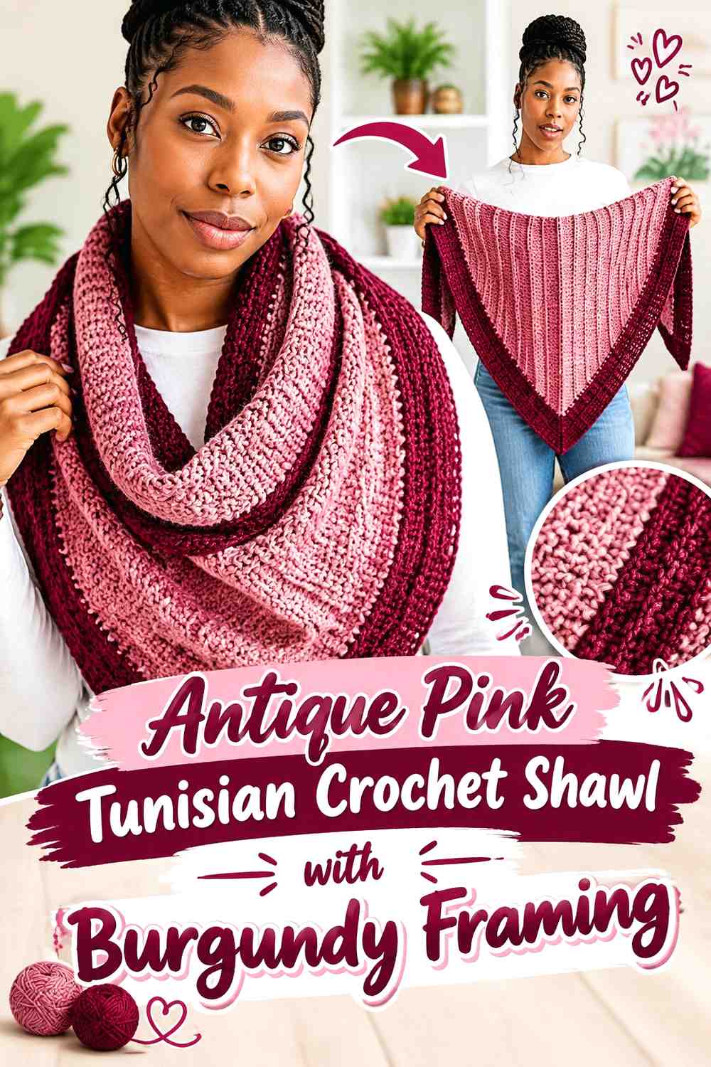
3. Antique Pink Tunisian Crochet Shawl With Burgundy Framing
 SAVE
SAVEA shawl gives this palette a different visual problem because the color distribution changes as the fabric widens. Let antique pink cover the central field or a substantial series of sections, then use burgundy toward the outer portions or final framing areas. The deep edge can emphasize the shawl silhouette without burying all of its texture in the darkest color.
Antique Pink Helps Tunisian Crochet Texture Stay Visible
Antique pink can be particularly useful across textured sections because its lighter value may make changes in the fabric easier to see than very dark burgundy. If the shawl combines several textures, keep some adjoining sections in antique pink rather than changing color every time the stitch pattern changes.
Burgundy Gives the Antique Pink Shawl a Defined Outer Frame
A burgundy finishing section can visually contain a large area of antique pink. Repeat burgundy in more than one place if possible—for example, an earlier narrow section and the final edge—so it reads as part of the palette rather than as an unrelated ending.
Creator Credit: TL Yarn Crafts
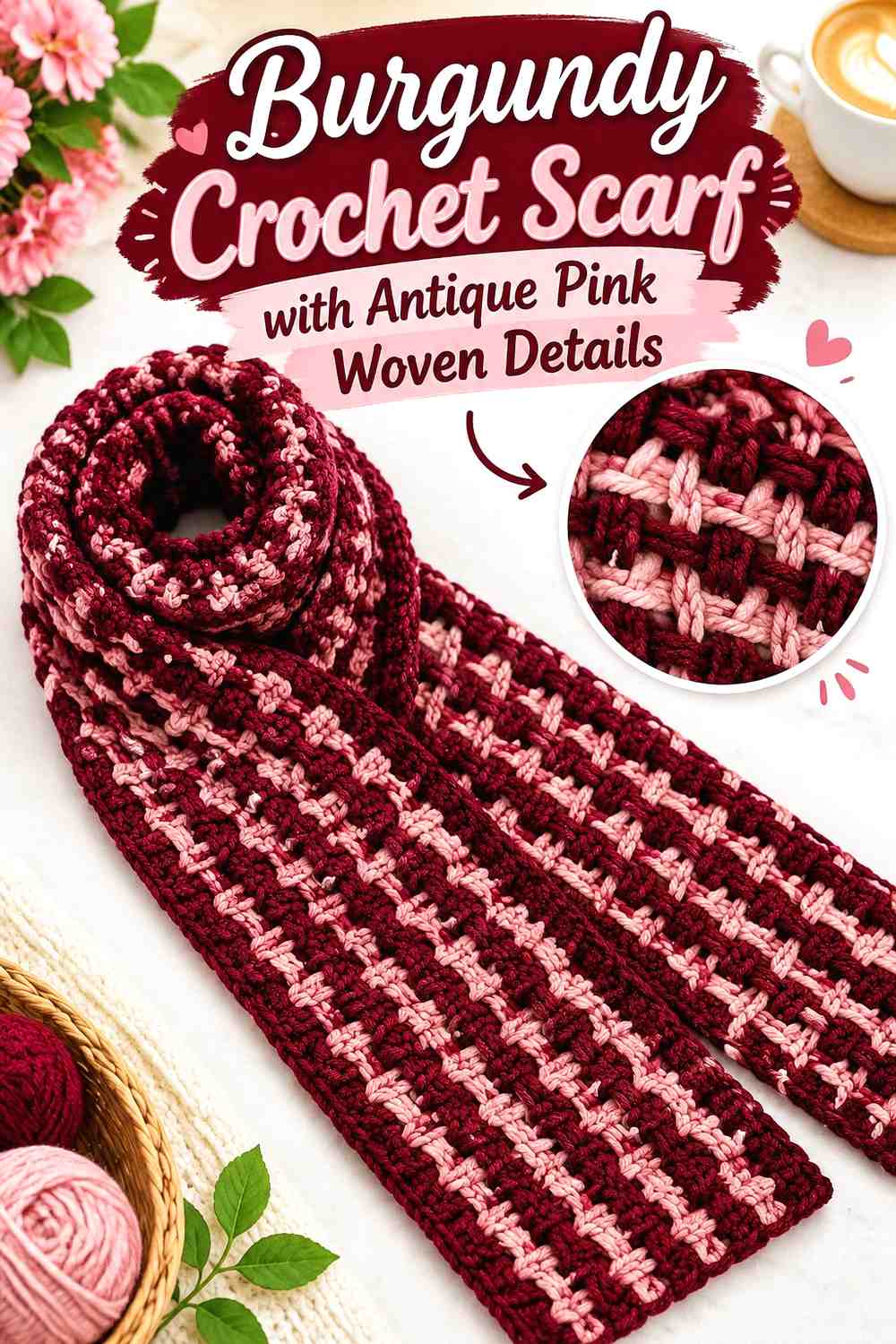
4. Burgundy Crochet Scarf With Antique Pink Woven Details
 SAVE
SAVEA woven-look scarf offers a useful way to make burgundy dominant without reducing antique pink to ordinary stripes. Burgundy can form the main crochet structure, while antique pink appears through the openings as a contrasting woven element. The two colors then occupy different visual roles instead of competing across identical bands.
Burgundy Gives the Crochet Scarf a Consistent Structural Base
Keeping the underlying scarf burgundy makes its overall shape read as one continuous piece. Because the woven accent will attract attention, avoid adding several unrelated colors to the main mesh unless you intentionally want a busier result.
Antique Pink Makes the Burgundy Woven Openings Easier to Read
Use antique pink where it passes through the burgundy structure so the weaving remains visible from a normal viewing distance. Before completing the full scarf, test a short section; two shades that look different in skeins can still blend once the pink appears only in narrow strips.
Creator Credit: naztazia
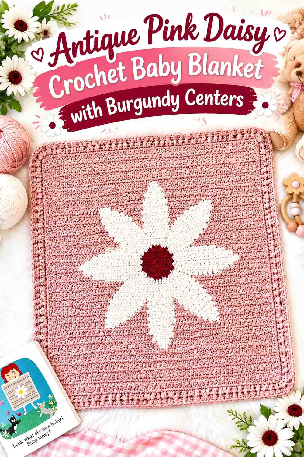
5. Antique Pink Daisy Crochet Baby Blanket With Burgundy Centers
 SAVE
SAVEFor a floral baby blanket, antique pink can act as the field while burgundy is reserved for small repeated flower details. Cream or another light neutral can separate the two colors in the daisy motifs. This keeps burgundy present throughout the blanket without letting the darkest shade occupy most of the surface.
Antique Pink Gives Burgundy Daisy Centers Room to Repeat
Use antique pink consistently around the floral units so each burgundy center has the same surrounding color relationship. Repetition is important here: a few isolated burgundy centers can look accidental, while regular placement turns burgundy into a deliberate part of the motif system.
Burgundy Needs a Lighter Separator Against Antique Pink Flowers
If burgundy forms the flower center and antique pink forms the surrounding field, a cream petal layer can provide additional value separation. This is especially useful when your antique pink is relatively dark. Keep that light neutral consistent rather than introducing several different pale colors around the motifs.
Creator Credit: Daisy Farm Crafts
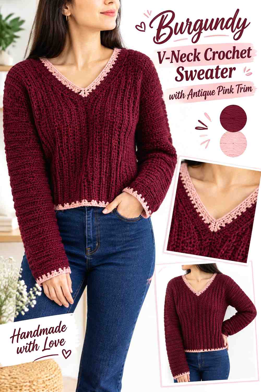
6. Burgundy V Neck Crochet Sweater With Antique Pink Trim
 SAVE
SAVEA burgundy sweater can carry a large amount of dark color successfully when antique pink is placed where it outlines the garment rather than scattered randomly. The V-neck, cuffs, and hem are useful candidates because they repeat around clear structural edges.
Burgundy Can Lead the Crochet Sweater Body Without Covering Every Detail
Keep the main front, back, and most of the sleeves burgundy if you want the strongest dark interpretation of this palette. Before committing to an all-burgundy body, make a swatch and check whether the sweater’s stitch texture remains sufficiently visible in your chosen yarn.
Antique Pink Can Trace the Burgundy V-Neck and Cuffs
An antique pink V-neck edge immediately creates contrast near the face of the garment, while matching pink cuffs repeat the color farther down. Use a controlled amount at the hem if a third pink area is needed, but avoid making every edge equally wide unless you intentionally want the trim to become a major feature.
Creator Credit: forthefrills
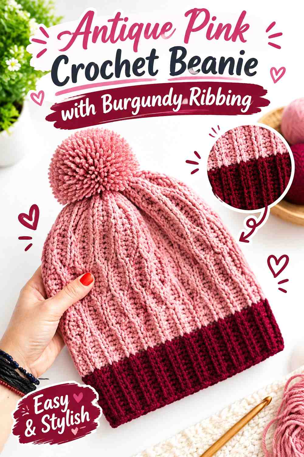
7. Antique Pink Crochet Beanie With Burgundy Ribbing
 SAVE
SAVEA beanie provides a compact place to use strong color blocking. Antique pink can cover the crown while burgundy stays around the lower edge, creating a clear dark-to-light division. Because a hat has relatively little surface area, keeping the palette simple usually makes the contrast easier to read.
Antique Pink Keeps the Crochet Beanie Crown From Feeling Too Dark
Use antique pink through the main hat area when you want the softer shade to be visible from every direction. If the stitch texture is pronounced, check it in both daylight and indoor lighting before deciding whether a darker antique pink still gives enough definition.
Burgundy Gives the Antique Pink Beanie a Strong Ribbed Base
The lower band is an effective place for burgundy because it creates a distinct frame without breaking up the crown. A folded brim can make that dark area visually larger, so consider how much burgundy will show when the beanie is worn rather than judging the color balance only while it lies flat.
Creator Credit: Sirin’s Crochet
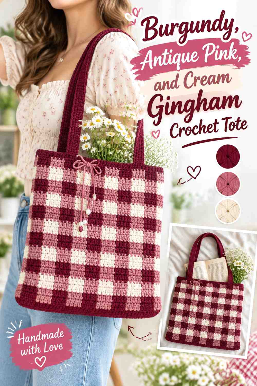
8. Burgundy Antique Pink And Cream Gingham Crochet Tote
 SAVE
SAVEGingham needs more planning than a simple two-color stripe because the checks depend on recognizable value differences. Use burgundy as the deepest square, antique pink as the middle tone, and cream as the lightest. This creates a three-step palette while keeping burgundy and antique pink as the defining colors.
Burgundy Should Remain the Darkest Crochet Gingham Check
Place burgundy where the gingham design needs its strongest visual anchor. Check your three yarns in grayscale before starting the full bag; if antique pink and burgundy appear nearly identical in value, the checked effect can flatten even though the hues are different.
Antique Pink Connects Burgundy and Cream Across the Crochet Tote
Antique pink works as the bridge between dark burgundy and pale cream. Repeat it evenly rather than allowing one side of the bag to become pink-heavy. Also review the handles after the body is complete—using one existing palette color there usually keeps the top of the tote from looking disconnected.
Cream Keeps Burgundy and Antique Pink Checks Distinct
Cream should be used deliberately rather than filling every remaining space. Its job is to provide the lightest point in the gingham relationship. If bright white creates more contrast than you want, choose a softer light neutral while preserving a clear value difference from antique pink.
Creator Credit: HayHay Crochet
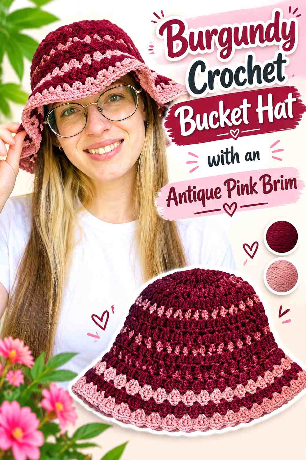
9. Burgundy Crochet Bucket Hat With An Antique Pink Brim
 SAVE
SAVESeparating the crown and brim gives a bucket hat a natural two-color layout. Burgundy can cover the crown and sides, while antique pink begins at the brim. The color change then reinforces an existing structural transition instead of creating an arbitrary stripe.
Burgundy Gives the Crochet Bucket Hat Crown More Visual Weight
Keeping burgundy across the upper portion creates a strong solid block that can coordinate easily with simple wardrobe neutrals. Because the crown is seen from multiple angles, avoid adding isolated antique pink patches unless you plan to repeat them symmetrically.
Antique Pink Makes the Burgundy Bucket Hat Brim a Clear Feature
Switch to antique pink where the brim starts if you want the lower section to read distinctly from the crown. The brim occupies a prominent area when viewed from the front, so even a lighter supporting shade can have a substantial visual presence. Check the hat from the side as well as from above before deciding the balance works.
Creator Credit: PassioKnit Kelsie
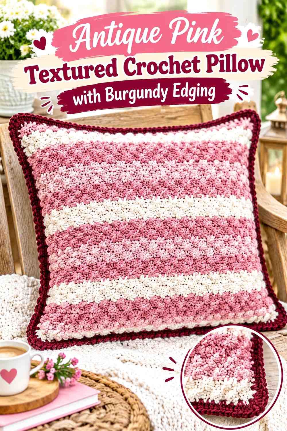
10. Antique Pink Textured Crochet Pillow With Burgundy Edging
 SAVE
SAVEA crochet pillow is a good place to let antique pink cover almost the entire face while burgundy provides smaller areas of definition. This balance keeps the raised texture visible while giving the square outline a darker finish. Burgundy can also appear in selected textured rows if the face needs stronger repetition.
Antique Pink Can Show Crochet Pillow Texture More Clearly
Let antique pink cover the main textured face when the stitchwork itself is a major part of the design. Before making the entire front, compare a textured pink swatch with a burgundy one; if the darker yarn hides too much shadow and stitch definition, reserve burgundy for simpler areas.
Burgundy Gives the Antique Pink Pillow a Defined Edge
Use burgundy around the outer joining or border area to visually frame the pink center. If you introduce burgundy inside the pillow face, keep the same shade at the perimeter so those darker details feel related rather than scattered.
Creator Credit: Rich Textures Crochet
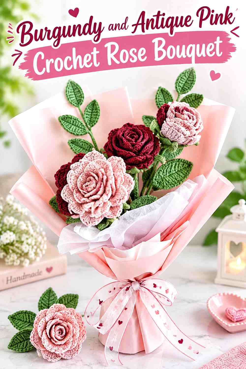
11. Burgundy And Antique Pink Crochet Rose Bouquet
 SAVE
SAVEA crochet rose bouquet lets the two colors appear as separate objects rather than stripes or panels. Use burgundy for the darkest blooms and antique pink for lighter roses, then distribute both throughout the arrangement instead of clustering each shade on one side. A restrained green for leaves or stems can support the flowers without becoming a third competing focal color.
Burgundy Roses Can Anchor the Antique Pink Crochet Bouquet
Position burgundy roses at several points through the bouquet so the darkest color is visually distributed. One large block of burgundy flowers on a single side can make the arrangement look unbalanced, especially when antique pink is much lighter.
Antique Pink Roses Keep Burgundy Crochet Flowers From Merging Together
Place antique pink blooms between or near burgundy roses to create value breaks. If both yarns are muted, compare the finished flower heads rather than the yarn balls alone because overlapping petals can make colors appear visually deeper.
Creator Credit: Lingzhi Handmade
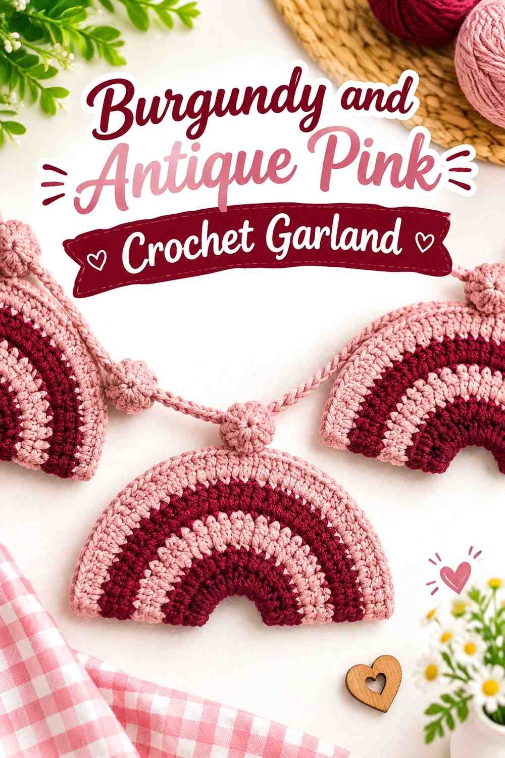
12. Burgundy And Antique Pink Crochet Garland
 SAVE
SAVEA garland benefits from repetition, making it an effective place to alternate burgundy and antique pink. Rather than introducing many additional colors, repeat the two shades through each motif and use a simple neutral joining cord if you want the individual pieces to remain the focus.
Burgundy Gives the Antique Pink Crochet Garland a Repeating Dark Beat
Space burgundy motifs at regular intervals instead of using several in one section and none elsewhere. Consistent repetition helps the dark color guide the eye across the full length of the garland rather than weighing down one end.
Antique Pink Can Soften Burgundy Crochet Motifs Without Losing Contrast
Use antique pink for alternating motifs or for an outer band around burgundy centers. If the garland will hang against a dark wall or furniture, antique pink may also provide the clearer silhouette, so view your yarn against the intended background before finalizing the ratio.
Creator Credit: Hooked by Robin
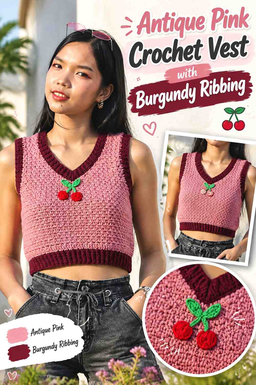
13. Antique Pink Crochet Vest With Burgundy Ribbing
 SAVE
SAVEA vest offers fewer color-placement zones than a cardigan, which makes disciplined placement especially useful. Let antique pink cover the front and back panels, then reserve burgundy for the lower ribbing, neckline, and armhole finishing. Those repeated dark edges can define the garment without chopping the body into multiple blocks.
Antique Pink Keeps the Crochet Vest Panels Visually Continuous
Working the main panels in antique pink prevents the center of the vest from becoming too segmented. If you want additional burgundy inside the body, keep it to a deliberate repeated motif or narrow band rather than introducing isolated patches.
Burgundy Can Connect the Antique Pink Neckline, Hem, and Armholes
Repeating burgundy around several edges creates a coherent finish. Compare the widths of those dark borders before completing all of them; a very wide burgundy hem with extremely narrow armhole edging can make the bottom of the vest feel disproportionately heavy.
Creator Credit: Chenda DIY
14. Burgundy And Antique Pink Two Tone Crochet Skirt
 SAVE
SAVEA two-tone skirt needs color placement that works vertically as well as around the body. Burgundy can provide the main field, while antique pink defines the waistband, selected repeated sections, or a controlled secondary pattern. Keeping the color changes consistent around the skirt helps prevent the palette from looking uneven from different angles.
Burgundy Can Carry Most of the Crochet Skirt Without Hiding Antique Pink
Use burgundy for the larger body area when you want the skirt to have a dark overall direction. Antique pink needs enough repetition to remain intentional, so preview the entire color layout rather than deciding each new pink section while crocheting.
Antique Pink Can Separate the Burgundy Skirt Waistband From the Body
The waistband is a useful place for antique pink because it establishes the lighter color immediately. Repeat that pink lower in the skirt or in another controlled detail so the waistband does not become the only place where the supporting shade appears.
Burgundy and Antique Pink Need Consistent Placement Around the Crochet Skirt
Check the project from the front, back, and sides before finishing. A two-color layout that looks balanced from the front can become burgundy-heavy or pink-heavy elsewhere if the transitions are not repeated consistently around the garment.
Creator Credit: TCDDIY
Comparing These Burgundy and Antique Pink Crochet Ideas
| If You Want | Color Direction to Consider |
|---|---|
| A dark, burgundy-led result | Striped blanket, V-neck sweater, bucket hat, or skirt |
| More antique pink across the finished piece | Cardigan, beanie, pillow, vest, or baby blanket |
| Clear geometric contrast | Gingham tote or striped blanket |
| Texture to remain a major feature | Tunisian shawl or textured pillow |
| Small repeated color accents | Daisy blanket, garland, or rose bouquet |
| Color placed along garment edges | Cardigan, sweater, beanie, or vest |
| A third neutral to separate the two colors | Gingham tote or floral baby blanket |
Conclusion
Burgundy and antique pink can produce very different crochet results depending on which shade leads. Choose a burgundy-dominant blanket, sweater, bucket hat, or skirt when you want the deeper color to control the overall look. A pink-led cardigan, pillow, beanie, vest, or baby blanket gives the same palette a lighter direction.
For projects where the design itself depends on color separation, pay extra attention to value. Gingham checks, flower motifs, woven scarf details, and narrow accents need enough light-dark difference to remain visible. When the two yarns are closer in value, increasing the amount of antique pink or introducing a restrained light neutral can restore separation without abandoning the burgundy-and-pink theme.
Use the original tutorials for the construction details, then treat the color placements above as independent ways to adapt each crochet concept.
Frequently Asked Questions
Does antique pink have to be much lighter than burgundy in crochet?
No, but the difference affects what the two colors can do. A noticeably lighter antique pink creates clearer borders, motifs, and checks. A deeper dusty pink produces a more tonal result, which can work well for large panels or broad stripes but may make small details less distinct.
How can I check whether burgundy and antique pink have enough contrast?
Place the yarns side by side and look at them from a distance. You can also photograph them and convert the image to grayscale. If they become almost the same gray value, expect subtler separation in small motifs, gingham checks, and narrow stripes.
Should burgundy or antique pink be the dominant crochet color?
Choose according to the finished item. Burgundy can give a blanket, sweater, skirt, or hat a darker visual base. Antique pink can make textured pillows, cardigans, vests, and motif-based blankets feel lighter while still leaving room for burgundy definition.
What neutral works with burgundy and antique pink crochet?
A light neutral such as cream, ivory, or oatmeal can sit between the two colors when additional separation is useful. This is particularly helpful in gingham or floral motifs. Preserve the neutral as a supporting shade rather than allowing it to replace the burgundy-and-antique-pink focus.
Can burgundy and antique pink work in the same crochet garment?
Yes. Garments offer several controlled places for the second color, including cuffs, hems, necklines, armhole edging, panels, and selected sleeve sections. Repeating a supporting color in more than one area usually creates a more connected result than using it in a single isolated patch.
What should I do if my antique pink is almost as dark as the burgundy?
You can keep the tonal look for broad sections, or substitute a lighter muted pink when the design requires stronger separation. Preserve the softened, slightly muted character of antique pink while increasing the value difference from burgundy.
How do I keep burgundy and antique pink crochet from looking too busy?
Give the colors different roles rather than equal competition everywhere. Let one cover most of the item and repeat the other at deliberate intervals, edges, motifs, or structural details. On projects that already contain complex texture, fewer color changes often allow the crochet work itself to remain visible.