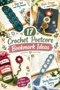
Crochet bookmarks fit poetcore especially well because they already belong beside books, journals, handwritten notes, and well-used paperbacks. For this collection, the poetcore direction comes through worn-library neutrals, pressed-flower colors, botanical greens, faded purples, ink-dark accents, delicate lace, and small details that look at home between the pages of an old poetry collection.
Color matters more than the size of these projects suggests. A bookmark may only expose a narrow strip of crochet between pages, while its flower, tassel, butterfly, or circular motif remains outside the book. That means the decorative end can carry stronger colors while the section inside the book stays quieter.
The 17 tutorials below cover genuine crochet bookmark constructions including pressed flowers, daisies, lavender, butterflies, sunflowers, floral lace, hearts, tassels, strawberries, bookworms, textured strips, and circular motifs. The poetcore palettes are independent editorial adaptations rather than claims that the creators used these exact colors.
Quick List
- Faded Mauve Moss Green And Parchment Crochet Pressed Flower Poetcore Bookmark
- Ivory Antique Gold And Sage Crochet Daisy Poetcore Bookmark
- Dusty Lavender And Moss Green Crochet Lavender Poetcore Bookmark
- Faded Blue And Parchment Crochet Butterfly Poetcore Bookmark
- Ochre Umber And Olive Crochet Sunflower Poetcore Bookmark
- Tea Stained Cream And Dusty Rose Crochet Flower Lace Poetcore Bookmark
- Burgundy And Parchment Crochet Heart Poetcore Bookmark
- Tobacco Brown And Cream Crochet Beaded Tassel Poetcore Bookmark
- Antique Ivory And Sepia Crochet Thread Lace Poetcore Bookmark
- Old Rose And Moss Green Crochet Stemmed Flower Poetcore Bookmark
- Oxblood Sage And Cream Crochet Strawberry Poetcore Bookmark
- Moss Green Burgundy And Parchment Crochet Bookworm Poetcore Bookmark
- Charcoal And Oatmeal Crochet Textured Poetcore Bookmark
- Dusty Blue And Ivory Crochet Jasmine Lace Poetcore Bookmark
- Plum Old Rose And Olive Crochet Floral Poetcore Bookmark
- Rust Cream And Olive Crochet Granny Circle Poetcore Bookmark
- Deep Teal And Parchment Crochet Floral Lace Poetcore Bookmark
Build a Poetcore Crochet Palette Around Paper, Ink, and Botanicals
A useful poetcore palette does not need ten muted shades. Two or three colors with distinct jobs usually communicate the idea more clearly. Parchment, oatmeal, ivory, and tea-stained cream can suggest aged paper without making the entire bookmark beige. Burgundy, charcoal, plum, or deep teal can supply the darker ink-like note, while moss, sage, olive, faded rose, or lavender bring in the pressed-botanical side.
Consider where each color will actually appear. A parchment bookmark body with a burgundy tassel gives a very different result from a burgundy body with a parchment edge, even though the yarn selection is identical.
Keep the Crochet Bookmark Body Flatter Than the Poetcore Accent
Flowers, tassels, circles, and other dimensional details can sit outside the book, but the section trapped between pages benefits from remaining visually and physically restrained.
Color can reinforce that distinction. Keep the narrow bookmark body in one quiet neutral or botanical shade, then concentrate the strongest color in the flower, heart, tassel, or motif that remains visible above or below the pages.
For lace bookmarks, the openwork itself can provide enough detail that additional color changes are unnecessary.
Use Faded Contrast Without Losing Small Crochet Details
Muted color does not have to mean low contrast everywhere. Dusty lavender and moss green, for example, can both be medium-value shades and may merge when used in tiny adjacent details.
When the motif includes a small center, leaf, petal edge, or narrow lace opening, compare the yarns at normal reading distance. A grayscale photo can help reveal whether the important parts still separate.
Keep softer value relationships for larger areas and reserve the clearest contrast for details that define the motif.
1. Faded Mauve Moss Green And Parchment Crochet Pressed Flower Poetcore Bookmark
 SAVE
A pressed-flower bookmark is one of the strongest matches for the poetcore theme because the crochet can resemble a small botanical specimen preserved between pages. Let faded mauve form the flower, moss green carry the stem and leaves, and parchment appear only as a small secondary detail or tassel. Keeping each color attached to a recognizable botanical part prevents the tiny motif from becoming visually crowded.
Faded Mauve Should Lead the Crochet Pressed-Flower Petals
Use faded mauve consistently through the flower so its outline remains recognizable when the bookmark is viewed against printed pages.
If several petals overlap, rely on the stitch shadows for variation instead of changing shades between every petal. The flower is small enough that too many pink-purple tones can blur its shape.
Moss Green Can Keep the Faded Mauve Poetcore Bookmark Botanical
Reserve moss green for the stem and leaf structure. Its darker, earthy value gives the mauve flower a visual anchor and strengthens the pressed-botanical direction.
If parchment is added, keep it small—perhaps in the tassel or a tiny central detail—so it does not compete with the mauve-and-green plant silhouette.
Creator Credit: Make It Yourself By Papari
2. Ivory Antique Gold And Sage Crochet Daisy Poetcore Bookmark
 SAVE
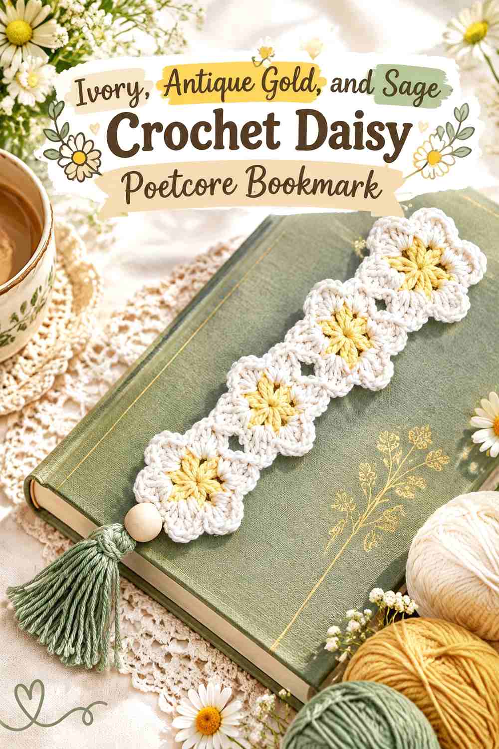
A daisy chain can lean poetcore rather than bright springtime by replacing stark white and vivid yellow with ivory and muted antique gold. Sage keeps the connecting portions botanical while allowing the flowers to remain the main visual feature.
Ivory Can Give Antique Gold Crochet Daisy Centers an Aged-Paper Contrast
Use ivory for the petals so the daisies stay light without looking sharply white. Against an antique-gold center, the flower remains easy to recognize while the palette feels softer.
If the bookmark will be used primarily with cream-colored pages, make sure the flower outline is still visible when it rests against paper.
Sage Can Connect Ivory Crochet Daisies Without Competing With Them
Sage works well through the connecting section because it separates one ivory flower from the next without introducing another strong accent.
If you add a tassel, repeating sage can make the top and bottom of the bookmark feel connected. Antique gold is better kept concentrated in the flower centers.
Creator Credit: Bella Coco
3. Dusty Lavender And Moss Green Crochet Lavender Poetcore Bookmark
 SAVE
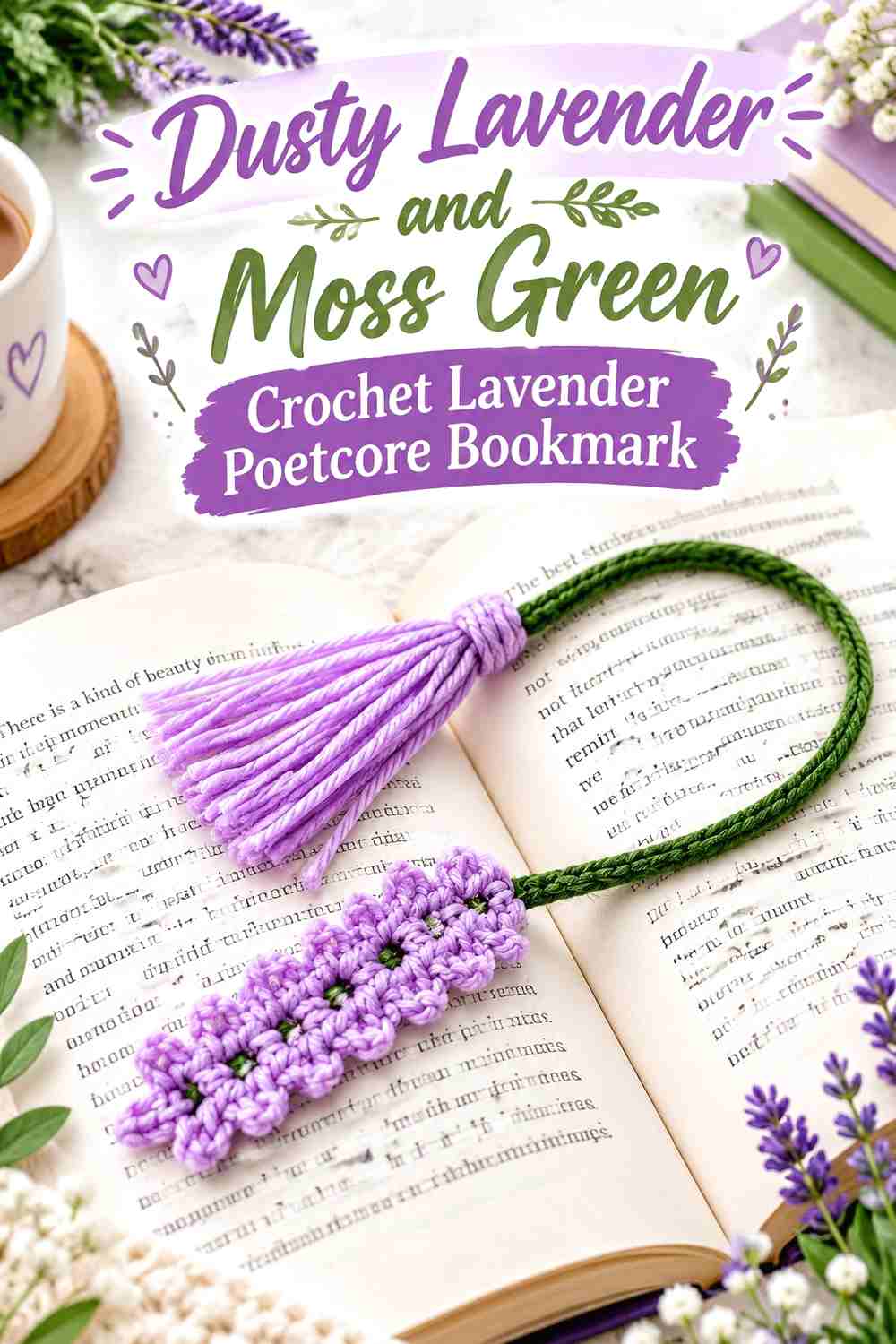
A lavender-flower bookmark already carries a literary botanical quality, so the color plan can remain simple. Dusty lavender should dominate the flower sections, while moss green provides the stem and any leaves.
Dusty Lavender Should Remain Concentrated in the Crochet Flower Spikes
Keep the flower heads within one dusty lavender family so the repeated small blossoms read together.
If individual blossoms are tiny, switching between several purples can make the shape harder to understand. Let the crochet texture create the variation instead.
Moss Green Gives Dusty Lavender Crochet Stems More Definition
A moss green stem creates enough depth to separate the flower from pale book pages and light journal paper.
Check the balance before enlarging the leaves. The bookmark should still read as lavender-led, with moss green supporting the botanical structure rather than becoming the largest visible feature.
Creator Credit: Yarn Garden By Shagufta
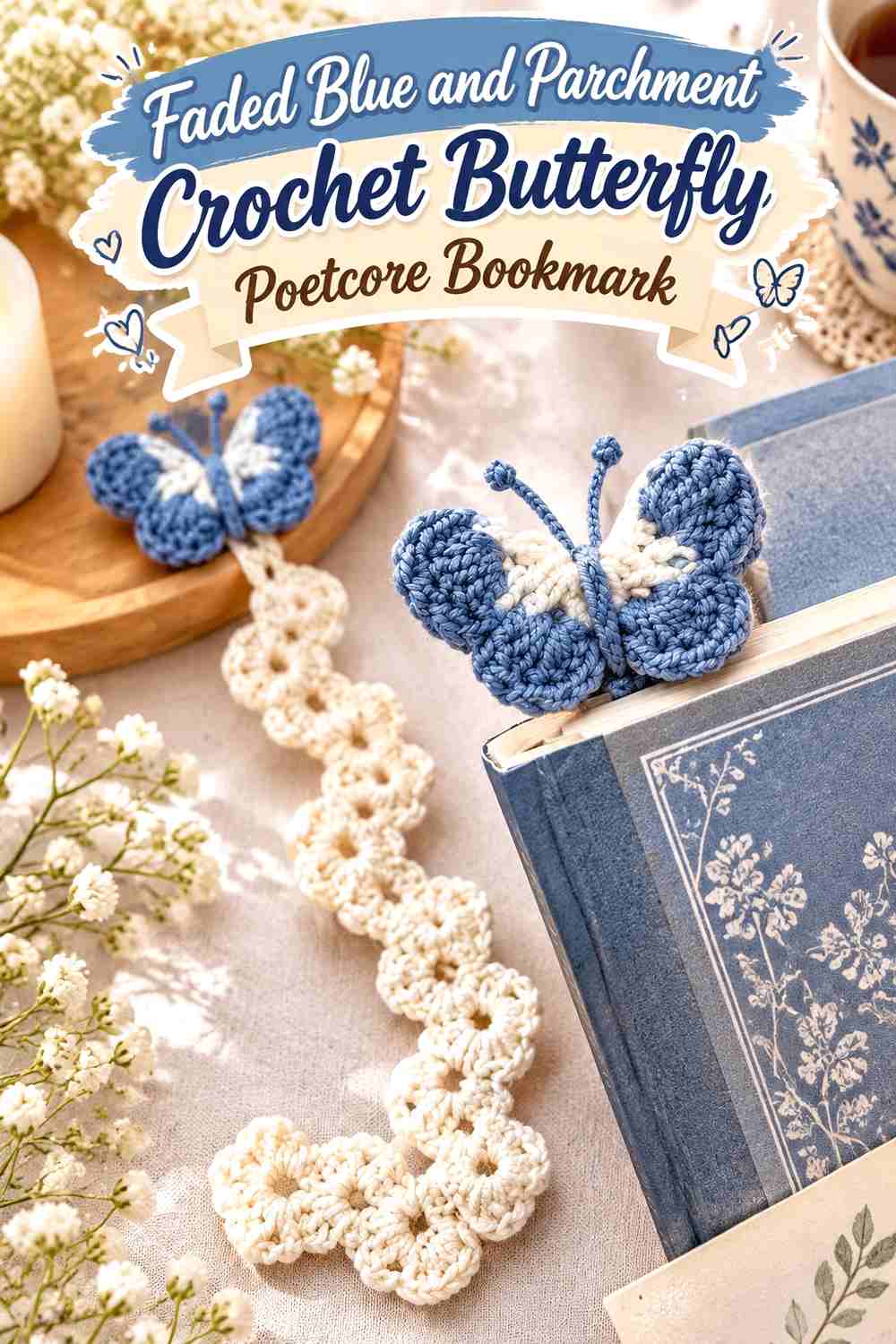
4. Faded Blue And Parchment Crochet Butterfly Poetcore Bookmark
 SAVE
A butterfly bookmark can move away from a bright whimsical look when faded blue leads the wings and parchment softens the smaller details. This combination works especially well when you want the bookmark to feel like a small illustration tucked into an old natural-history volume.
Faded Blue Can Keep Both Crochet Butterfly Wings Connected
Use the same faded blue across the main areas of both wings so the butterfly remains symmetrical and easy to recognize.
If you want variation, shift the amount of blue within matching sections rather than making the left and right wings completely different colors.
Parchment Can Highlight Faded Blue Crochet Butterfly Details
Parchment works best in smaller central or wing-edge areas where the lighter value can clarify the shape.
Avoid filling every opening with parchment. Leaving broader faded-blue areas makes the bookmark look intentionally two-toned rather than intricately striped.
Creator Credit: Ovi
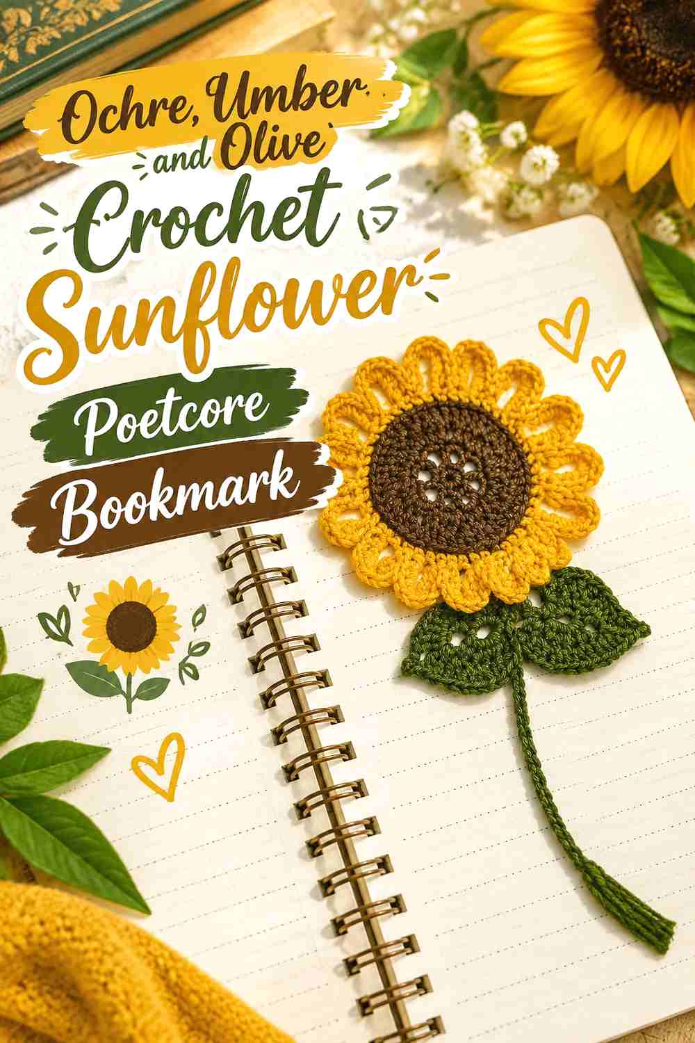
5. Ochre Umber And Olive Crochet Sunflower Poetcore Bookmark
 SAVE
An ochre sunflower, umber center, and olive stem shifts the traditional sunflower palette toward warmer, aged tones. That makes the flower feel more like a pressed autumn specimen than a bright summer motif.
Ochre Should Stay Distinct Around the Umber Crochet Sunflower Center
Give the ochre petals enough width to remain visible around the dark center. Umber has strong visual weight and can make a narrow petal ring appear smaller than expected.
If your ochre is particularly deep, compare the two colors in grayscale to confirm that the flower center still has a clear boundary.
Olive Can Ground Ochre and Umber Crochet Bookmark Details
Use olive on the stem and foliage rather than mixing it into the petals. That preserves the familiar flower structure while keeping the palette earthy.
A small olive tassel can repeat the botanical color if the stem otherwise disappears inside the pages.
Creator Credit: Crafty Crochet Castle
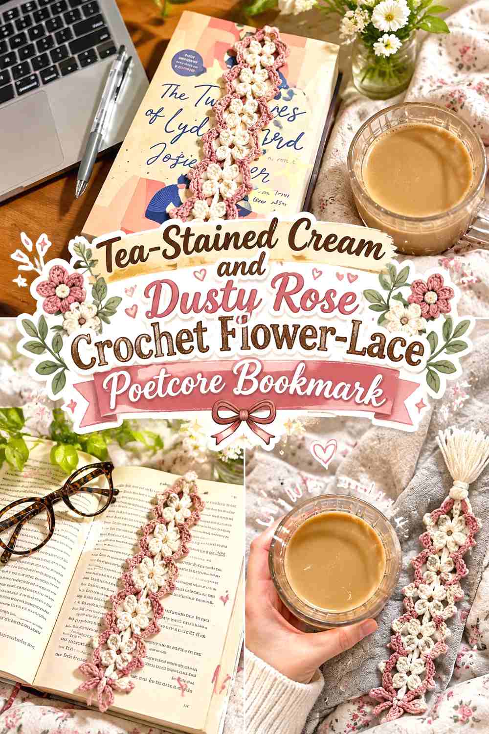
6. Tea Stained Cream And Dusty Rose Crochet Flower Lace Poetcore Bookmark
 SAVE
Flower lace gives the bookmark enough pattern that the palette can stay restrained. Tea-stained cream can cover most of the lace body, while dusty rose appears in a selected flower row, edging section, or tassel.
Tea-Stained Cream Lets Dusty Rose Crochet Lace Stay Delicate
A warm cream keeps the narrow bookmark visually light and allows shadows around the openwork to help define the pattern.
If the lace contains several repeated flowers, avoid changing every motif to a different color. Consistent cream gives the bookmark a stronger antique-lace direction.
Dusty Rose Can Mark One Tea-Stained Cream Crochet Lace Feature
Use dusty rose where you want the reader’s eye to stop—perhaps one motif group or the finishing area.
Because the bookmark is narrow, a small rose section can already carry considerable emphasis. More rose is not automatically more effective.
Creator Credit: Mucie Studio
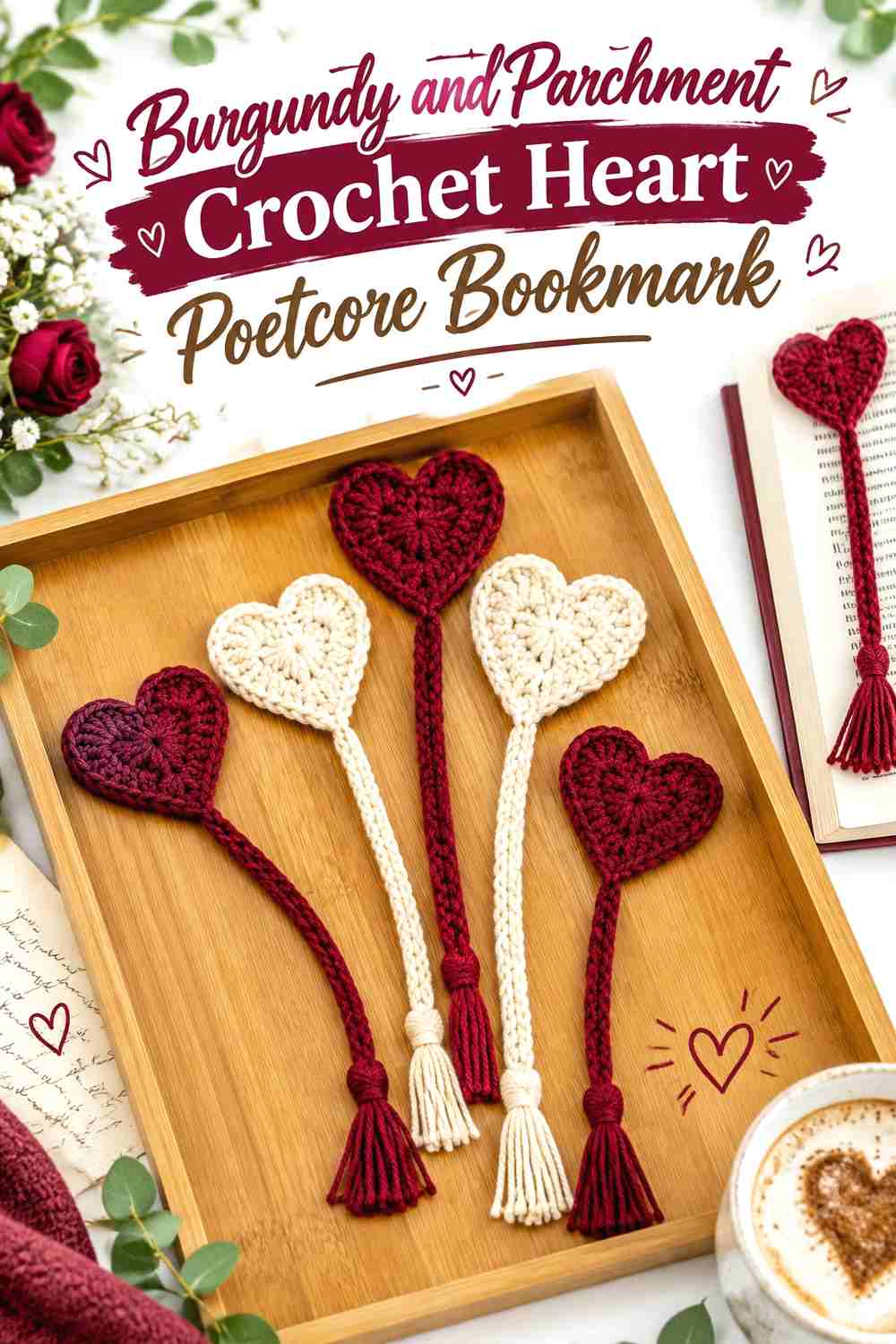
7. Burgundy And Parchment Crochet Heart Poetcore Bookmark
 SAVE
A heart bookmark fits the romantic side of poetcore especially well when the red is darkened toward burgundy and balanced with parchment rather than bright white. Burgundy can lead the heart while parchment carries the tassel or narrow marker section.
Burgundy Can Give the Crochet Heart a Literary Romantic Focal Point
Keep burgundy across the heart so its silhouette remains strong when the rest of the bookmark disappears between the pages.
If the heart is already the largest decorative element, additional burgundy bands along the body may be unnecessary.
Parchment Can Keep the Burgundy Crochet Bookmark From Feeling Too Dark
A parchment tail or tassel introduces a light paper-like neutral without taking attention away from the heart.
If the bookmark is used in books with very cream pages, make sure enough burgundy remains outside the book to maintain the intended contrast.
Creator Credit: Jo to the World Creations
8. Tobacco Brown And Cream Crochet Beaded Tassel Poetcore Bookmark
 SAVE
A macrame-inspired crochet bookmark already has an old-library, handmade-stationery quality. Tobacco brown can dominate the body while cream breaks up the tassel or openwork, creating a warmer alternative to black-and-white contrast.
Tobacco Brown Can Give the Cream Crochet Bookmark an Aged-Leather Direction
Use tobacco brown through the main textured section when you want the bookmark to look grounded and substantial.
Cream should interrupt rather than divide the entire body. A narrow light accent keeps the texture readable without turning the bookmark into equal stripes.
Cream Can Separate Tobacco Brown Crochet Tassels and Beads
Cream around the tassel or bead area creates a lighter endpoint and prevents dark brown details from visually merging.
If the bead itself is already light, repeating cream only once may be enough. Too many pale details can pull attention away from the textured bookmark body.
Creator Credit: Pretty Darn Adorable Crochet Tutorials
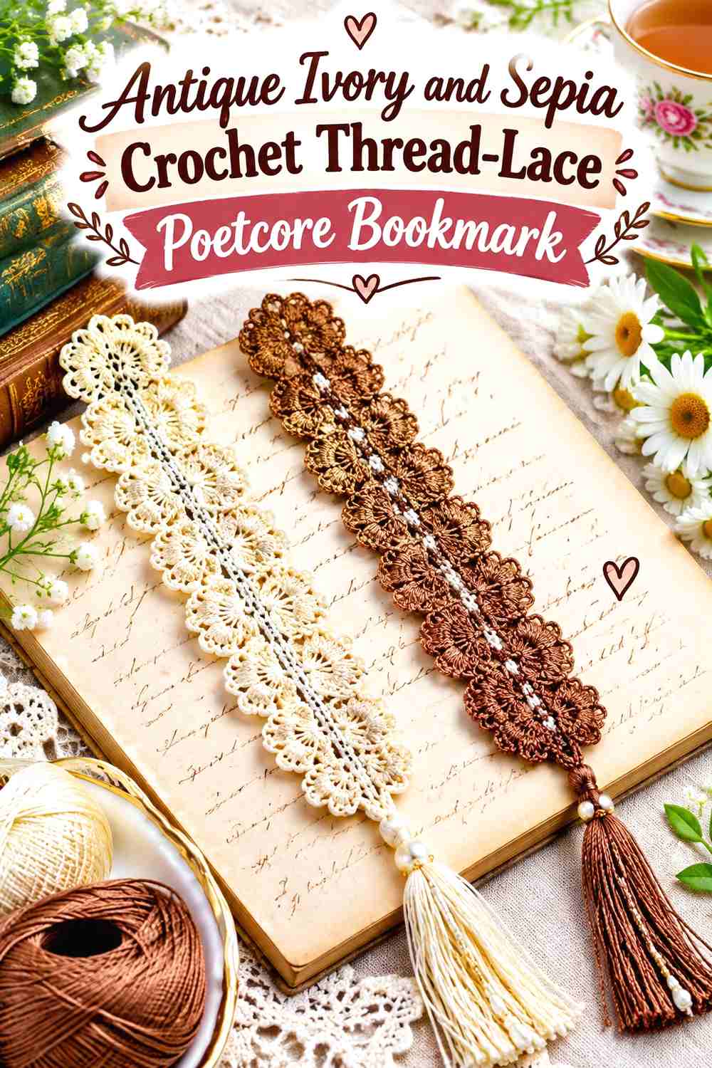
9. Antique Ivory And Sepia Crochet Thread Lace Poetcore Bookmark
 SAVE
A narrow lace bookmark needs very little color variation to create a convincing vintage direction. Antique ivory can carry nearly the entire strip, with sepia concentrated at the tassel, edge, or one small repeated detail.
Antique Ivory Should Carry Most of the Crochet Thread Lace
Keeping the main lace one color allows every opening and narrow stitch group to remain part of a continuous pattern.
On a project this slim, frequent changes between ivory and brown can make the lace appear chopped into sections rather than delicately patterned.
Sepia Can Give Antique Ivory Crochet Lace a Defined Endpoint
A sepia tassel or small end detail gives the bookmark an ink-dark accent without interrupting the openwork.
If you add sepia to the lace itself, repeat it sparingly and at predictable intervals so it does not overwhelm the finer ivory structure.
Creator Credit: Handmade by LovelyMiracle
10. Old Rose And Moss Green Crochet Stemmed Flower Poetcore Bookmark
 SAVE
A flower attached to a long stem-like marker creates a natural two-color layout. Old rose can cover the bloom while moss green follows the stem and leaf, making the bookmark resemble a small flower laid between pages.
Old Rose Should Remain the Main Crochet Flower Color
Keep the petals in one old-rose shade so the bloom remains distinct from the narrow green section.
If the flower has a visible center, choose a closely related darker rose or a restrained neutral rather than adding an unrelated bright shade.
Moss Green Can Make the Old Rose Crochet Bookmark Read Like a Botanical Specimen
Use moss green continuously through the stem and leaf where possible. The repeated botanical color gives the flower a visual connection to the long bookmark section.
Avoid making the leaves too large if the old-rose flower is intended to remain the feature visible outside the book.
Creator Credit: Hectanooga1
11. Oxblood Sage And Cream Crochet Strawberry Poetcore Bookmark
 SAVE
A strawberry bookmark can still fit poetcore when its familiar bright colors are muted. Oxblood can replace vivid red, sage can soften the leaves, and a tiny amount of cream can define seeds or a secondary detail when the construction supports it.
Oxblood Can Give the Crochet Strawberry a Deeper Vintage Fruit Color
Use oxblood across most of the berry so its silhouette stays clear and uninterrupted.
Because oxblood is already dark, avoid adding another equally dark red around every detail. Let stitch texture create the tonal variation.
Sage and Cream Should Stay Secondary Around the Oxblood Crochet Strawberry
Use sage for the leafy section and cream only where a tiny lighter detail genuinely improves separation.
The berry should remain the first shape you notice. Too much cream near the top can pull attention away from the oxblood fruit and make the small bookmark feel top-heavy.
Creator Credit: Secret Crochet Corner
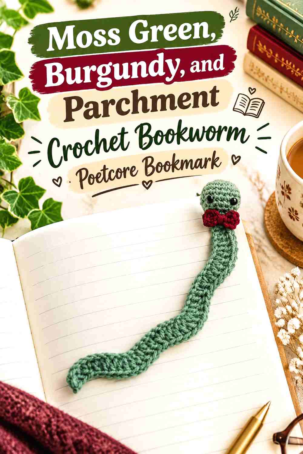
12. Moss Green Burgundy And Parchment Crochet Bookworm Poetcore Bookmark
 SAVE
A bookworm is more playful than the botanical ideas, but a darker palette can keep it within the poetcore collection. Moss green can lead the body, burgundy can define the bow or another small feature, and parchment can soften a tiny secondary detail.
Moss Green Can Keep the Crochet Bookworm Grounded in the Poetcore Palette
Use moss green for most of the long body so the bookmark retains the collection’s botanical, library-inspired direction.
Because the body runs between the pages, keeping it mainly one color also prevents small alternating sections from becoming visually messy.
Burgundy Can Give the Moss Green Crochet Bookworm One Strong Accent
Use burgundy on one clearly defined feature rather than distributing it through the whole worm.
A bow or another compact area gives the color enough importance without competing with the moss-green body. Parchment can remain a quieter supporting neutral if needed.
Creator Credit: Sweet Softies
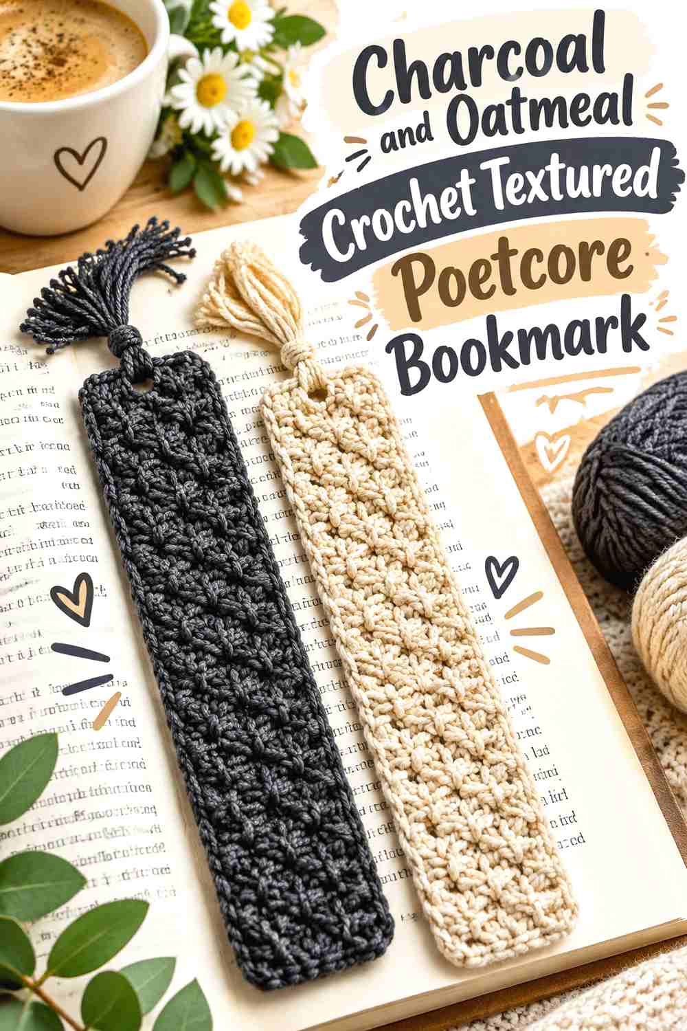
13. Charcoal And Oatmeal Crochet Textured Poetcore Bookmark
 SAVE
A straight textured bookmark can lean toward the ink-and-paper side of poetcore rather than botanical imagery. Charcoal can provide the dark written-ink color, while oatmeal keeps the strip from becoming too visually dense.
Oatmeal Can Show Charcoal Crochet Texture More Clearly
Let oatmeal cover the largest area if the stitch texture is the main attraction. The lighter yarn allows small shadows between stitches to remain visible.
If the bookmark will be used with very pale paper, a charcoal tassel gives the design a stronger visible endpoint outside the book.
Charcoal Should Repeat Carefully Across the Oatmeal Crochet Bookmark
One charcoal border, tassel, or narrow band may be enough. Several dark stripes can visually shorten a narrow bookmark.
If you want a more ink-heavy version, reverse the hierarchy and use oatmeal only around the finishing detail rather than alternating the two throughout.
Creator Credit: This Pixie Creates
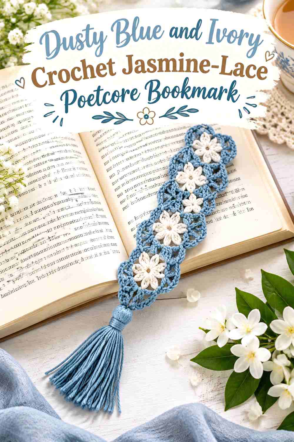
14. Dusty Blue And Ivory Crochet Jasmine Lace Poetcore Bookmark
 SAVE
Dusty blue and ivory suit decorative lace when you want a cooler poetcore palette. Dusty blue can carry most of the stitch pattern, while ivory appears at the tassel or a restrained finishing point.
Dusty Blue Can Keep the Crochet Jasmine-Lace Pattern Continuous
Use dusty blue through the repeated lace structure so the open shapes remain connected visually.
Frequent switches to ivory can interrupt a pattern that is already intricate. Keep the color plan simpler as the lace becomes more detailed.
Ivory Can Give Dusty Blue Crochet Lace a Light Poetcore Finish
An ivory tassel creates a paper-like contrast at the end of the dusty-blue strip and can make the bookmark look lighter without changing the body.
If ivory is introduced into the lace itself, restrict it to one deliberate section so the bookmark does not lose its cool blue direction.
Creator Credit: Amelia Makes
15. Plum Old Rose And Olive Crochet Floral Poetcore Bookmark
 SAVE
A flower-and-stem bookmark can support a richer floral palette when each shade has a specific purpose. Plum can provide the darkest petals or center, old rose can carry the broader flower area, and olive can define the foliage.
Old Rose Can Keep Plum Crochet Flower Details From Becoming Too Dark
Use old rose across enough of the bloom that the flower does not collapse into one dark plum shape.
Plum is most effective in concentrated areas where you want depth. If it surrounds every old-rose section, the small motif can become visually heavy.
Olive Can Separate Plum and Old Rose Crochet Flower Sections
Place olive only where the bookmark naturally needs stems or foliage. The green introduces another hue without competing directly inside the flower.
If the olive is as dark as the plum, keep the foliage relatively narrow so the floral head remains the focal point.
Creator Credit: Vardhman Knitworld
16. Rust Cream And Olive Crochet Granny Circle Poetcore Bookmark
 SAVE
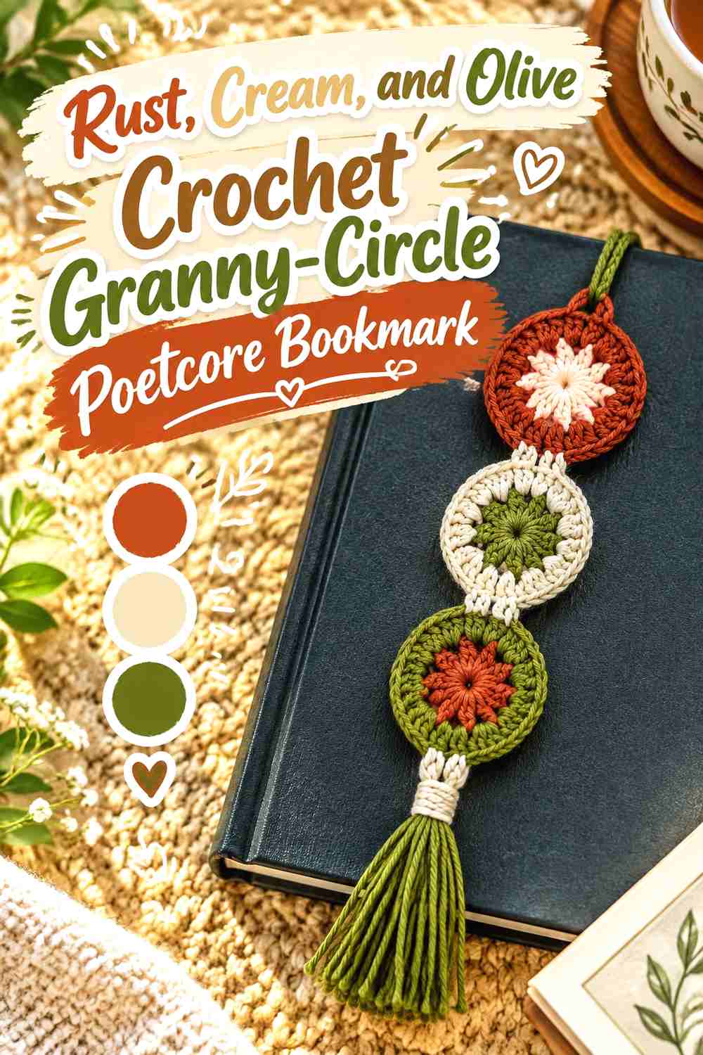
A granny circle offers a less literal botanical interpretation of poetcore while still fitting an antique textile direction. Rust can form the central circle, cream can provide a lighter surrounding round, and olive can appear in a restrained outer section or tassel.
Rust Can Give the Cream Crochet Granny Circle a Warm Center
Use rust where the circular motif begins so the eye has one strong warm focal point.
As the circle expands, cream can occupy more area and prevent the motif from becoming too dark. The change in proportion is more effective than dividing every round equally.
Olive Can Connect the Rust and Cream Crochet Bookmark Tail
Olive works well on the narrow tail or tassel because it introduces a botanical note away from the circular motif.
If the circle already contains olive, repeat it consistently rather than adding several new shades to later rounds.
Creator Credit: Juniper & Oakes
17. Deep Teal And Parchment Crochet Floral Lace Poetcore Bookmark
 SAVE
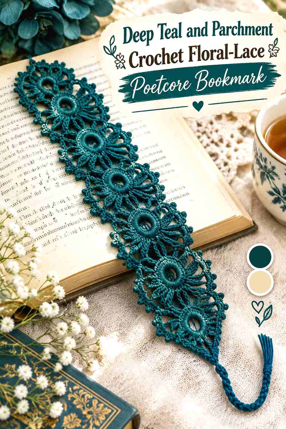
Deep teal and parchment create a darker, more atmospheric final palette. Deep teal can dominate the floral lace while parchment supplies one small section, tassel, or edging detail that recalls aged paper.
Deep Teal Can Make the Crochet Floral Lace Feel Ink-Dark
Use deep teal continuously through most of the lace if you want the bookmark to have a stronger library-at-night direction.
Because dark yarn can hide subtle stitch differences, check the completed lace under normal reading light before deciding whether additional dark sections are needed.
Parchment Can Open Up Deep Teal Crochet Lace Details
A parchment finishing section gives the eye a light break and can emphasize the end of the lace without interrupting every floral repeat.
If you need more definition inside the bookmark, place parchment around one important motif rather than alternating colors across the whole strip.
Creator Credit: Annanitato Lolo
Comparing the 17 Crochet Poetcore Bookmark Directions
For the strongest pressed-botanical poetcore look, start with the faded mauve pressed flower, dusty lavender sprig, ochre sunflower, old-rose stemmed flower, or plum floral bookmark. These projects give greens a botanical role instead of using them merely as decorative accents.
For a romantic old-library direction, the burgundy heart, antique-ivory lace, dusty-blue jasmine lace, deep-teal floral lace, and tobacco-brown beaded bookmark shift attention toward paper, ink, lace, and aged neutral colors.
The butterfly, strawberry, and bookworm add recognizable motifs without abandoning the palette. Keeping their colors muted is what connects them to the surrounding poetcore ideas.
For a bookmark that relies more on textile texture than illustration, choose the charcoal-and-oatmeal strip, tea-stained flower lace, or rust granny circle. These designs can communicate the theme through texture, tassels, and color hierarchy rather than a literal flower.
Conclusion
Poetcore crochet bookmarks work best when the colors support the relationship between books and handmade detail. Parchment, ivory, oatmeal, and tea-stained cream can echo paper; charcoal, burgundy, plum, brown, and deep teal provide ink-like depth; and moss, sage, olive, faded rose, lavender, and ochre introduce the feeling of pressed or dried botanicals.
For flower bookmarks, give petals and foliage separate color roles. For lace, keep the palette simpler so the openwork remains readable. For tassel and textured bookmarks, use the darkest shade strategically rather than automatically dividing the body into equal blocks.
The smallest detail often stays outside the closed book, so judge the palette in actual use. A strong flower, tassel, heart, butterfly, or circle at the page edge can provide enough color even when the bookmark body itself remains quiet.
Frequently Asked Questions
What colors make a crochet bookmark look poetcore?
Muted botanical colors and paper-like neutrals work particularly well: moss green, sage, olive, dusty rose, faded mauve, lavender, burgundy, rust, ochre, cream, parchment, oatmeal, sepia, and charcoal. You do not need all of them in one project; two or three controlled shades are usually more effective.
How can I make a floral crochet bookmark look vintage rather than bright?
Reduce saturation rather than simply making every color dark. Replace vivid pink with old rose, bright purple with dusty lavender, fresh green with moss or olive, and stark white with ivory or parchment. Preserve enough contrast for the flower and leaves to remain distinct.
Should a poetcore crochet bookmark be made in neutral colors only?
No. Floral purples, faded blues, deep reds, ochres, and dark greens can all fit the direction. Neutrals are useful for balancing those colors and connecting the bookmark visually with paper and books.
What color should the tassel be on a poetcore crochet bookmark?
The tassel can repeat the darkest accent, the main bookmark color, or a light parchment-like neutral. Repeating an existing shade usually keeps the bookmark more cohesive than introducing a completely new color at the end.
How do I keep a multicolor crochet bookmark from looking too busy?
Assign each color a job. For example, use old rose for petals, moss green for leaves, and parchment for the tassel. Avoid alternating all three through every part of the bookmark when the motif already has several small details.
Are lace crochet bookmarks suitable for a poetcore palette?
Yes. Lace is especially compatible with muted, antique-inspired palettes because the openings and shadows provide visual detail without requiring many colors. Antique ivory, dusty blue, faded mauve, parchment, deep teal, or sepia can all work depending on how light or dark you want the bookmark.
How can I check whether muted poetcore yarn colors have enough contrast?
Place the yarns next to each other and look from several feet away, or photograph them in grayscale. If two small adjacent details become nearly the same gray, increase the light-and-dark difference or use those shades in larger separate areas instead.