Crochet brooches are small projects, but their colors have to work harder than they would across a blanket or garment. A flower center that is too close in value to its petals can disappear, dark leaves can overpower a tiny bloom, and too many equally strong shades can make a detailed motif difficult to read once it is pinned to clothing.
For a vintage-inspired direction, color does not have to mean faded beige alone. Dusty pinks, burgundy, mustard, moss green, cream, muted blue, plum, rust, and deep red can all create different period-influenced looks when their roles are controlled.
These 11 crochet vintage brooch ideas use verified brooch or pin tutorials as their construction references. The palettes below are independent color adaptations, so the creators are not being credited with using these exact color combinations.
Quick List
- Antique Rose And Sage Crochet Rose Corsage Vintage Brooch
- Ivory And Mustard Crochet Daisy Vintage Brooch
- Oxblood And Charcoal Crochet Poppy Vintage Brooch
- Brick Red And Olive Crochet Poppy Vintage Brooch
- Dusty Mauve And Cream Crochet Layered Flower Vintage Brooch
- Powder Blue And Ivory Crochet Flower Pin Vintage Brooch
- Plum And Camel Crochet Safety Pin Flower Vintage Brooch
- Burgundy And Antique Gold Crochet Rose Vintage Brooch
- Rust And Oatmeal Crochet Mushroom Vintage Brooch
- Lilac And Sage Crochet Butterfly Vintage Brooch
- Deep Red And Moss Green Crochet Cherry Vintage Brooch
Give Small Crochet Brooches a Clear Color Hierarchy
A brooch has very little surface area compared with most crochet projects, so dividing three or four strong colors equally can quickly make the motif feel crowded. Decide which shade belongs to the main recognizable shape first.
On a rose, that will normally be the petals. On a mushroom, it may be the cap. On a butterfly, it can be the wings. Supporting colors should help separate those features rather than competing with them.
A useful checkpoint is to place the unfinished brooch against the jacket, cardigan, scarf, or bag where you might wear it. A palette that looks balanced on a white work surface may behave quite differently against dark fabric.
Use Light and Dark Vintage Colors to Protect Crochet Detail
Different hues are not automatically different in value. Dusty rose and muted sage, for example, can both sit in a similar middle range and merge when used in very small sections.
For tiny petals, centers, leaves, or borders, compare the yarns side by side. A grayscale photo can also reveal whether adjacent colors have enough light-and-dark separation.
Stronger contrast is useful around details that define the motif. Softer contrast can be reserved for larger petals or layered sections where shape already provides separation.
Coordinate the Crochet Brooch With Its Background
Brooch color is partly influenced by whatever sits behind it. Ivory petals may disappear on a cream cardigan, while a charcoal flower center that looks balanced on a table can become unusually dominant on a black coat.
You do not need to match the brooch to the garment. Instead, check whether the main outline and important motif details remain visible against the intended background.
This is particularly useful with vintage-inspired palettes because muted shades can look much softer when placed against similarly muted clothing.
1. Antique Rose And Sage Crochet Rose Corsage Vintage Brooch
 SAVE
Antique rose can lead the petals while sage is reserved for leaves or other supporting greenery. This keeps the flower recognizable as the main feature and gives the green a logical location rather than mixing both colors throughout the bloom. A slightly lighter rose on selected outer petals can add separation without turning the brooch into a busy multicolor accessory.
Antique Rose Should Carry Most of the Crochet Rose Petals
Keep antique rose across the largest petal area so the flower reads as one continuous bloom. If several similar pink shades are available, choose one main rose first rather than changing colors between every petal layer.
That consistency matters on a small corsage because the overlapping crochet already creates plenty of visual variation.
Sage Can Frame the Antique Rose Crochet Corsage
Use sage where the foliage naturally sits behind or beneath the rose. The cooler muted green provides a boundary around the warmer flower without needing a dark outline.
Check how much sage remains visible after the brooch is pinned. Leaves that look prominent while lying flat can partially disappear behind dimensional petals.
Creator Credit: Frisian Knitting tutorials
2. Ivory And Mustard Crochet Daisy Vintage Brooch
 SAVE
Ivory petals with a mustard center give the familiar daisy shape a warmer, slightly aged direction compared with stark white and bright yellow. Because the flower is small and symmetrical, keeping the petals in one light shade helps the center remain the obvious focal point.
Ivory Keeps the Mustard Crochet Daisy Center Distinct
Use ivory consistently through the petals instead of alternating several pale neutrals. The repeated light petals create a clear ring around the stronger center.
If ivory is too close to the color of the garment underneath, consider a slightly warmer or darker neutral rather than changing every petal.
Mustard Needs Enough Contrast Against Ivory Daisy Petals
The mustard center should be noticeably different from the ivory when viewed at normal wearing distance. If your mustard is extremely pale, the center may flatten into the surrounding petals.
A deeper muted mustard keeps the vintage-inspired direction while giving the flower a recognizable center.
Creator Credit: Olga Lukoshkina
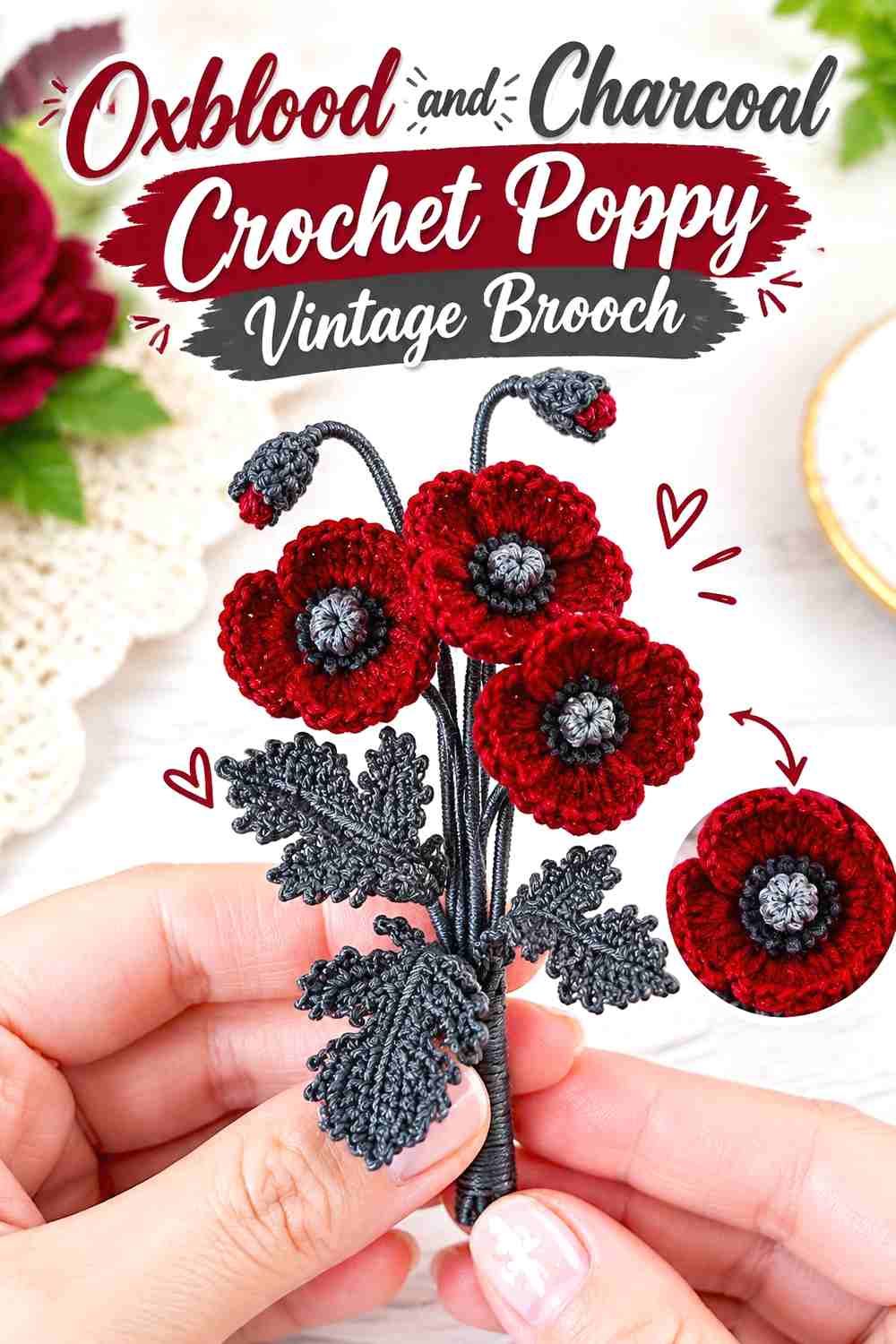
3. Oxblood And Charcoal Crochet Poppy Vintage Brooch
 SAVE
Oxblood gives a poppy a darker red direction than bright scarlet, while charcoal can define the central details. Because both colors are deep, their placement needs to remain simple. Let oxblood cover the broad petal surfaces and confine charcoal to the smallest central area.
Oxblood Should Remain the Main Crochet Poppy Color
Give oxblood enough uninterrupted petal area that the brooch reads as a flower rather than as alternating dark sections.
The folds and overlapping petals already produce natural shadows, so additional dark color changes across the petals are usually unnecessary for this palette.
Charcoal Should Stay Concentrated Inside the Oxblood Poppy
Charcoal is visually heavy beside oxblood. Keeping it near the flower center creates definition without darkening the entire brooch.
If the center seems too dominant, reduce the visible charcoal area rather than lightening every oxblood petal.
Creator Credit: TinyLimeCraft
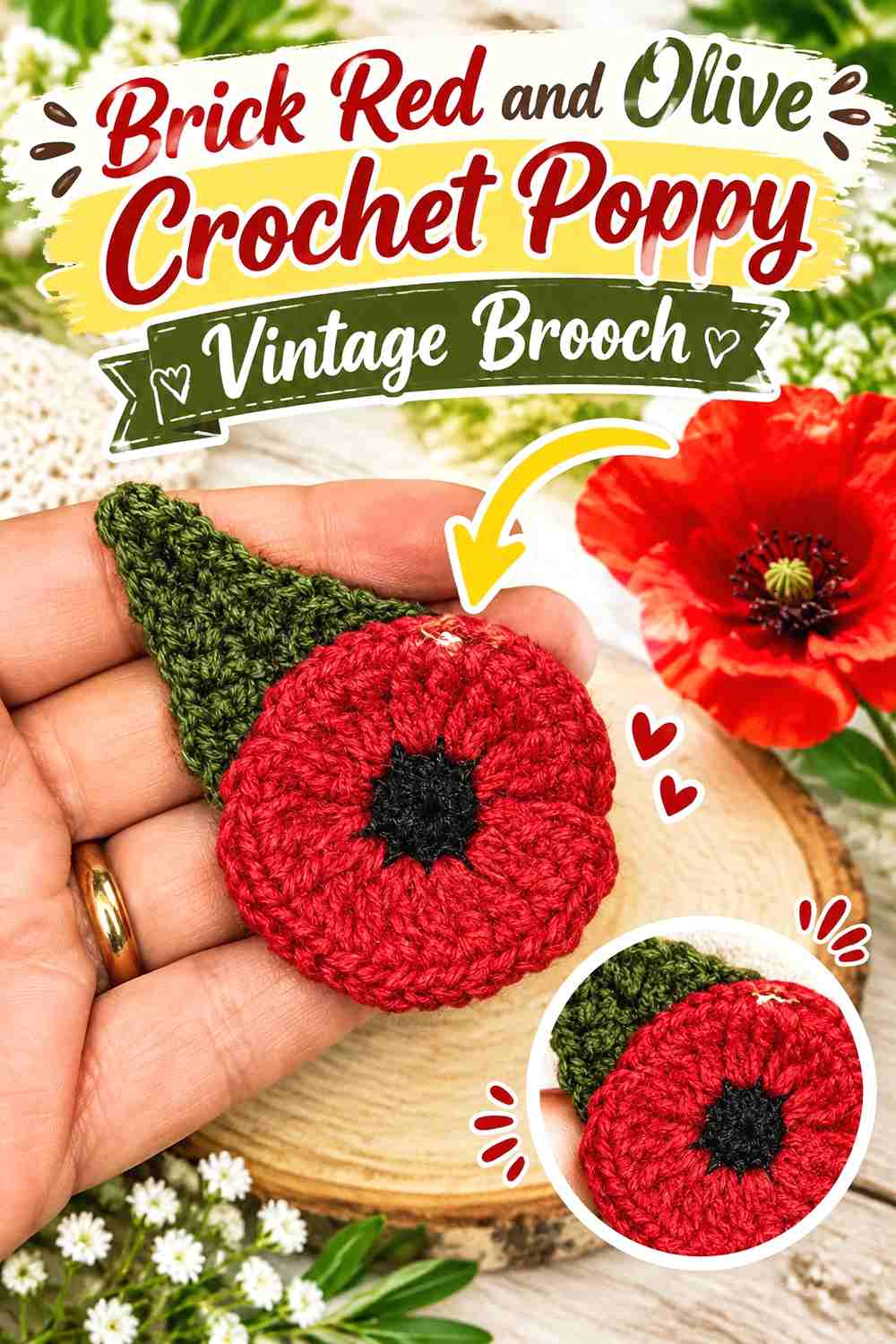
4. Brick Red And Olive Crochet Poppy Vintage Brooch
 SAVE
Brick red and olive create a warmer botanical direction. Brick red can cover the flower while olive belongs to leaves or other green details. Compared with the oxblood-and-charcoal version, this palette relies more on color temperature and botanical placement than on a very dark center.
Brick Red Gives the Crochet Poppy a Softer Red Direction
Keep brick red across the petal layers when you want the flower to look warm without using an extremely vivid red.
Because the petals create their own dimensional variation, one consistent brick red can look more deliberate than several unrelated red-orange shades.
Olive Can Support Brick Red Without Taking Over the Brooch
Olive works best in smaller botanical areas around the brick-red flower. If the foliage becomes nearly as large as the petals, the brooch can begin reading as green-led.
Pin the unfinished motif to fabric before finalizing leaf placement and check that the brick-red bloom remains the first feature you notice.
Creator Credit: One Seven UK 🇬🇧
5. Dusty Mauve And Cream Crochet Layered Flower Vintage Brooch
 SAVE
A layered flower allows dusty mauve to do most of the work while cream creates selective separation between the center and surrounding petals. Keeping the palette restrained is particularly useful when the flower itself has several overlapping crochet layers.
Dusty Mauve Can Unite the Crochet Flower Layers
Use dusty mauve through most of the petals so dimensional construction, rather than repeated color changes, creates the differences between layers.
If every layer changes color, the small brooch may look striped instead of floral. A continuous mauve field keeps the silhouette easier to understand.
Cream Can Open Up the Dusty Mauve Crochet Flower Center
A cream center introduces a small light point that separates the middle from the surrounding mauve petals.
Because cream creates strong contrast against a medium or deep mauve, it does not need to occupy much area. Keep it concentrated where the flower needs definition.
Creator Credit: Crochet con Lillo
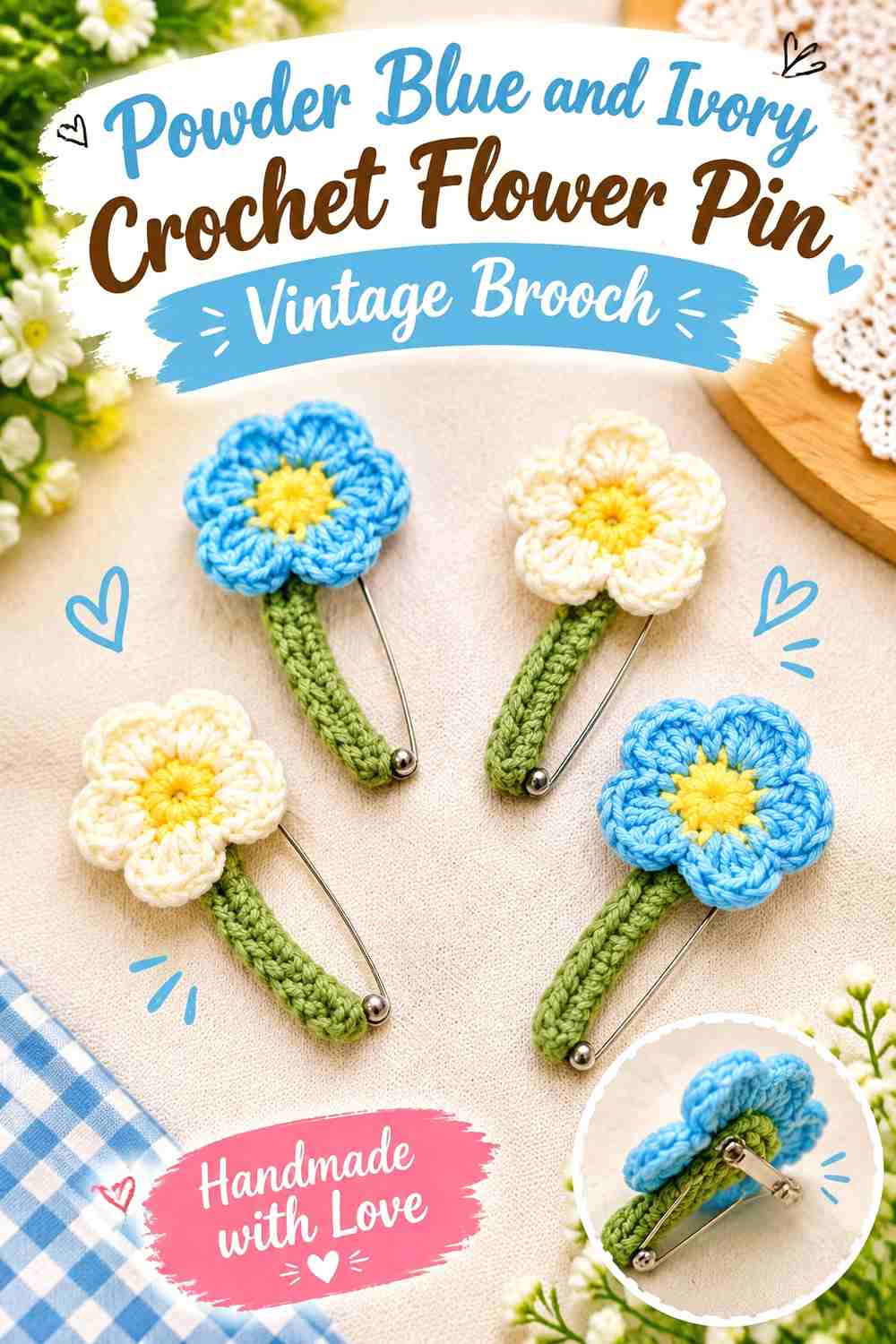
6. Powder Blue And Ivory Crochet Flower Pin Vintage Brooch
 SAVE
Powder blue and ivory create a lighter vintage-inspired brooch with less visual weight than burgundy or plum palettes. Let powder blue define the petals and use ivory for a center or a controlled secondary layer.
Powder Blue Should Define the Main Crochet Flower Shape
Keeping all major petals powder blue makes the outline easy to follow, especially when the brooch is pinned to cream, camel, gray, or darker clothing.
If several blues are available, preserve a muted quality rather than mixing a very bright blue into an otherwise softened palette.
Ivory Can Separate Powder Blue Crochet Petal Details
Ivory is most effective when used where the construction needs a visual break, such as a flower center or a small inner layer.
Avoid distributing tiny ivory stitches throughout every powder-blue petal unless the motif specifically benefits from that pattern. The small scale of a brooch rewards larger, cleaner color areas.
Creator Credit: Creative Asra
7. Plum And Camel Crochet Safety Pin Flower Vintage Brooch
 SAVE
A flower arranged around a safety-pin-style brooch already has a strong linear element. Plum can lead the flower, while camel provides a warm neutral around smaller floral or connecting details so the crochet remains distinct from the hardware.
Plum Can Keep the Crochet Flower Strong Beside the Brooch Pin
Use plum for the main flower so it does not visually disappear beside the long pin shape.
A concentrated plum bloom gives the eye one clear focal point instead of spreading dark color along the entire length of the accessory.
Camel Can Soften the Plum Crochet Safety-Pin Brooch
Camel works as a quieter supporting color around plum petals or secondary flower details. It can keep the project from becoming overwhelmingly dark without creating the sharper contrast of bright white.
Check camel against the clothing where you expect to wear the pin. On similarly colored fabric, the plum flower may need to carry almost all of the visible contrast.
Creator Credit: Yo Moda Crochet
8. Burgundy And Antique Gold Crochet Rose Vintage Brooch
 SAVE
Burgundy gives a rose brooch a deep main color, while antique-gold-inspired mustard can provide a small warm center or leaf accent. The main challenge is restraint: both colors have enough strength to command attention, so one should clearly dominate.
Burgundy Should Cover Most of the Crochet Rose Brooch
Keeping burgundy through the main petal structure allows shadows between the layers to provide tonal variation naturally.
If the flower begins to look too dark, introduce the lighter accent at a central or supporting feature rather than changing half of the petals.
Antique Gold Can Warm the Burgundy Crochet Rose Details
A muted golden mustard can highlight one small feature without turning the brooch into equal burgundy-and-yellow blocks.
Use the accent where it remains visually contained. On a small rose, repeated gold around every petal edge may overpower the layered shape.
Creator Credit: szydełko
9. Rust And Oatmeal Crochet Mushroom Vintage Brooch
 SAVE
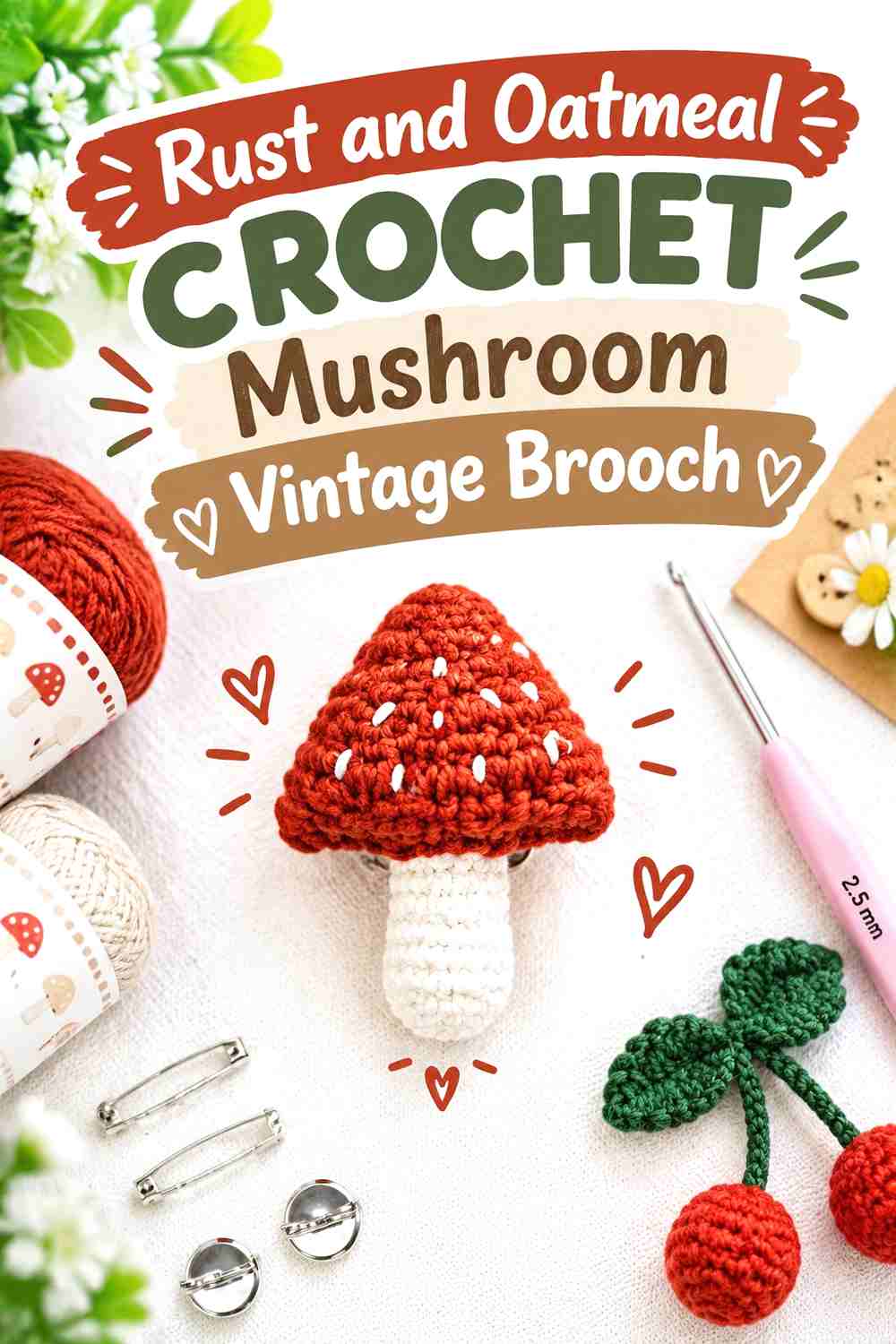
A mushroom brooch provides clear natural zones for color. Rust can lead the cap while oatmeal defines the stem or lighter cap details. This gives both colors specific roles and avoids the need for decorative striping across a very small motif.
Rust Should Stay Concentrated on the Crochet Mushroom Cap
Use rust across enough of the cap that the upper silhouette remains easy to recognize.
If oatmeal details are added to the cap, leave enough rust between them to prevent the lighter color from breaking the cap into several disconnected pieces.
Oatmeal Can Keep the Rust Crochet Mushroom Stem Distinct
Oatmeal gives the stem a lighter value than the rust cap, helping the upper and lower parts remain separate even at small scale.
Compare the brooch against its intended garment. On an oatmeal or cream background, the stem may blend in, making the rust cap appear to float unless the outline remains sufficiently visible.
Creator Credit: MYBAGZING Crochet Studio
10. Lilac And Sage Crochet Butterfly Vintage Brooch
 SAVE
A butterfly gives lilac and sage a different placement opportunity from floral brooches. Lilac can cover the wings while sage remains in smaller central or decorative areas. Keeping the pair muted creates a softer color transition while the butterfly silhouette supplies most of the definition.
Lilac Can Keep Both Crochet Butterfly Wings Connected
Use the same lilac family across both wings so they read as a matched pair. Large color differences between the left and right sides can distract from the symmetry unless deliberate asymmetry is the goal.
If you want variation, change the amount of lilac within matching wing areas instead of assigning unrelated shades to each side.
Sage Should Support the Lilac Crochet Butterfly Symmetry
Sage can appear in a small central body area or repeated wing details. Whatever placement you choose, repeat it symmetrically when you want the butterfly to retain a more traditional balanced appearance.
Because lilac and sage can be similar in value, check the two colors in grayscale if the sage details are small.
Creator Credit: CrochetConfetti
11. Deep Red And Moss Green Crochet Cherry Vintage Brooch
 SAVE
A cherry brooch naturally divides its palette between fruit and foliage. Deep red can define the cherries while moss green covers stems and leaves, giving the vintage-inspired combination a clear botanical logic.
Deep Red Should Remain the Focus of the Crochet Cherry Brooch
Use deep red consistently across both cherries so they read as a pair. Different reds can work, but they should remain close enough that one cherry does not look unrelated to the other.
If the cherries are dimensional, their shadows already create darker areas without requiring a second red yarn.
Moss Green Can Connect the Deep Red Crochet Cherries
Moss green works through the stems and leaf because those areas visually link the two red forms.
Keep the green portions proportional to the fruit. An oversized dark leaf can become the focal point and reduce the impact of the deep-red cherries.
Creator Credit: Hobisever
Comparing the 11 Crochet Vintage Brooch Color Directions
For a soft floral look, antique rose and sage, dusty mauve and cream, or powder blue and ivory keep the contrasts controlled while allowing petals and layered texture to remain visible.
For a deeper vintage palette, oxblood and charcoal, burgundy and antique gold, or plum and camel give a small brooch more visual weight. These combinations work particularly well when the darkest shade has one clearly defined role rather than appearing everywhere.
The ivory and mustard daisy offers the clearest light-centered floral direction, while rust and oatmeal, lilac and sage, and deep red and moss green move beyond traditional roses and poppies without losing a vintage-inspired color character.
Conclusion
A crochet vintage brooch works best when its palette reinforces the motif. Flowers usually benefit from one dominant petal color with a smaller center or foliage shade. Butterflies need balanced wing placement, while mushrooms and cherries already provide natural boundaries for different colors.
For the lightest direction, start with ivory, cream, powder blue, or dusty mauve. Burgundy, oxblood, plum, and deep red create more dramatic brooches, while sage, olive, moss green, camel, and oatmeal can keep those stronger colors grounded.
Most importantly, check the completed motif against the clothing or accessory where it will be worn. Brooches are small enough that the background can significantly change which color appears dominant and which details remain visible.
Frequently Asked Questions
What colors make a crochet brooch look vintage-inspired?
Muted florals, deep reds, softened greens, warm neutrals, mustard, cream, plum, dusty blue, and similar restrained palettes can all support a vintage-inspired direction. The placement matters as much as the color names: one dominant shade with controlled supporting colors usually keeps a small brooch clearer.
How many colors should I use in a crochet vintage brooch?
Two or three colors are often enough for a small motif. A flower may only need petals, a center, and foliage. Adding several equally strong colors can make tiny details compete, particularly on layered flowers.
How can I make crochet brooch details easier to see?
Compare neighboring yarn colors for light-and-dark contrast, not only hue. A grayscale photo can help reveal colors that are different in hue but nearly identical in value. Place the clearest contrast around the details that define the motif.
Should a crochet flower brooch have darker leaves than petals?
It can, but it is not required. Darker leaves provide a strong frame around lighter petals, while similar-value leaves create a softer transition. Make sure the foliage does not become more visually dominant than the flower unless that is intentional.
How do I choose a crochet brooch color for a dark coat?
Test the brooch against the coat before finishing the palette. Medium and light petals usually separate more clearly from very dark fabric, while an all-burgundy or charcoal brooch may need a lighter center or border to prevent the outline from disappearing.
Can cream replace white in a vintage crochet brooch?
Yes. Cream, ivory, oatmeal, and other warm light neutrals can fill the same light-color role while creating a softer contrast than a very bright white. Preserve enough value difference from the neighboring color when the light shade defines small petals or details.
Can I change the colors shown in a crochet brooch tutorial?
Yes. Treat the construction and color plan as separate decisions. Preserve the visual roles that matter—such as petal versus center, fruit versus leaf, or wing versus body—and check that your replacement shades still provide the contrast the motif needs.