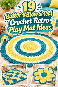
Butter yellow and teal give a crochet play mat an immediate warm-and-cool color structure. Butter yellow can brighten centers, motifs, stripes, or border details, while teal can ground larger sections and keep the play surface from becoming overwhelmingly pale.
A play mat also gives color more room than a small crochet accessory. A narrow teal line on one motif can turn into a strong grid once it repeats across the entire surface, while a butter-yellow border can influence the finished mat more than expected because it surrounds every other color. Planning color by area is therefore more useful than simply choosing several attractive shades.
The 19 ideas below keep butter yellow and teal central while varying shape, motif structure, border strategy, joins, and supporting colors. The credited tutorials support rug or mat construction concepts; the retro-inspired palettes are independent color adaptations.
Quick List
- Butter Yellow, Teal, and Cream Crochet Concentric Retro Play Mat
- Butter Yellow, Teal, and Rust Crochet Stripe Retro Play Mat
- Butter Yellow, Teal, and Avocado Crochet Round Retro Play Mat
- Butter Yellow, Teal, and Coral Crochet Color-Block Retro Play Mat
- Butter Yellow, Teal, and Cocoa Crochet Granny-Square Retro Play Mat
- Butter Yellow, Teal, and Orange Crochet Hexagon Retro Play Mat
- Butter Yellow, Teal, and Olive Crochet Mosaic Retro Play Mat
- Butter Yellow, Teal, and Dusty Pink Crochet Oval Retro Play Mat
- Butter Yellow, Teal, and Cream Crochet Checker Retro Play Mat
- Butter Yellow, Teal, and Tomato Red Crochet Border-Stripe Retro Play Mat
- Butter Yellow, Teal, and Warm White Crochet Center-Panel Retro Play Mat
- Butter Yellow, Teal, and Pumpkin Crochet Spiral Retro Play Mat
- Butter Yellow, Teal, and Chocolate Crochet Zigzag Retro Play Mat
- Butter Yellow, Teal, and Peach Crochet Heart-Center Retro Play Mat
- Butter Yellow, Teal, and Soft Gray Crochet Round Retro Play Mat
- Butter Yellow, Teal, and Sage Crochet Modular Retro Play Mat
- Butter Yellow, Teal, and Lilac Crochet Geometric Retro Play Mat
- Butter Yellow, Teal, and Navy Crochet Rectangular Retro Play Mat
- Butter Yellow, Teal, and Brick Red Crochet Framed Retro Play Mat
Make Butter Yellow and Teal Read Across a Large Play Mat
On a floor-scale crochet project, color proportions matter more than individual small details. If butter yellow and teal are both important to the finished look, give each a substantial repeated role. One can control the center while the other controls the outer bands, or both can recur through motifs in a predictable sequence.
Avoid using one anchor shade only in tiny accents. A few teal stitches may look noticeable while you are crocheting, but they can become insignificant once the play mat expands.
Use Butter Yellow to Separate Deep Teal Mat Sections
Teal can become visually dense when used through large blocks, especially beside cocoa, navy, olive, or another dark supporting shade. Butter yellow can create the light break that keeps adjoining motifs, stripes, or borders distinct.
Use that contrast strategically. A yellow joining line can reveal a modular layout, while a yellow center can lighten a round mat without requiring every outer band to be pale.
Plan the Teal Border Before Repeating Butter Yellow Through the Center
Borders have unusual visual weight on play mats because they surround the entire project. A broad teal border can visually contain a busy multicolor center, while a butter-yellow border makes the whole mat appear lighter.
Choose the border role early, especially for granny-square, hexagon, mosaic, and striped designs. Otherwise, a late color decision can change the apparent balance of everything inside it.
1. Butter Yellow, Teal, and Cream Crochet Concentric Retro Play Mat
 SAVE
A concentric design gives butter yellow and teal large, easy-to-read color zones. Teal can establish the central anchor, butter yellow can create a broad light ring, and cream can provide a quieter separator before the colors repeat. This approach works well when you want a retro palette without making the surface visually complicated.
Let Teal Anchor the Butter Yellow Concentric Play Mat
Use teal in the center and repeat it again farther outward rather than placing all of the dark color in one location. Repetition keeps the mat visually balanced as the circumference increases.
Butter yellow can occupy a broader intermediate band to prevent the darker teal areas from visually merging.
Cream Can Give Butter Yellow and Teal Rings More Space
Insert cream only where adjacent colored bands need separation. A thin neutral ring can make both anchor colors look clearer without becoming a third dominant shade.
Keep cream narrower than butter yellow if you want the finished mat to retain a distinctly yellow-and-teal character.
Creator Credit: Crochet with Tuula Maaria
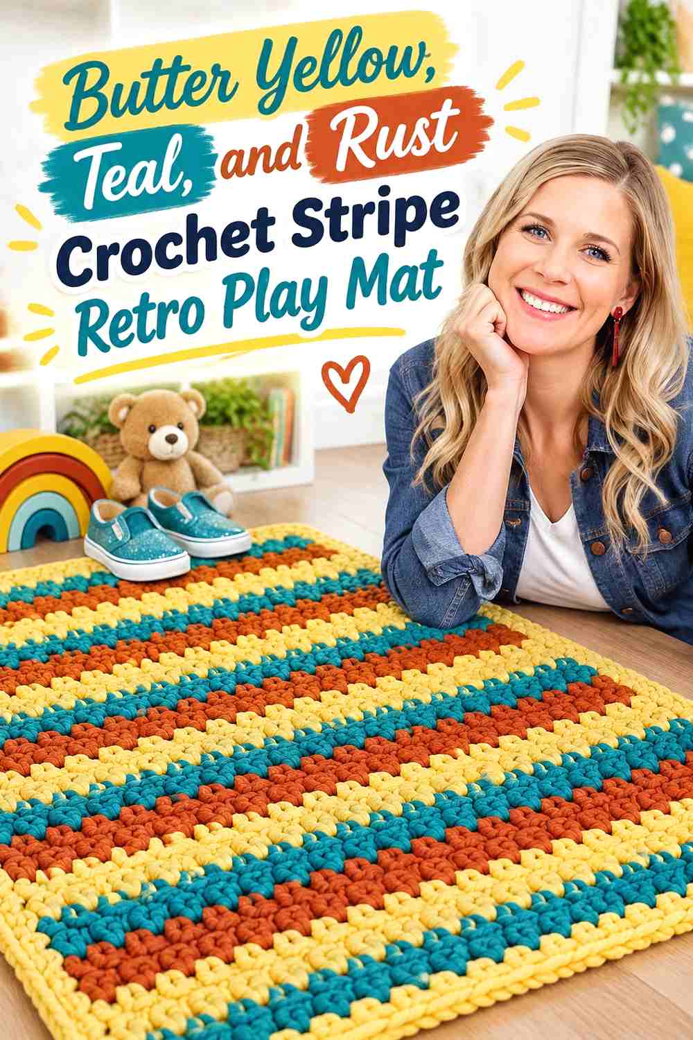
2. Butter Yellow, Teal, and Rust Crochet Stripe Retro Play Mat
 SAVE
Rust adds a deeper warm color that can make butter yellow feel brighter while teal maintains the cool counterbalance. Use the three shades in unequal stripe widths so the mat looks intentionally layered rather than mechanically divided into equal thirds.
Butter Yellow Can Break Up Teal and Rust Play-Mat Stripes
Place butter yellow between darker teal and rust bands where possible. The lighter value gives each strong hue a clearer boundary and prevents the surface from appearing too heavy.
A wider yellow stripe can also become the visual pause between groups of narrower colored bands.
Teal Should Repeat More Consistently Than Rust Across the Mat
Use teal in a predictable stripe sequence while allowing rust to appear less frequently. This keeps teal tied to the anchor palette rather than letting rust become the primary dark color.
Creator Credit: Missouri Star
3. Butter Yellow, Teal, and Avocado Crochet Round Retro Play Mat
 SAVE
Avocado gives this round mat a second green-family shade without replacing teal. The clearest arrangement uses teal in the center or border, avocado in an intermediate section, and butter yellow wherever the greens need a visible light break.
Butter Yellow Should Separate Teal From Avocado on the Round Mat
Teal and avocado can feel related even when their hues differ. Place butter yellow between them if narrow bands begin to blend when viewed from across the room.
The light ring also helps emphasize the circular growth of the mat.
Keep Teal Deeper Than Avocado in the Retro Play-Mat Palette
Give teal the darker structural role and avocado the secondary green role. If they are similar in value, assign them to separate broad rings rather than alternating them frequently.
Creator Credit: Ateliê Isabela Fernanda
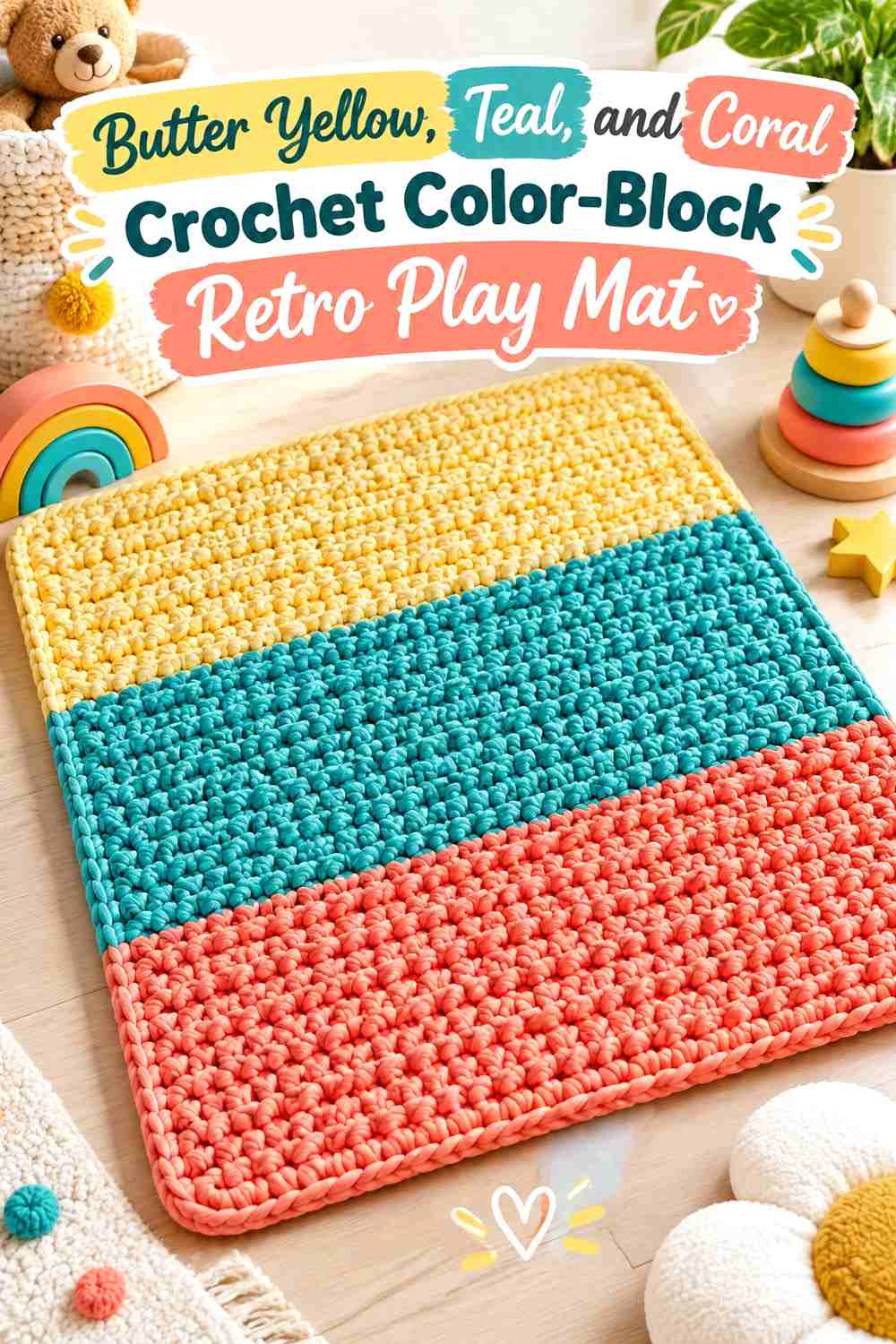
4. Butter Yellow, Teal, and Coral Crochet Color-Block Retro Play Mat
 SAVE
Coral introduces a warm red-orange accent that contrasts strongly with teal. Butter yellow can keep the transition playful rather than harsh by occupying a meaningful central block or repeating between teal and coral sections.
Teal Can Frame Butter Yellow and Coral Color Blocks
Use teal along the outside or in repeated structural bands so the brighter center remains visually contained.
A consistent teal frame is especially helpful when the internal blocks vary in size.
Butter Yellow Should Get More Space Than Coral on the Play Mat
Let yellow function as the main warm field and use coral as the stronger accent. Equal yellow and coral coverage can reduce the importance of teal by making the entire center feel warm-dominant.
Creator Credit: Serafima Crochet & Knitting
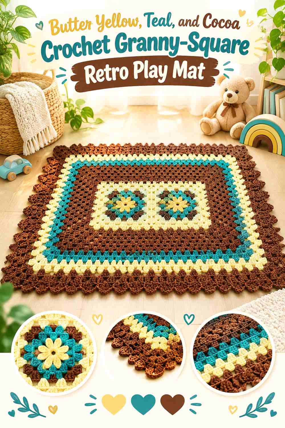
5. Butter Yellow, Teal, and Cocoa Crochet Granny-Square Retro Play Mat
 SAVE
A granny-square layout turns every repeated color decision into part of the overall grid. Butter yellow can control motif centers, teal can form outer rounds, and cocoa can appear in selected intermediate sections or joins.
Repeat Butter Yellow Centers Across Teal Granny Squares
Keeping butter yellow in the same position on each motif creates a clear visual rhythm before the squares are joined.
You can vary cocoa placement around those centers without losing the overall connection between motifs.
Teal Joins Can Contain Butter Yellow and Cocoa Motifs
A teal joining color can create a visible grid that ties differently colored squares together. If the teal lines become too dominant, repeat teal within each square so the joins do not look separate from the motif palette.
Creator Credit: Pedacinho Artes Crochê
6. Butter Yellow, Teal, and Orange Crochet Hexagon Retro Play Mat
 SAVE
Hexagons allow color to shift from motif to motif without requiring changes to the overall construction. Teal can surround each shape, butter yellow can form the center, and orange can appear on selected hexagons for a stronger warm accent.
Butter Yellow Centers Can Unify Teal Hexagon Motifs
Repeat yellow at the center of every hexagon even if teal and orange change places farther outward. That constant center gives the play mat one reliable visual pattern.
Orange Should Stay Smaller Than Teal Around Butter Yellow Hexagons
Use orange in occasional outer rounds or selected full motifs. If orange surrounds every yellow center, the play mat may shift toward a yellow-orange palette with teal becoming secondary.
Creator Credit: Las Totoras Crochet
7. Butter Yellow, Teal, and Olive Crochet Mosaic Retro Play Mat
 SAVE
A mosaic-like layout benefits from stronger light-and-dark separation. Teal and olive can create the deeper pattern, while butter yellow can expose the repeating geometry and keep individual shapes from disappearing into one another.
Butter Yellow Can Reveal the Teal Mosaic Pattern
Use yellow where the geometric design needs the clearest contrast. Repeated light motifs are easier to follow across a large surface than tiny isolated yellow accents.
Olive Should Support Teal Rather Than Compete With It
Keep olive in a smaller secondary pattern or border role. If teal and olive receive equal coverage, their related cool-earthy character may make the pattern less distinct.
Creator Credit: Guria Crocheteira e Arteira
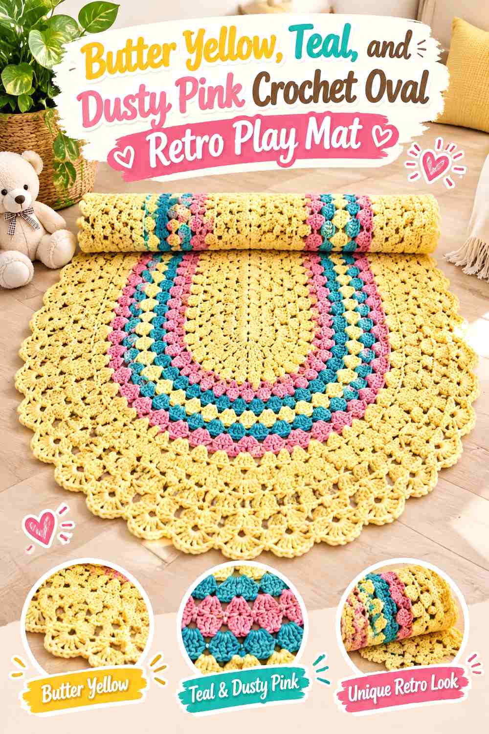
8. Butter Yellow, Teal, and Dusty Pink Crochet Oval Retro Play Mat
 SAVE
Dusty pink softens the contrast between cool teal and warm butter yellow. On an oval mat, the long central field offers room for a broad yellow area while teal and pink can repeat around the perimeter.
Teal Can Strengthen the Butter Yellow Oval Outline
Use teal in an outer band if a pale yellow center needs a stronger boundary against a light floor.
Repeating teal near both ends of the oval also keeps the elongated shape visually balanced.
Dusty Pink Should Sit Between Butter Yellow and Teal in Broad Bands
Give pink enough area to be recognizable instead of using it only as a narrow line. A broader intermediate band creates a softer color progression around the oval.
Creator Credit: LUIZA DE LUGH CROCHET
9. Butter Yellow, Teal, and Cream Crochet Checker Retro Play Mat
 SAVE
A checker layout creates strong repetition, so a limited palette works particularly well. Alternate butter-yellow and teal blocks, then use cream around the edge or as an occasional spacer to prevent the grid from feeling too visually dense.
Keep Butter Yellow and Teal Checker Blocks Similar in Visual Weight
The blocks do not need identical color area, but both anchor colors should recur often enough to be recognizable across the complete surface.
If teal is substantially darker, slightly more yellow may be needed to keep the mat from looking teal-dominant.
Cream Can Calm the Butter Yellow and Teal Checker Border
Use cream around the outside when the internal checker pattern already supplies plenty of contrast.
A neutral border prevents another row of alternating blocks from making the edge too busy.
Creator Credit: KnitcroAddict
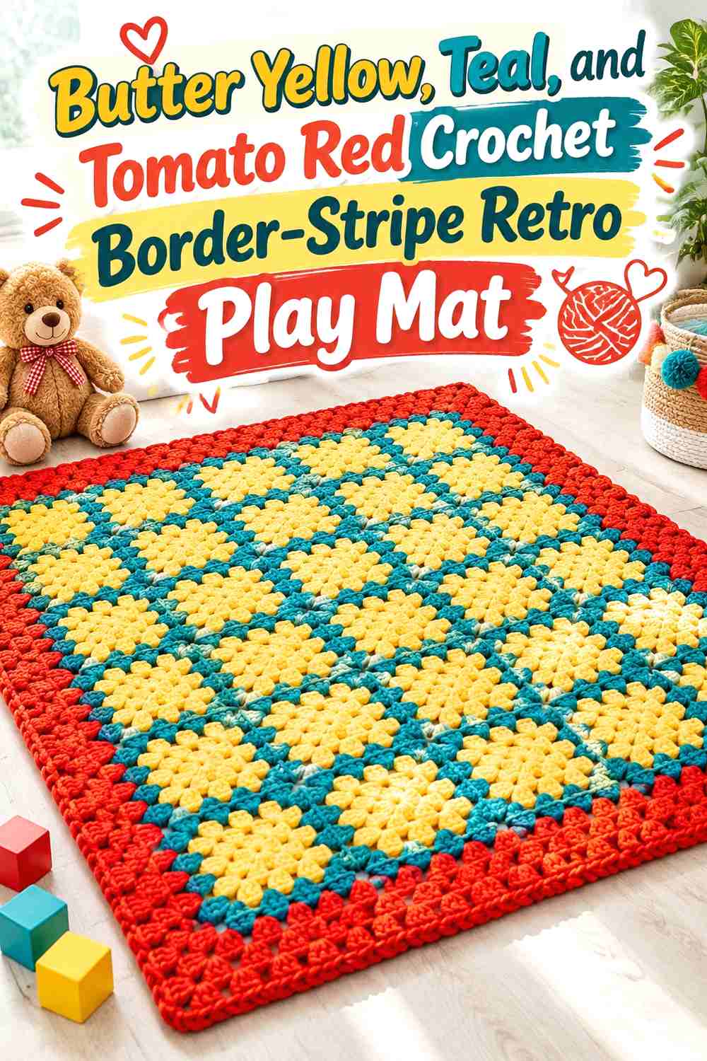
10. Butter Yellow, Teal, and Tomato Red Crochet Border-Stripe Retro Play Mat
 SAVE
Tomato red creates one of the strongest warm accents in the collection. Keep it concentrated in a narrow stripe or inner border while butter yellow covers a larger light area and teal provides the main frame.
Teal Should Control the Outer Edge Around Butter Yellow
A broad teal edge can contain the brighter yellow and red center and give the mat a clear endpoint.
If the play mat already contains several red stripes, keep the final border teal rather than adding another high-energy warm band.
Tomato Red Needs Less Coverage Than Butter Yellow
Use red as the stronger accent, not the primary warm field. A narrow red band can influence the whole mat because it repeats across the full width or circumference.
Creator Credit: Aprendendo Crochê
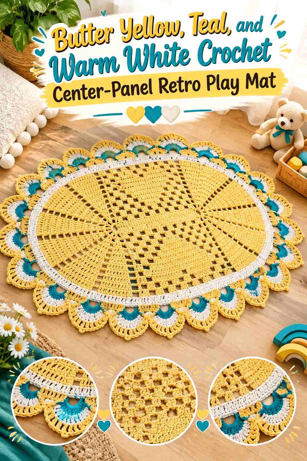
11. Butter Yellow, Teal, and Warm White Crochet Center-Panel Retro Play Mat
 SAVE
A broad central panel offers an easy way to make butter yellow dominant without losing teal. Use yellow through the center, teal along the sides or borders, and warm white as a restrained transition.
Butter Yellow Can Lead the Central Play-Mat Field
Give butter yellow enough uninterrupted space for the center to feel deliberately bright rather than like one stripe among many.
Teal along the outside then provides a stronger floor-level frame.
Warm White Should Separate Teal From Butter Yellow, Not Replace Them
Use white on a narrow transition band or selected internal detail. If the white area becomes as broad as the yellow center, the anchor colors lose some of their visual hierarchy.
Creator Credit: janine freitas
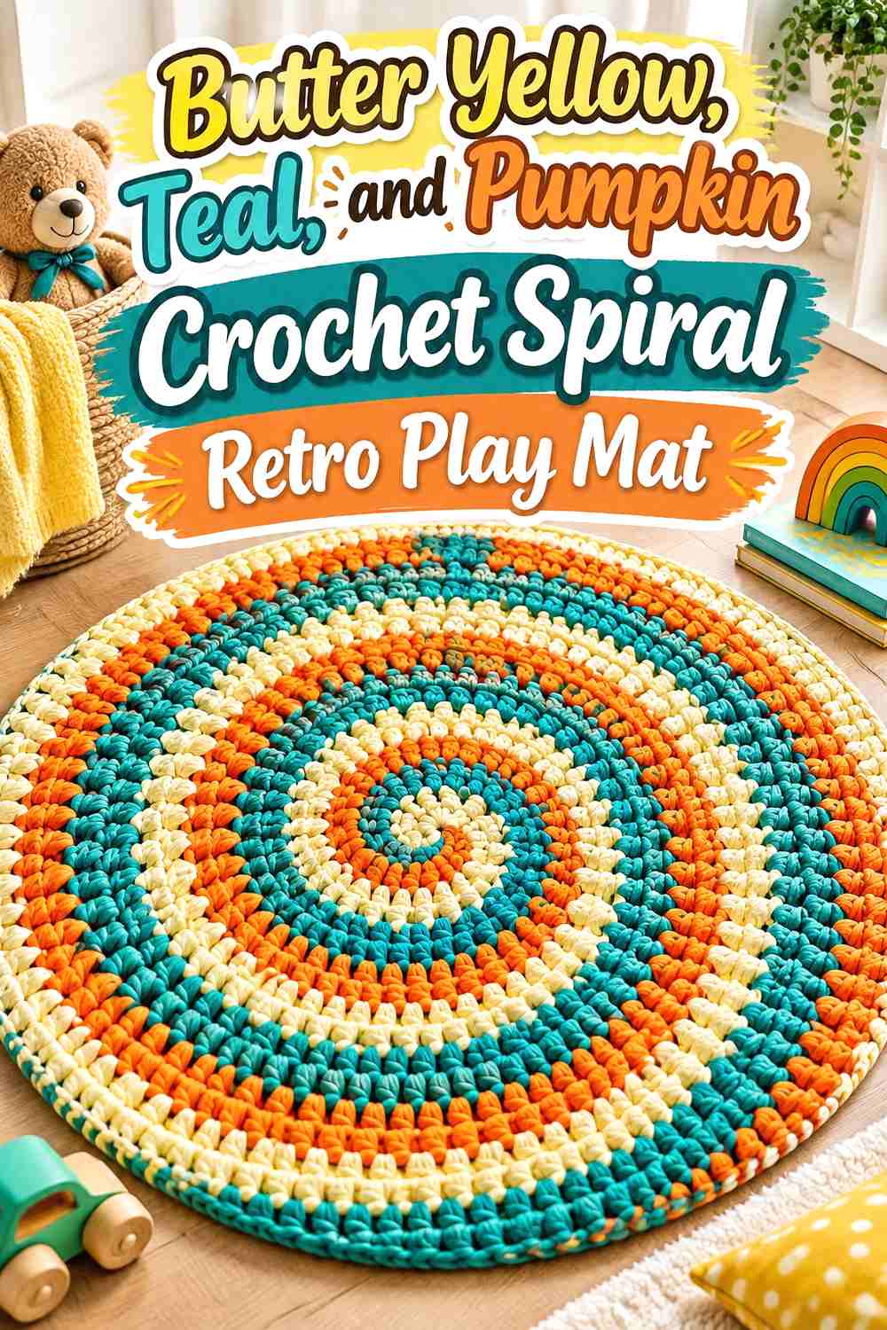
12. Butter Yellow, Teal, and Pumpkin Crochet Spiral Retro Play Mat
 SAVE
Pumpkin deepens the warm side while a spiral construction naturally emphasizes color movement. Let teal establish one strong continuous path and use butter yellow and pumpkin in separate warm sections.
Keep Teal Continuous Through the Butter Yellow Spiral Mat
A recognizable teal path gives the eye something to follow as the colors turn around the center.
Breaking teal repeatedly into very short segments can make the spiral look more like disconnected stripes.
Butter Yellow Can Separate Pumpkin From Teal in the Spiral
Use yellow as the light intermediary where deep teal and pumpkin meet. The three-stage contrast keeps the spiral legible even as the mat grows.
Creator Credit: Meladora’s Creations for Crochet
13. Butter Yellow, Teal, and Chocolate Crochet Zigzag Retro Play Mat
 SAVE
Chocolate creates a dark earthy anchor that makes butter yellow particularly noticeable. Teal should remain the primary cool color, while chocolate can define selected zigzags or border lines.
Butter Yellow Can Keep Teal and Chocolate Zigzags Distinct
Place yellow between the two deeper shades when adjacent zigzags begin to merge. A lighter stripe reveals the directional pattern from across the room.
Teal Should Repeat More Often Than Chocolate Across the Play Mat
Use chocolate as the grounding accent rather than an equal second dark color. This keeps the requested teal influence visible across the complete zigzag layout.
Creator Credit: ПроВЯЖУ / Наташа Николайчук
14. Butter Yellow, Teal, and Peach Crochet Heart-Center Retro Play Mat
 SAVE
A heart-shaped or heart-centered mat gives peach a natural warm supporting role. Teal can outline the shape, butter yellow can occupy the broad interior, and peach can mark an inner heart or smaller center.
Teal Can Define the Butter Yellow Heart Play-Mat Edge
A darker teal perimeter makes the heart silhouette easier to understand when most of the interior is light.
Keep the border similar in width around both curved sides so the color does not visually distort the shape.
Peach Should Stay Softer Than Butter Yellow in the Heart Center
Use peach for a contained inner feature rather than dividing the entire mat equally between two warm pastels.
The result keeps butter yellow visibly connected to the main palette while still introducing a warm tonal variation.
Creator Credit: Claudete Azevedo Crochê
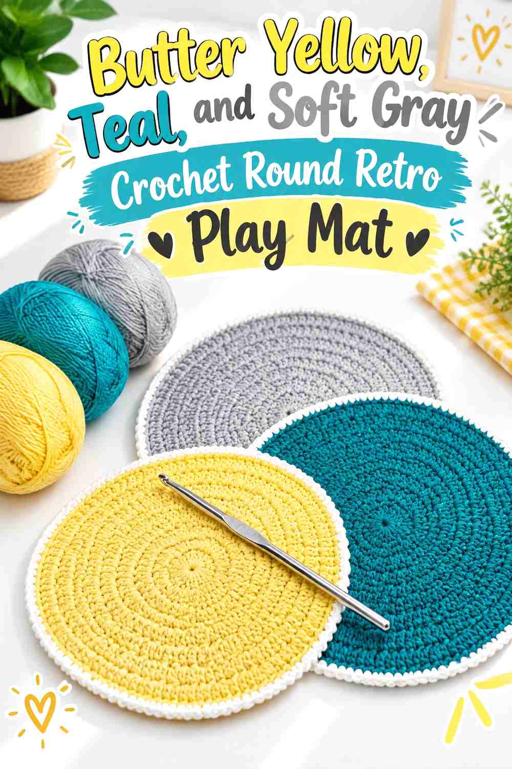
15. Butter Yellow, Teal, and Soft Gray Crochet Round Retro Play Mat
 SAVE
Soft gray gives this round mat a neutral pause between the brighter anchor colors. Teal can control the center and outer rim, while butter yellow remains the broadest warm ring.
Soft Gray Can Separate Butter Yellow From Teal Rings
Use gray where direct teal-and-yellow contrast feels too sharp or repetitive. A neutral intermediate band also gives the eye a resting point on a large circular surface.
Keep Butter Yellow Wider Than Soft Gray on the Retro Mat
Gray should support the palette rather than turn the play mat primarily neutral. Give butter yellow more visual area and repeat teal strongly enough to frame it.
Creator Credit: Happy stockist
16. Butter Yellow, Teal, and Sage Crochet Modular Retro Play Mat
 SAVE
Sage introduces another green without the depth of teal. It can occupy selected modules while butter yellow keeps the center light and teal creates consistent joins or borders.
Teal Joins Can Organize Butter Yellow and Sage Modules
Use teal between modules when you want the individual shapes to remain clearly separated.
The repeated dark grid can bring order to a center that alternates yellow and sage.
Butter Yellow Should Stay Brighter Than Sage Across the Mat
Keep yellow in the highest-contrast locations, such as motif centers or repeated corner details. Sage can cover larger secondary areas without competing as strongly.
Creator Credit: Ateliê Samila crochê
17. Butter Yellow, Teal, and Lilac Crochet Geometric Retro Play Mat
 SAVE
Lilac creates an unexpected cool-warm bridge between teal and yellow. Use it on selected geometric blocks or bands rather than distributing all three colors equally through every section.
Butter Yellow Can Keep Lilac and Teal Geometry Clear
Place yellow where adjoining cool colors need separation. Its higher lightness can make individual shapes easier to distinguish on a repeated geometric surface.
Teal Should Remain the Stronger Cool Color Beside Lilac
Give teal the border, large blocks, or repeated framework and keep lilac secondary. This preserves a clear color hierarchy rather than creating an equal teal-purple composition.
Creator Credit: TimTim Crafty Crochet
18. Butter Yellow, Teal, and Navy Crochet Rectangular Retro Play Mat
 SAVE
Navy deepens the cool side of the palette and works well on the outer edge of a rectangular play mat. Teal can occupy interior stripes or panels, while butter yellow provides the light field needed to keep the two blues distinct.
Butter Yellow Should Separate Teal From Navy Panels
Use yellow between the deeper cool colors where possible. On a wide mat, even one substantial pale panel can prevent navy and teal from reading as one continuous dark zone.
Teal Needs More Interior Space Than Navy
Reserve navy for the outer frame or smaller repeated bands and allow teal to appear more often inside the play surface.
That distinction keeps the requested teal role obvious even with a very dark border.
Creator Credit: Vem Crochetar
19. Butter Yellow, Teal, and Brick Red Crochet Framed Retro Play Mat
 SAVE
Brick red gives the final mat a muted warm accent that is deeper than peach or coral. Use teal as the strong frame, butter yellow across the central field, and brick red for selected internal bands or shapes.
Teal Can Frame the Butter Yellow Retro Play Surface
A consistent teal border gives the large light center a clear boundary and visually connects smaller teal details inside the mat.
Keep the border broad enough to register but not so wide that the play surface becomes teal-dominant.
Brick Red Should Stay Smaller Than Butter Yellow Inside the Frame
Use brick red in a few repeated motifs, stripes, or corner sections. Its deeper warmth carries enough weight that it does not need equal coverage.
Butter Yellow Can Connect Teal and Brick Red Across the Mat
Allow yellow to touch both supporting colors in different parts of the design. The repeated lighter field prevents the cool teal and earthy brick red from forming disconnected visual zones.
Creator Credit: Alexandra Diaz
Which Butter Yellow and Teal Retro Play Mat Palette Should You Choose?
| If You Want | Try This Color Direction |
|---|---|
| Clean retro contrast | Butter Yellow + Teal + Cream |
| Warm earthy stripes | Butter Yellow + Teal + Rust |
| Green-heavy retro color | Butter Yellow + Teal + Avocado |
| Bright warm color blocks | Butter Yellow + Teal + Coral |
| Dark granny-square grounding | Butter Yellow + Teal + Cocoa |
| Playful modular warmth | Butter Yellow + Teal + Orange |
| Muted geometric greens | Butter Yellow + Teal + Olive |
| Softer pastel contrast | Butter Yellow + Teal + Dusty Pink |
| Simple graphic checks | Butter Yellow + Teal + Cream |
| Strong red accent | Butter Yellow + Teal + Tomato Red |
| Lighter center-panel styling | Butter Yellow + Teal + Warm White |
| Warm spiral movement | Butter Yellow + Teal + Pumpkin |
| Deep earthy zigzags | Butter Yellow + Teal + Chocolate |
| Soft heart-centered color | Butter Yellow + Teal + Peach |
| Quieter neutral balance | Butter Yellow + Teal + Soft Gray |
| Muted modular greens | Butter Yellow + Teal + Sage |
| Unexpected pastel geometry | Butter Yellow + Teal + Lilac |
| Deep cool framing | Butter Yellow + Teal + Navy |
| Muted warm framing | Butter Yellow + Teal + Brick Red |
Conclusion
Butter yellow and teal work especially well on a crochet retro play mat because each can occupy a substantial area without needing many additional colors. Butter yellow provides the lighter field, while teal can define borders, joins, centers, stripes, or repeated geometric structures.
Cream, warm white, and soft gray create quieter palettes. Rust, pumpkin, brick red, coral, orange, and peach make the warm side more prominent, while avocado, olive, and sage develop the green side. Cocoa, chocolate, and navy are useful when the mat needs a deeper visual frame.
Before committing to the complete project, arrange a sample of the intended stripes or motifs at floor scale. Check whether butter yellow still has enough area to lighten the design, whether teal repeats consistently, and whether the third shade has a clear role. On a large crochet surface, disciplined repetition usually produces a stronger result than introducing a new color every few rows.
Frequently Asked Questions
Should Butter Yellow or Teal Dominate a Crochet Retro Play Mat?
Either can lead. Butter yellow creates a lighter play surface, while teal gives the mat more visual depth. A practical color arrangement is to let one cover the center and repeat the other in borders, motifs, joins, or broad stripes.
What Colors Work With Butter Yellow and Teal on a Retro Play Mat?
Warm options include rust, coral, pumpkin, orange, peach, brick red, and cocoa. Avocado, olive, and sage extend the green side, while cream, warm white, and soft gray provide quieter separation. Navy creates the deepest cool variation.
How Can I Keep Teal From Overpowering Butter Yellow?
Avoid using teal simultaneously for the center, joining lines, and widest border unless a teal-led mat is intentional. Give butter yellow one broad repeated role, such as motif centers, a central panel, or substantial bands.
Where Should Butter Yellow Go on a Granny-Square or Modular Play Mat?
Motif centers are a strong choice because repeated yellow centers create a recognizable pattern across the full surface. Butter yellow can also be used in joins or borders, but using it in every structural location may make the mat much lighter than expected.
What Border Color Works With Butter Yellow and Teal?
Teal creates the strongest contained edge around a lighter center. Butter yellow gives a dark or multicolor center a brighter finish, while cream or soft gray can calm a particularly busy arrangement. Choose the border according to which color needs more weight in the final balance.
How Can I Make a Butter Yellow and Teal Play Mat Look More Retro?
Use deliberate geometric repetition rather than simply adding many colors. Concentric rings, broad stripes, checker blocks, hexagons, granny squares, zigzags, and framed panels all give the palette a stronger retro-inspired direction. Supporting shades such as rust, avocado, orange, cocoa, and dusty pink can reinforce that approach.
Should Every Motif Use Butter Yellow and Teal in the Same Position?
Not necessarily. Keeping one color role constant is often enough. For example, every motif can have a butter-yellow center while teal and the third accent change positions, or teal can remain the joining color while the motif interiors vary. That creates variety without losing overall cohesion.