Persimmon and plum noir create a crochet palette with a strong light-to-dark relationship when the persimmon is noticeably brighter than the plum. Persimmon brings the warmer visual area, while plum noir can provide depth around borders, cuffs, motif edges, handles, and other places that benefit from stronger definition.
The pair does not have to be divided evenly. A persimmon-led blanket feels very different from a plum-noir sweater with small persimmon accents, even though both projects use the same two core colors. Adding cream, oatmeal, dusty rose, or another quieter supporting shade can change the spacing between them without replacing the main palette.
The 14 ideas below show different ways to distribute persimmon and plum noir across crochet surfaces, garments, motifs, accessories, and home decor.
Quick List
- Persimmon Plum Noir And Cream Crochet Blanket
- Persimmon And Plum Noir Crochet Cardigan
- Plum Noir Persimmon And Oatmeal Crochet Pillow
- Persimmon Plum Noir And Cream Crochet Granny Square Tote
- Plum Noir And Persimmon Crochet Scarf
- Persimmon And Plum Noir Crochet Ribbed Beanie
- Persimmon Plum Noir And Dusty Rose Crochet Granny Square
- Persimmon Plum Noir And Soft Gold Crochet Shawl
- Plum Noir And Persimmon Crochet V Neck Sweater
- Persimmon And Plum Noir Crochet Vest
- Plum Noir And Persimmon Crochet Bucket Hat
- Persimmon And Plum Noir Crochet Market Bag
- Plum Noir And Persimmon Crochet Placemat And Coaster Set
- Persimmon And Plum Noir Crochet Chevron Basket
How to Balance Persimmon and Plum Noir in Crochet
Persimmon and plum noir usually work more clearly when they are given different visual jobs instead of covering identical amounts of the project. On a cardigan, persimmon might cover the body while plum noir defines cuffs and edging. On a granny square, plum noir can frame a lighter center. On a bag, the darker shade can be concentrated around the base and handles.
Think about the parts of the crochet item that need the most definition. Borders, ribbing, joins, straps, and small motif outlines are natural places to test plum noir. Persimmon can cover larger uninterrupted areas when you want the warmer shade to remain the first color the viewer notices.
Check Persimmon and Plum Noir Contrast Before Placement
The names of two colors do not guarantee strong value contrast. Your particular persimmon and plum yarns may be clearly separated or unexpectedly close in lightness.
Place the yarns next to each other before committing to small motifs or textured details. A quick grayscale photo can also help reveal whether the shades remain distinct without their hue. If they merge, introduce a lighter neutral between them or increase the size of each color area rather than alternating the two in tiny details.
1. Persimmon Plum Noir And Cream Crochet Blanket
 SAVE
SAVELet persimmon cover much of the blanket if you want the warm side of the palette to lead, then use plum noir in broader bands or selected sections to create dark visual anchors. Thin cream transitions can prevent the two stronger colors from forming one heavy block and can make repeated color changes easier to read across a large surface.
This arrangement works especially well when the blanket already has visible texture. Large uninterrupted color areas allow the stitch surface and palette to contribute separately instead of asking every row to provide a new color effect.
Persimmon Can Carry the Main Crochet Blanket Surface
Using persimmon across the largest sections creates continuity from one side of the blanket to the other. Rather than dividing persimmon and plum noir into equal narrow stripes, keep some persimmon areas wide enough to let the crochet texture remain visible.
If the blanket begins to look too orange-heavy, add another plum noir section rather than scattering tiny dark stripes everywhere. Larger color blocks create a clearer hierarchy.
Plum Noir and Cream Can Separate Persimmon Blanket Sections
Plum noir can form the strongest bands or outer border, while cream works as a visual pause between the dark plum and warm persimmon. Cream is particularly useful near an edge if a direct persimmon-to-plum transition feels too abrupt.
Keep cream subordinate if you want the article’s two main colors to remain obvious. It should separate or highlight the palette rather than become a third competing dominant color.
Creator Credit: Bella Coco
2. Persimmon And Plum Noir Crochet Cardigan
 SAVE
SAVEA cardigan offers several natural places to separate the two colors without forcing stripes across the entire garment. Persimmon can lead across the front and back panels, while plum noir can be reserved for cuffs, the front band, hem details, or other edging.
This distribution keeps the warm color visible across the main garment while allowing the darker color to trace its structure. Before committing to placement, view the front and back together so the plum accents do not become concentrated on only one side.
Persimmon Can Keep the Crochet Cardigan Body Visually Continuous
Using persimmon through most of the body panels avoids breaking the cardigan into too many small color sections. That is helpful when the stitch pattern already has a noticeable surface texture.
For a stronger two-color look, repeat plum noir in more than one finishing area. A single isolated dark cuff, for example, may look less connected than plum noir repeated at the opposite cuff or along the front edge.
Plum Noir Can Define Persimmon Cardigan Cuffs and Edging
Plum noir works well where the cardigan naturally changes direction or construction, such as cuffs, lower edging, or the front opening. Those placements allow the dark shade to create definition without reducing the amount of persimmon visible across the larger panels.
If your plum noir yarn is extremely dark, compare it with the stitch texture before using it across every detailed section. Subtle surface work may be easier to see in persimmon.
Creator Credit: TCDDIY
3. Plum Noir Persimmon And Oatmeal Crochet Pillow
 SAVE
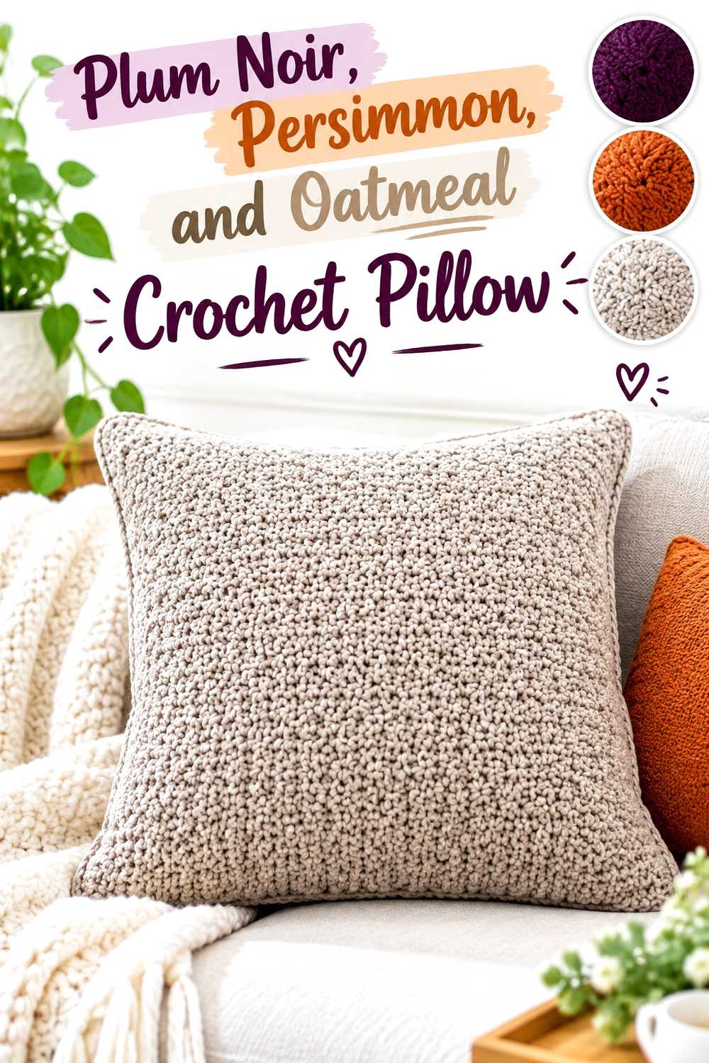
SAVEA pillow allows plum noir to take a larger role because the finished surface is compact. Use plum noir across much of the pillow face when you want a dark decor piece, then place persimmon where texture, bands, or selected details need warmer separation.
Oatmeal can keep the combination from becoming visually dense. It works especially well as a narrow divider or outer frame rather than an equal third section.
Plum Noir Gives the Crochet Pillow a Dark Main Surface
A plum-noir pillow face creates a strong background for larger persimmon details. Keep the persimmon areas substantial enough to remain visible from normal room-viewing distance instead of limiting the warm color to tiny stitches that disappear against the dark field.
If the pillow uses raised texture, make a small sample in plum noir first. Very dark yarn can reduce the visual shadow between individual stitches.
Persimmon and Oatmeal Can Keep Plum Noir Pillow Texture Readable
Persimmon can highlight selected raised sections, while oatmeal can form a lighter outer edge or small separator. The three values give the pillow more opportunities for visible layering than an equal split between two dark or saturated shades.
Avoid placing oatmeal randomly across the surface. Use it in a repeated role so the pillow still reads primarily as a persimmon-and-plum design.
Creator Credit: Jo to the World Creations
4. Persimmon Plum Noir And Cream Crochet Granny Square Tote
 SAVE
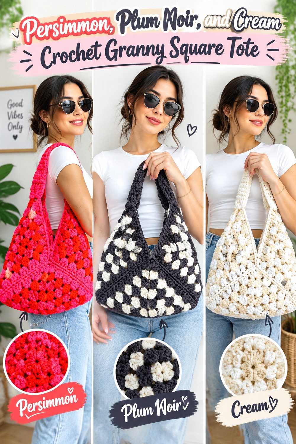
SAVEGranny squares give this palette a natural center-to-edge structure. Persimmon can fill motif centers, cream can open up the middle area, and plum noir can define outer rounds or joins. Repeating the same color order across the tote creates cohesion even when the individual squares have prominent contrast.
Using plum noir around square edges also makes the final motif grid more obvious once the bag is assembled.
Persimmon Can Make the Crochet Tote Motif Centers Repeat Clearly
Repeating persimmon in each square center gives the tote an immediate visual rhythm. It also keeps the warm color visible even when plum noir occupies more of the joining or outer-round area.
If you vary the squares, keep persimmon in at least one repeated position. Otherwise the finished bag may lose the connection between motifs.
Plum Noir and Cream Can Organize Persimmon Granny Squares
Cream can act as breathing room between a persimmon center and plum noir edge. This helps when the main shades are both visually strong.
Use plum noir consistently for the final motif round, joins, or another repeated structural area if you want the tote to look organized. Moving the dark color to a different position in every square can make the grid much busier.
Creator Credit: Kenikse Crochet
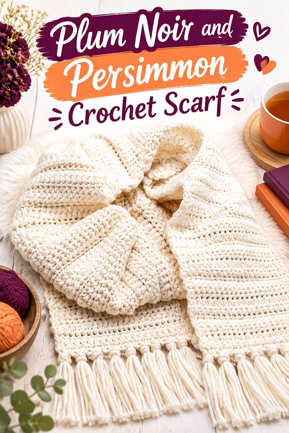
5. Plum Noir And Persimmon Crochet Scarf
 SAVE
SAVEA scarf can handle a plum-noir dominant palette because its long shape provides enough space for the dark shade to repeat without overwhelming a compact object. Use plum noir through most of the length and place persimmon near the ends, in spaced blocks, or in another deliberately repeated section.
That arrangement draws attention along the length while keeping the warmer color visible when the scarf is wrapped.
Plum Noir Can Form the Main Crochet Scarf Length
Keeping the longest uninterrupted area in plum noir gives the scarf a consistent dark foundation. If the stitch pattern includes raised or deeply textured sections, check that the dark yarn does not conceal the detail you want to emphasize.
You can preserve texture visibility by using persimmon across one or more prominent textured sections rather than limiting it to very small accents.
Persimmon Can Give Plum Noir Scarf Ends a Warmer Finish
Persimmon at both ends creates intentional repetition and prevents a single warm section from looking accidental. It can also frame fringe or end texture without forcing frequent color changes through the center.
If you want a subtler version, choose a muted persimmon rather than making the persimmon areas smaller and smaller. Preserving the size of the color block usually keeps the design easier to read.
Creator Credit: Rich Textures Crochet
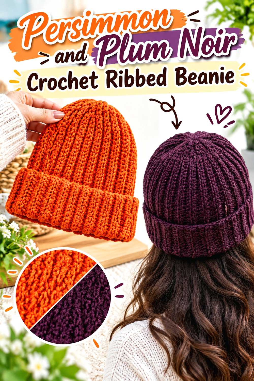
6. Persimmon And Plum Noir Crochet Ribbed Beanie
 SAVE
SAVERibbing makes color placement especially noticeable because the repeated vertical or horizontal lines already create strong direction. Persimmon can cover the crown while plum noir defines the folded brim or lower band.
This approach also keeps the darkest shade near the most visually structured part of the hat instead of alternating colors through every rib.
Persimmon Keeps the Crochet Beanie Crown Warm and Unbroken
Use persimmon through most of the crown when you want a clean color field that lets the ribbing stay visible. Large uninterrupted areas are particularly useful when the ribbed texture is the main design feature.
Before adding plum noir, check the hat from a distance. If the persimmon already has strong dark shadows between ribs, a very wide plum section may make the lower half feel disproportionately heavy.
Plum Noir Can Anchor the Persimmon Crochet Beanie Brim
A plum-noir brim creates a strong visual boundary around the bottom of a persimmon hat. Repeat plum noir only where it serves a clear purpose; the brim alone may provide enough contrast.
If you prefer a more integrated result, a small plum-noir detail near the crown can echo the brim, but avoid scattering dark accents so widely that the simple two-part color plan disappears.
Creator Credit: VivCrochets
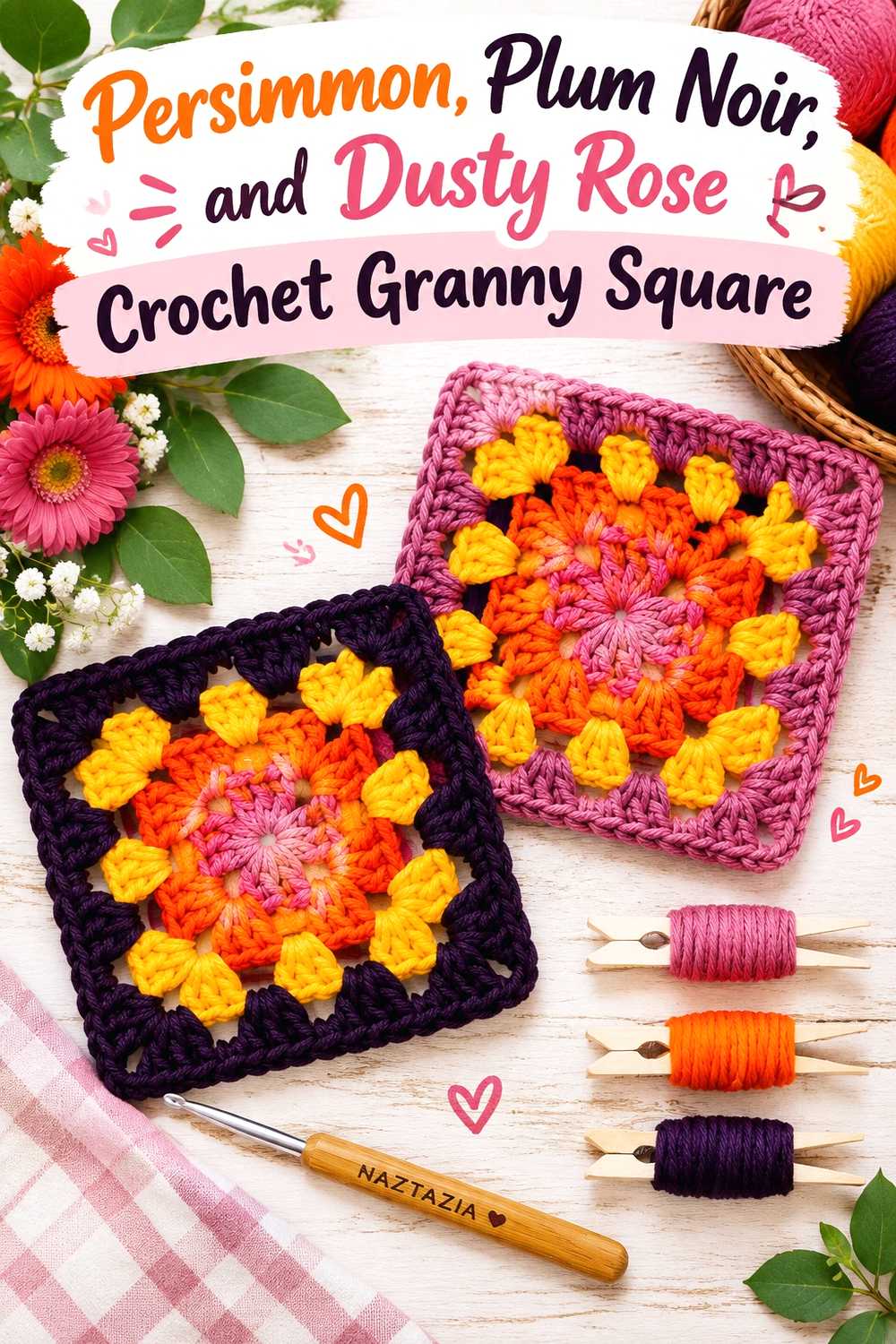
7. Persimmon Plum Noir And Dusty Rose Crochet Granny Square
 SAVE
SAVEThis palette uses dusty rose as a transition between the warm persimmon and the much darker plum noir. It is useful for granny squares because each successive round can have a distinct job instead of requiring the main colors to touch everywhere.
Try plum noir at the center for depth, dusty rose around it for a softer transition, and persimmon farther out where the warmer color gains more visual area.
Plum Noir Can Give the Persimmon Crochet Granny Square a Defined Center
A dark center immediately establishes a focal point. Surrounding plum noir with a lighter shade before reaching persimmon prevents the center from spreading visually into every surrounding round.
If the center motif is intricate, however, test whether plum noir hides too much of the stitch definition. Switching the center and outer color roles can solve that problem without changing the palette.
Dusty Rose Can Bridge Persimmon and Plum Noir Motif Rounds
Dusty rose works best here as a connector rather than another dominant shade. Keep it in one or two repeated positions across every square.
When substituting, preserve its softer, middle-value role. A pink that is nearly as dark as plum noir will not provide the same visual separation.
Creator Credit: Naztazia
8. Persimmon Plum Noir And Soft Gold Crochet Shawl
 SAVE
SAVEA shawl gives the palette room to move from one shade into another across a larger triangular or wrapped surface. Persimmon can dominate the upper or central portion, soft gold can act as a narrow transition, and plum noir can finish the lower edge.
The dark edge gives the shawl definition while allowing the warmer colors to stay closer to the face and shoulders when worn.
Persimmon Can Lead the Crochet Shawl Before Plum Noir Deepens the Edge
Keeping persimmon across the larger upper section makes the palette read as warm first and dark second. That is useful when the shawl contains lace or openwork that you want to remain visible.
If your persimmon and plum noir have very strong contrast, widen each color area instead of changing between them repeatedly. Broad sections let the shawl shape remain easier to see.
Plum Noir and Soft Gold Can Frame the Persimmon Shawl
A soft-gold separator can keep the final plum-noir edge from looking detached from the persimmon body. Use gold sparingly so it behaves like a transition line rather than a third competing field.
Plum noir can then occupy the final border or lower section, where the darker value visually finishes the shawl.
Creator Credit: Fiber Flux
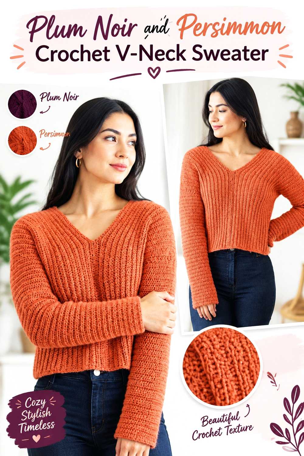
9. Plum Noir And Persimmon Crochet V Neck Sweater
 SAVE
SAVEA plum-noir sweater body creates a darker garment base, while persimmon can emphasize the V-neck, cuffs, hem, or another repeated finishing area. The key is to repeat persimmon enough that it reads as part of the sweater rather than as one isolated trim color.
This scheme is especially useful when you want the garment to remain predominantly dark without losing the warmer persimmon identity.
Plum Noir Can Carry the Main Crochet Sweater Panels
Use plum noir across the front, back, and most of the sleeves for the strongest dark-led version of this palette. Before committing, swatch any important surface texture in the dark yarn so you can see how clearly it reads.
If stitch definition becomes difficult to see, move more persimmon onto the cuffs or neckline, where texture and color can reinforce each other.
Persimmon Can Outline the Plum Noir Crochet V-Neck
The V-neck is a natural place for persimmon because the color follows an existing garment line. Echoing it at the cuffs or hem creates repetition without adding stripes through the body.
Keep the width of the persimmon trim proportionate to the garment. A very wide neckline treatment can shift the sweater from plum-led to nearly equal-color without that necessarily being your intention.
Creator Credit: forthefrills
10. Persimmon And Plum Noir Crochet Vest
 SAVE
SAVEA vest provides large front and back panels plus several narrow finishing areas, making it easy to give persimmon and plum noir separate roles. Persimmon can cover the primary panels while plum noir follows the neckline, armholes, front opening, or hem.
Because the garment has no sleeves to distribute additional color, repeat the plum accents across more than one edge if you want a balanced two-color result.
Persimmon Can Keep the Crochet Vest Panels Visually Connected
Using persimmon across both front sections and the back prevents the garment from becoming fragmented. It also leaves room for plum noir to define the vest shape rather than compete with it.
When laying out the finished pieces, compare the front and back before adding edging. This helps you judge whether the dark color needs to appear around several openings or only at the most visible edges.
Plum Noir Can Trace Persimmon Vest Armholes and Front Edges
Plum noir around armholes and front edging creates a clear outline against persimmon. These narrow structural areas are well suited to the dark shade because they naturally repeat around the garment.
If the contrast feels too severe, choose a slightly softened plum rather than adding an unrelated third color. That preserves the two-color character while reducing the jump between values.
Creator Credit: Crochet with Carrie
11. Plum Noir And Persimmon Crochet Bucket Hat
 SAVE
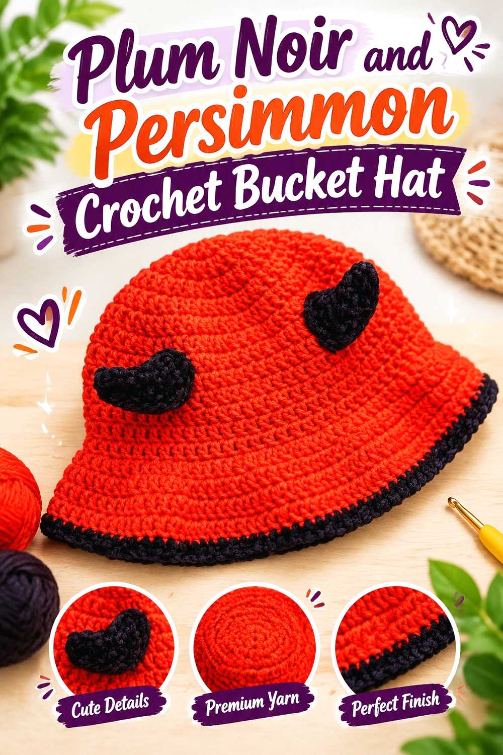
SAVEA bucket hat naturally divides into crown, sides, and brim, so the two colors can follow the construction instead of forming random stripes. Plum noir can cover the crown and sides, while persimmon takes over at the brim.
The wider persimmon edge keeps the warm shade visible from several angles even though plum noir occupies more of the hat.
Plum Noir Can Keep the Crochet Bucket Hat Crown Visually Solid
A solid plum-noir crown creates a clear base for the color change at the brim. Avoid inserting tiny persimmon sections through the crown unless you want a busier result; the hat shape already provides enough visual divisions.
Check textured or decorative details before committing to very dark plum yarn because small stitch features may become less visible.
Persimmon Can Turn the Plum Noir Crochet Brim Into the Main Accent
A persimmon brim produces a broad accent rather than a thin trim, making the warm color important without requiring equal overall coverage.
If the brim feels disconnected, repeat a small persimmon detail higher on the hat. Keep that repetition restrained so the clean crown-to-brim division remains clear.
Creator Credit: PassioKnit Kelsie
12. Persimmon And Plum Noir Crochet Market Bag
 SAVE
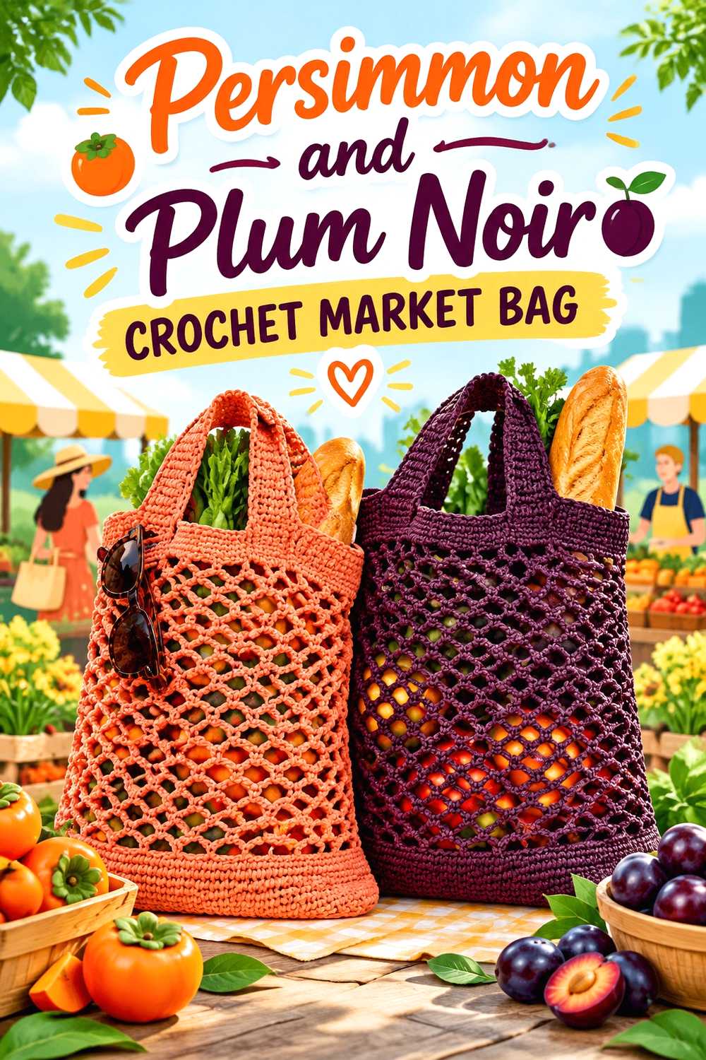
SAVEA market bag benefits from putting colors where the structure changes. Persimmon can fill the expandable or open body, while plum noir can define the base, upper edge, and handles.
That placement lets the darker shade visually reinforce the areas that frame the bag while the brighter persimmon remains visible across its largest surface.
Persimmon Can Keep the Crochet Market Bag Body Easy to Read
A large persimmon body keeps openwork or repeated mesh from competing with frequent color changes. If the bag expands when filled, a broad solid color also prevents stretched sections from breaking up a complicated stripe arrangement.
For a two-color version, wait until a natural construction transition before switching to plum noir.
Plum Noir Can Ground Persimmon Market Bag Handles and Base
Plum noir works well on the base and handles because the color repeats at both the bottom and top of the bag. This visually brackets the persimmon body.
If the handles are the only dark area, consider repeating plum noir in the upper edging or base so the color feels integrated rather than attached as an afterthought.
Creator Credit: The Crochet Crowd
13. Plum Noir And Persimmon Crochet Placemat And Coaster Set
 SAVE
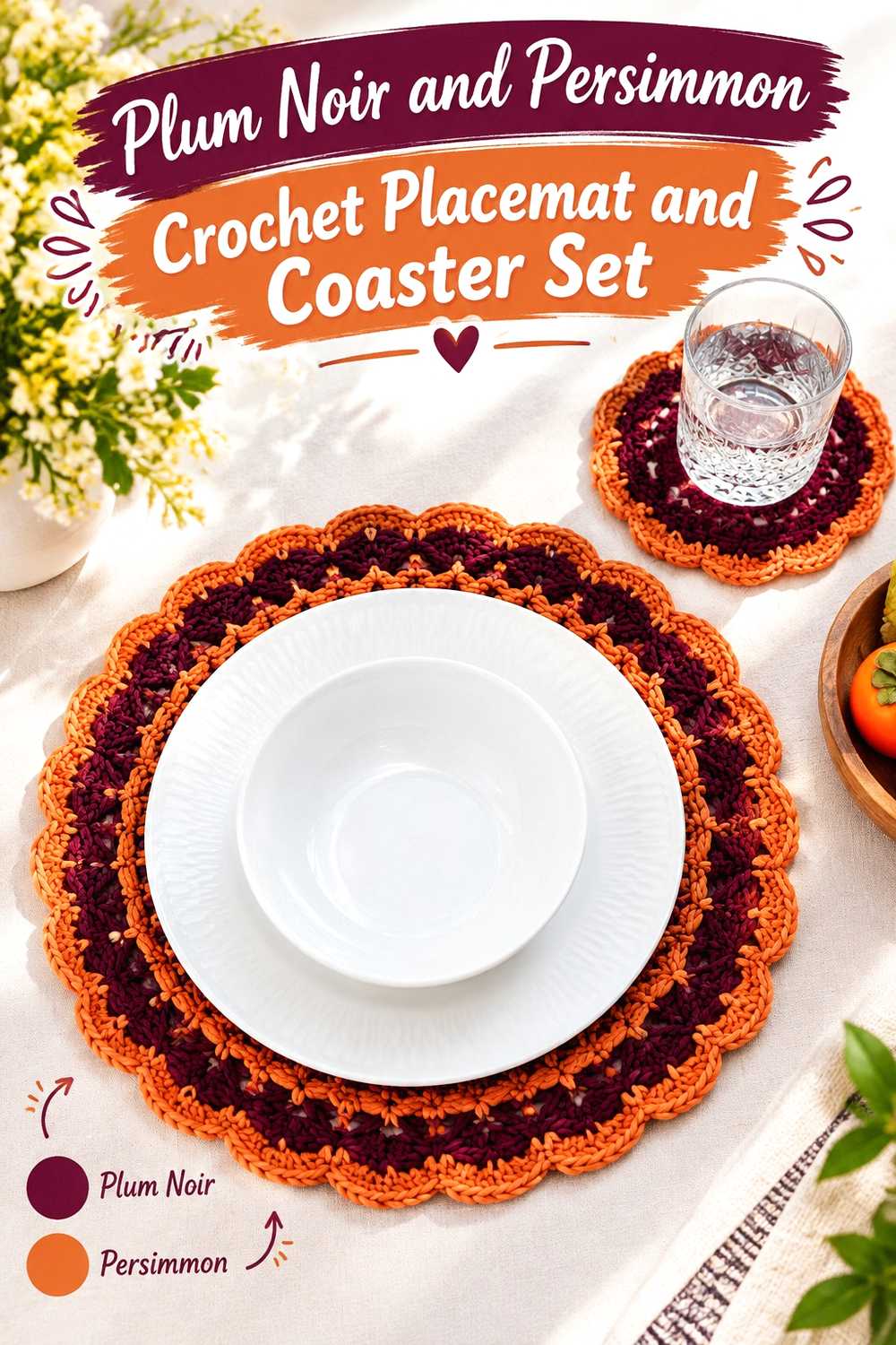
SAVEFor a coordinated table set, plum noir can cover the larger central areas while persimmon repeats around the outer edges. Keeping the same color hierarchy across both placemats and coasters makes pieces of different sizes look related.
Because these items are viewed flat, border width matters. A persimmon edge that is visible on a placemat may need a more restrained treatment on the much smaller coaster.
Plum Noir Can Unite the Crochet Placemat and Coaster Centers
Using plum noir consistently through each center creates a common base across the set. It also leaves persimmon available for edges or repeated details that are easy to recognize from piece to piece.
If the stitch surface contains pronounced texture, check it under normal room lighting before making every center dark.
Persimmon Can Give Plum Noir Table Pieces a Repeated Border
Repeat persimmon in the same general border role across all pieces rather than changing its function from item to item. That repetition is what makes the set feel planned.
If the persimmon border feels too bright, narrowing it is one option, but you can also select a more muted persimmon while preserving enough width for the edging to remain visible.
Creator Credit: Brunaticality
14. Persimmon And Plum Noir Crochet Chevron Basket
 SAVE
SAVEA chevron basket gives persimmon and plum noir a geometric way to alternate without relying on simple horizontal stripes. Persimmon can occupy the larger body sections while plum noir creates selected chevrons, a dark base, or a strong upper edge.
Because the basket already contains directional patterning, avoid adding several unrelated support colors unless the design has enough open visual space to accommodate them.
Persimmon Can Keep the Crochet Chevron Basket From Becoming Too Dark
Let persimmon occupy the wider background sections if the basket will include repeated plum-noir chevrons. The larger warm field keeps the dark geometry distinct rather than allowing adjacent plum areas to merge.
Step back from a sample section before continuing around the basket. Chevron color placement that looks balanced close up can appear much denser when viewed across the full circumference.
Plum Noir Can Define Persimmon Crochet Chevron Changes
Use plum noir where the zigzag changes direction or where you want the strongest geometric contrast. Consistent repetition matters more than using a large quantity of the dark color.
If plum noir begins to overpower persimmon, reduce its visual area instead of adding another bright accent. A simpler two-color hierarchy usually preserves the chevron pattern more clearly.
Creator Credit: Yarnspirations
Comparing the 14 Persimmon and Plum Noir Crochet Directions
For a persimmon-led palette, the blanket, cardigan, beanie, vest, market bag, and chevron basket give the warm color substantial surface area while using plum noir mainly for definition.
For a plum-noir-led palette, the pillow, scarf, V-neck sweater, bucket hat, and table set place more visual weight on the darker color and use persimmon as a warmer contrast.
The granny square tote, granny square motif, and shawl are useful when you want a third shade to manage the transition. Cream gives the strongest light break, dusty rose creates a softer tonal bridge, and soft gold keeps the combination warm while remaining distinct from persimmon.
Conclusion
Persimmon and plum noir can produce several very different crochet looks without changing the core color pair. The biggest choice is not simply which two yarns to buy, but which color should occupy the largest surface and which one should define edges, motifs, borders, or finishing details.
Choose persimmon-led arrangements when you want the warmer shade to remain immediately visible. Use plum noir as the dominant color when you want a deeper overall project with smaller warm accents. If the jump between the two feels too strong, cream, oatmeal, dusty rose, or another carefully chosen supporting shade can create separation without displacing the main palette.
Before adapting any of the tutorial concepts, compare your actual yarns side by side and make a small color sample when contrast or texture visibility is important. Use the original creator tutorials for their exact construction details.
Frequently Asked Questions
Should persimmon or plum noir be the dominant crochet color?
Either can lead. Persimmon works well when you want the project to read as warmer and brighter, while plum noir creates a darker overall direction. Choose the dominant shade according to the amount of surface it will cover and where the item will be viewed rather than assuming the colors need equal quantities.
How can I tell whether persimmon and plum noir have enough contrast?
Place the actual yarns next to each other and view them from several feet away. You can also photograph them in grayscale. If the two shades become difficult to distinguish, increase the size of each color section or introduce a lighter neutral around small motifs and detailed areas.
Can I add cream to a persimmon and plum noir crochet palette?
Yes. Cream can separate the two stronger colors and is particularly useful around granny-square rounds, blanket bands, borders, and other areas where you need a visible light break. Keep it in a supporting role if persimmon and plum noir should remain the obvious main palette.
What can replace persimmon if I cannot find the exact shade?
Look for another warm orange-red or softened orange shade that preserves the relationship you want with plum noir. More important than matching a color name exactly is keeping enough lightness and hue difference for the two yarns to remain visually separate.
What can replace plum noir in this crochet palette?
Choose another very deep plum, aubergine-like purple, or similarly dark purple-red yarn if it retains the dark anchoring role of plum noir. Compare it directly with your persimmon before purchasing enough for the project.
Can plum noir hide crochet texture?
Very dark yarn can make subtle stitch shadows less noticeable, particularly from a distance. If texture is central to the project, make a small swatch in plum noir first. You can also move persimmon or a lighter supporting shade closer to raised motifs, ribbing, borders, or other details that need stronger visual separation.