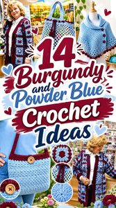
Burgundy and powder blue create an interesting crochet pairing because the colors bring very different visual weights to the same project. Burgundy is deep and visually strong, while powder blue is considerably lighter and can keep a burgundy-heavy piece from looking too dark.
The important decision is not simply whether to use both colors, but how much space each should occupy. Burgundy can define borders, cuffs, straps, and other areas where stronger definition helps. Powder blue can open up larger surfaces, separate motifs, or make textured sections easier to distinguish. Reversing those roles creates a noticeably different finished piece without changing the underlying crochet project.
The 14 ideas below apply that relationship to blankets, garments, bags, and smaller accessories. The linked tutorials support the project construction; the burgundy and powder blue color placements are independent palette ideas that you can adapt to the project.
Quick List
- Burgundy Led Powder Blue Crochet Throw Blanket
- Burgundy And Powder Blue Crochet Granny Square Cardigan
- Powder Blue Crochet Market Bag With Burgundy Details
- Burgundy Crochet Mittens With Powder Blue Cuffs
- Powder Blue Crochet Poncho With Burgundy Edging
- Burgundy And Powder Blue Crochet Slippers
- Powder Blue Crochet Scrunchie With Burgundy Contrast
- Burgundy Crochet Bucket Hat With Powder Blue Brim
- Powder Blue Crochet Scarf With Burgundy Ends
- Burgundy Crochet Sweater Vest With Powder Blue Trim
- Powder Blue Crochet Shawl With Burgundy Border
- Burgundy Crochet Beanie With Powder Blue Ribbing
- Burgundy And Powder Blue Crochet Market Tote
- Powder Blue Crochet Handbag With Burgundy Structure
How to Balance Burgundy and Powder Blue in Crochet
Burgundy and powder blue do not need equal space. In fact, giving one color a clear dominant role usually makes the relationship easier to read. A burgundy cardigan, for example, can use powder blue around cuffs and edging, while a powder blue shawl can reserve burgundy for the final border.
Consider the size of the color areas as well as their location. A narrow burgundy edge around a powder blue piece may look much stronger than its small percentage suggests because the dark shade outlines the entire object. On a blanket or cardigan made from repeated motifs, alternating the two colors more evenly can create a more rhythmic effect.
Check Burgundy and Powder Blue Contrast Before Crocheting Detailed Areas
The hues are clearly different, but the exact yarns you choose determine how much light-and-dark contrast exists between them. Place the skeins side by side before assigning colors to small motifs, textured stitches, or narrow stripes.
If your powder blue is relatively dark or your burgundy unusually softened, the values may be closer than expected. A quick grayscale photo can help reveal whether the colors will remain distinct. This matters most around small details; large panels can tolerate softer contrast more easily because each color has enough surface area to establish itself.
1. Burgundy Led Powder Blue Crochet Throw Blanket
 SAVE
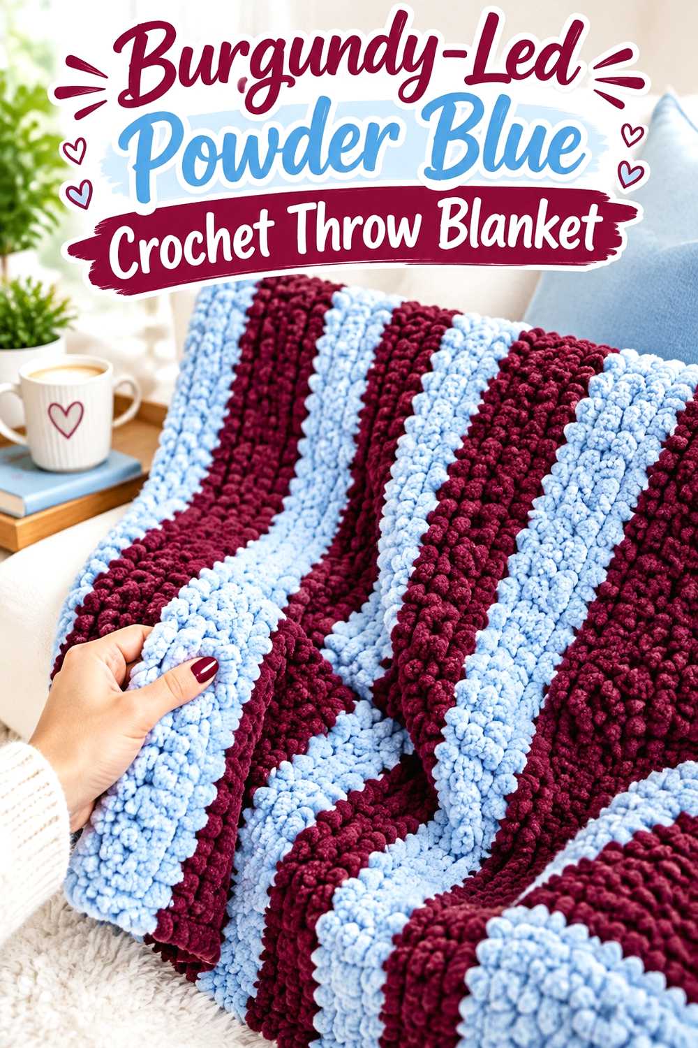
SAVEA burgundy-led blanket gives the deeper color most of the visual area while powder blue interrupts it with lighter bands or blocks. This works particularly well on a large crochet surface because there is enough room for burgundy to repeat without forcing powder blue into tiny, disconnected accents. If the blanket has obvious horizontal sections, use the blue consistently rather than inserting it only once.
Burgundy Can Anchor the Largest Crochet Blanket Sections
Let burgundy occupy broad areas when you want the throw to read as predominantly dark and rich. On a blanket, large uninterrupted sections allow stitch texture to remain cohesive instead of fragmenting the surface with frequent color changes.
If burgundy begins to feel visually heavy across the full width, increase the frequency of powder blue rather than adding many unrelated shades. That keeps the two-color idea clear while giving the eye lighter resting points.
Powder Blue Can Separate Burgundy Across the Crochet Blanket
Powder blue is useful between burgundy sections because the lighter value can make individual bands or textured areas easier to distinguish. Repeating it at planned intervals creates a stronger connection than placing a single pale stripe near one end.
You can also reverse the proportions for a lighter blanket while keeping burgundy at the outer edge or within selected bands.
Creator Credit: Bella Coco
2. Burgundy And Powder Blue Crochet Granny Square Cardigan
 SAVE
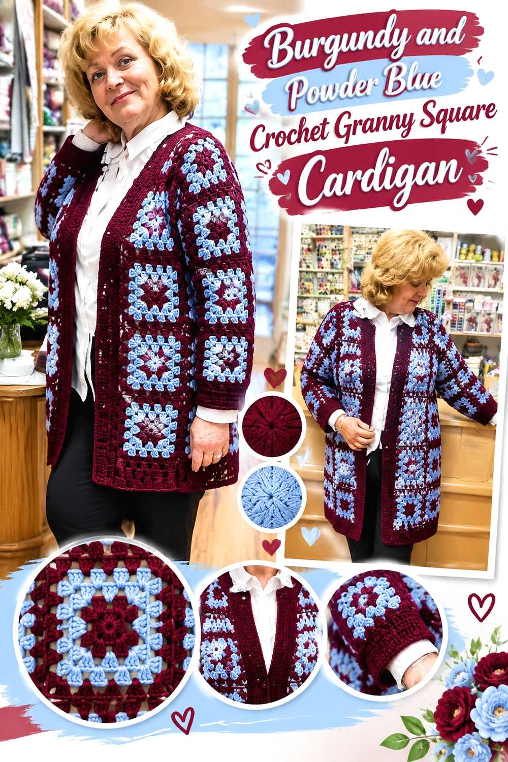
SAVEGranny square construction creates many natural places to divide burgundy and powder blue. Instead of alternating complete squares randomly, decide whether burgundy should define the garment silhouette or whether powder blue should carry most of the motif surface. Consistent repetition across the front, back, and sleeves will make the cardigan look more deliberate.
Burgundy Can Define Powder Blue Crochet Granny Squares
A burgundy outer round around powder blue-centered squares gives every motif a darker visual frame. Once the squares are joined, those darker edges can create a repeating grid across the cardigan.
Before committing to the layout, arrange finished or sample motifs in the approximate panel shape. A color arrangement that looks balanced in one square can appear much more burgundy-heavy when dozens of dark borders sit next to each other.
Powder Blue Can Lighten Burgundy Crochet Sleeves and Cuffs
If the body contains substantial burgundy, increase the powder blue around sleeves or cuffs to keep the garment from becoming dark from neckline to hem. Repeating powder blue at the sleeve ends also connects those areas back to blue sections in the body motifs.
Avoid introducing a completely different cuff color unless you plan to repeat it elsewhere. With a two-color cardigan, the existing burgundy and powder blue usually provide enough distinction.
Creator Credit: Viktoria e Svitlana Marongiu
3. Powder Blue Crochet Market Bag With Burgundy Details
 SAVE
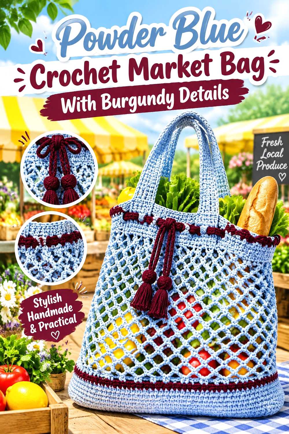
SAVEA powder blue body makes this market-bag direction noticeably lighter than a burgundy-led tote. Burgundy can then handle areas that naturally benefit from stronger definition, such as the upper edge, handles, or selected bands through the bag body.
Powder Blue Keeps the Crochet Market Bag Body Visually Light
Use powder blue across most of the bag when you want the open or textured crochet surface to remain visually clear. A lighter field makes changes in stitch direction and openings easier to notice than a uniformly dark body can.
Because a market bag is viewed both empty and filled, check how the burgundy areas look when the fabric stretches. A small accent may become more prominent once the bag is carrying something.
Burgundy Can Give Powder Blue Crochet Handles More Definition
Burgundy handles create a strong visual boundary at the top of a powder blue bag. Repeating a narrow burgundy section near the base or upper edge can keep those handles from looking disconnected from the rest of the piece.
If you prefer blue handles, reverse the idea and use burgundy as a body band instead. The useful principle is repetition: the smaller color should appear intentionally rather than as a one-off addition.
Creator Credit: The Crochet Crowd
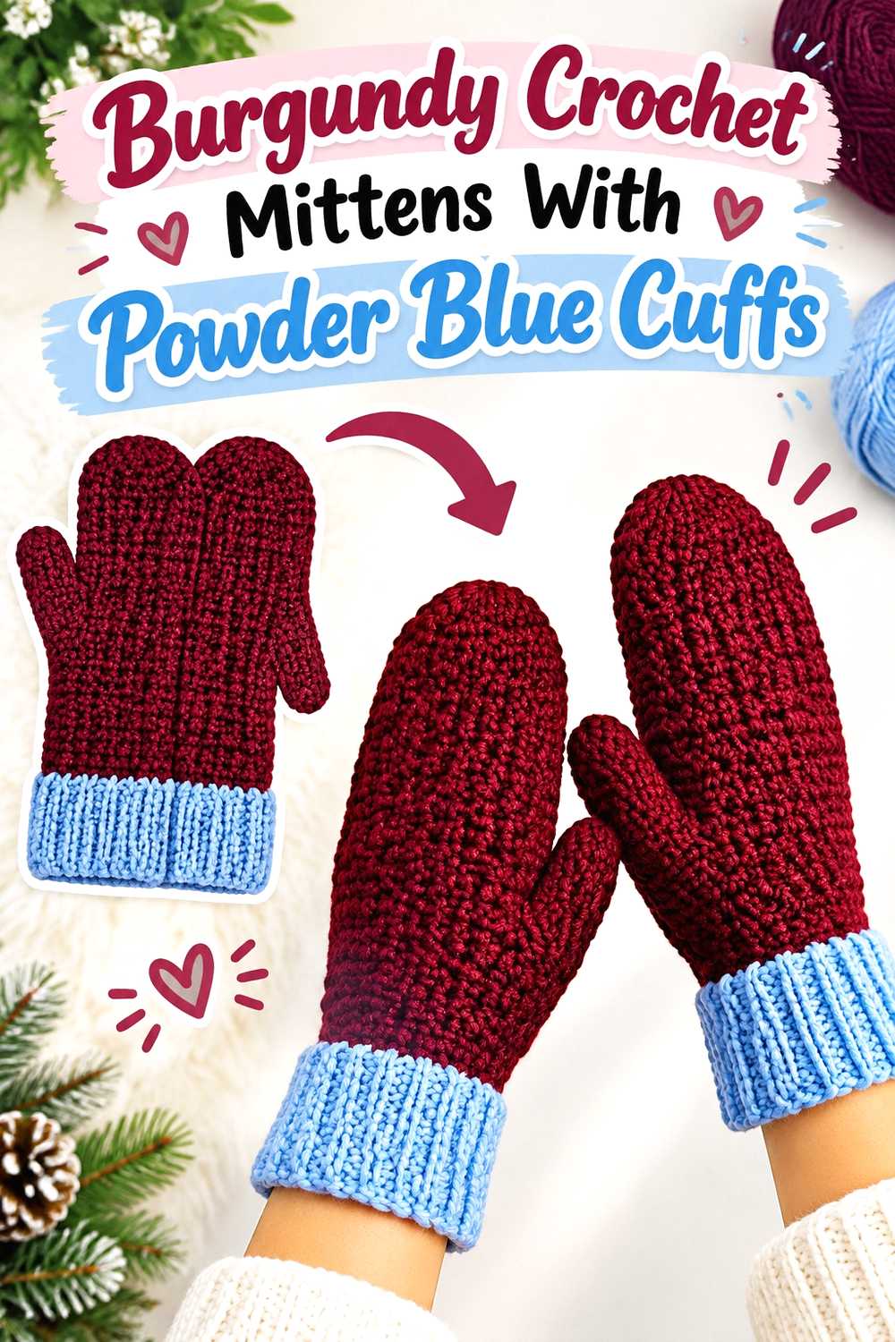
4. Burgundy Crochet Mittens With Powder Blue Cuffs
 SAVE
SAVEMittens offer a compact surface, so the burgundy-and-powder-blue division should stay relatively simple. A burgundy hand with a powder blue cuff creates a clear transition and avoids breaking the small mitten body into too many competing color areas.
Burgundy Works Well Across the Main Crochet Mitten Surface
Keeping the hand section primarily burgundy allows the mitten shape to read as one unit. If you want additional powder blue above the cuff, use a restrained repeated detail instead of several narrow stripes competing around the fingers and thumb.
Make both mittens follow the same color hierarchy unless an intentionally mismatched pair is the goal.
Powder Blue Can Separate Burgundy Crochet Mittens at the Cuff
A powder blue cuff creates an obvious lighter finish beside the deeper burgundy hand. Ribbing or other pronounced cuff texture can also become easier to see when it is worked in the lighter shade.
If your powder blue yarn is close to burgundy in value, compare a small cuff sample before making the pair. The color change should remain visible from normal viewing distance if contrast is an important part of the design.
Creator Credit: Brunaticality
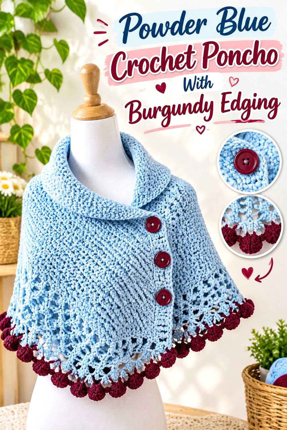
5. Powder Blue Crochet Poncho With Burgundy Edging
 SAVE
SAVEA poncho gives powder blue a large uninterrupted area, while burgundy can trace the neckline and lower perimeter. Because edging travels around such a large portion of the garment, even a relatively narrow burgundy section can have considerable visual impact.
Powder Blue Can Lead the Main Crochet Poncho Panels
Using powder blue through the body keeps the broad poncho shape lighter. This is particularly useful when the stitch pattern already creates noticeable surface detail and you do not want frequent color changes competing with it.
If you introduce burgundy within the body as well, repeat it symmetrically or at predictable intervals so the color distribution stays connected across the front and back.
Burgundy Can Frame a Powder Blue Crochet Poncho
Burgundy around the lower edge can visually outline the entire garment. That means you may need less burgundy than expected to make it an important part of the finished palette.
Repeating burgundy at the neckline gives the lower border a visual partner and prevents the dark shade from appearing confined to only one part of the poncho.
Creator Credit: Handwork diy
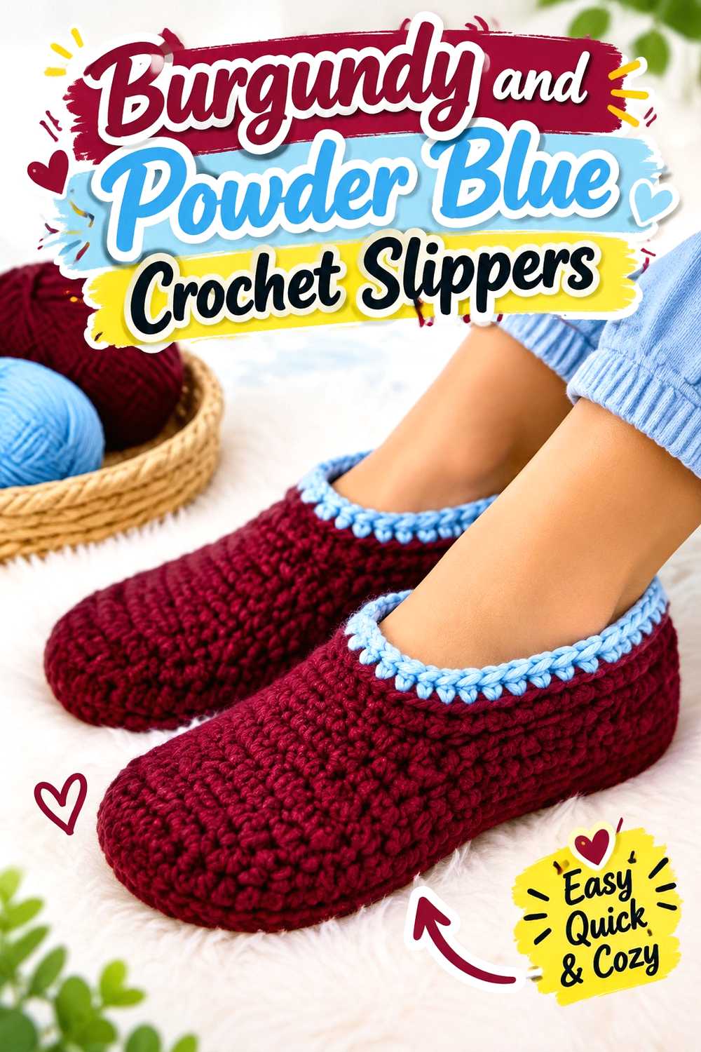
6. Burgundy And Powder Blue Crochet Slippers
 SAVE
SAVECrochet slippers need a color arrangement that remains easy to read across a relatively small three-dimensional form. One effective approach is a burgundy foot with powder blue around the opening, creating a simple dark-to-light division rather than numerous tiny stripes.
Burgundy Can Keep the Crochet Slipper Body Visually Unified
Use burgundy through most of the toe and foot when you want the slipper to read as one solid form. Breaking the body into many short color sections can make construction lines look busier than they need to.
For a matched pair, compare both slippers before finishing so the burgundy and powder blue changes occur in visually consistent areas.
Powder Blue Can Highlight a Burgundy Crochet Slipper Opening
Powder blue around the ankle or opening gives the upper edge more separation from the burgundy foot. It is especially useful when you want that finishing area to be visually noticeable without adding a third shade.
For a lighter version, reverse the arrangement and place burgundy only around the opening. Because burgundy is darker, even the smaller area can still provide strong definition.
Creator Credit: Littlejohn’s Yarn
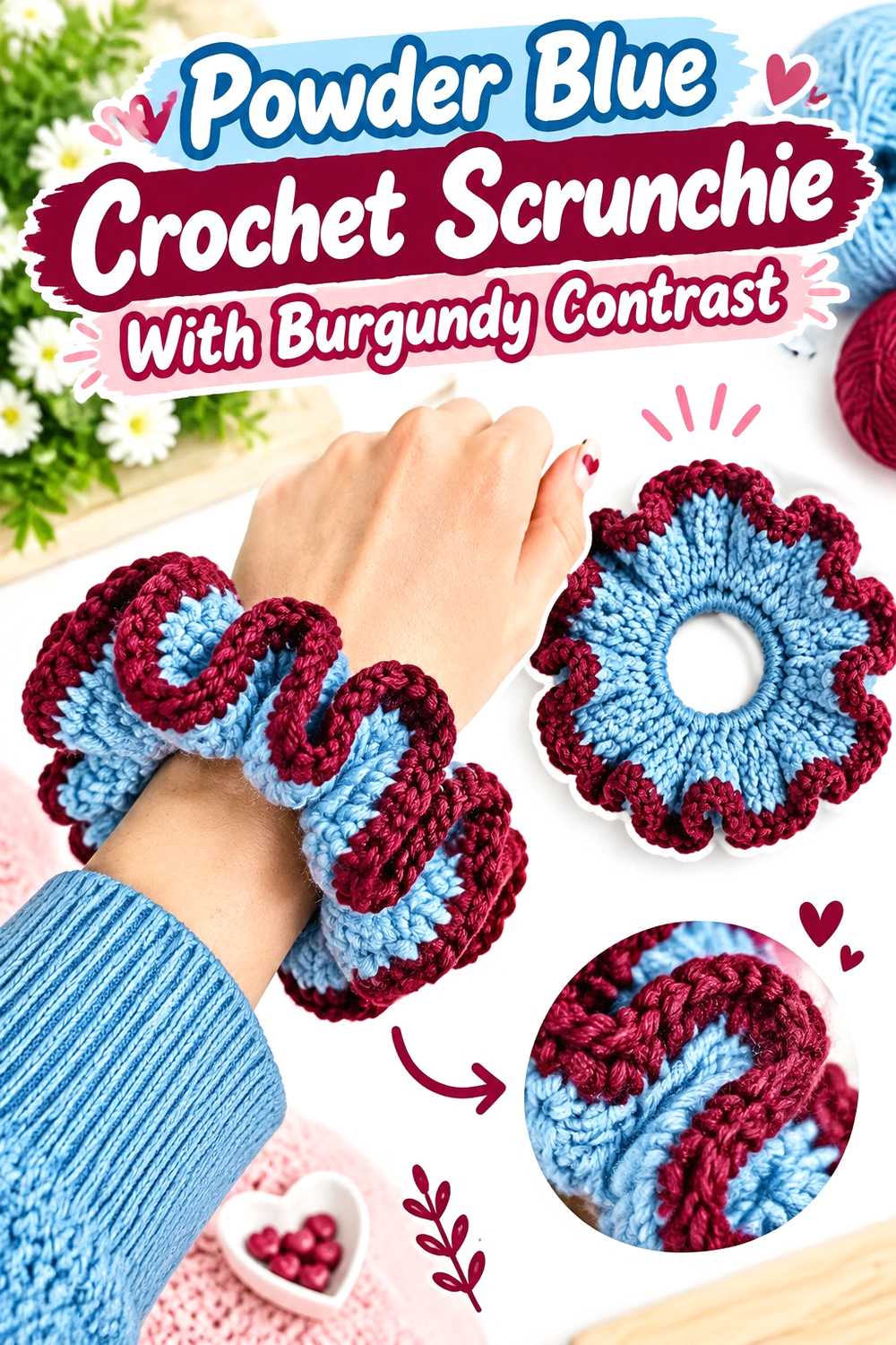
7. Powder Blue Crochet Scrunchie With Burgundy Contrast
 SAVE
SAVEA scrunchie has very little surface area compared with a cardigan or blanket, so color repetition needs to be simple. Powder blue can make up the primary ruffled fabric, while burgundy appears as a controlled contrast instead of dividing every small section.
Powder Blue Lets the Crochet Scrunchie Ruffles Stay Easy to Read
Powder blue works well across the main ruffled surface because light colors can make folds and shadows more visible. That gives the scrunchie’s texture more room to do the visual work.
If you are working with a very textured or fuzzy yarn, compare the two shades once crocheted rather than relying only on how they look in the skein.
Burgundy Should Stay Controlled on a Powder Blue Crochet Scrunchie
A narrow burgundy section can create enough contrast without visually chopping up the ruffles. Another option is to make a coordinated pair—one powder blue dominant and one burgundy dominant—rather than forcing equal amounts of both colors into a single small accessory.
This is one project where restraint can make the two-color idea clearer.
Creator Credit: ElyseCrochets 💌
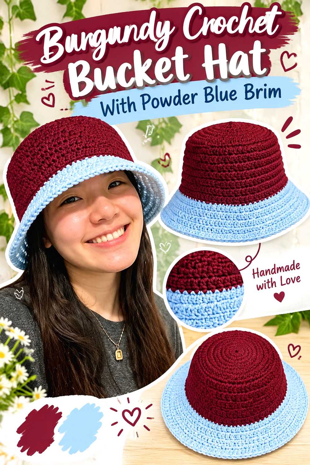
8. Burgundy Crochet Bucket Hat With Powder Blue Brim
 SAVE
SAVEThe crown, sides, and brim give a bucket hat three obvious zones for color placement. A burgundy crown and side wall paired with a powder blue brim creates a strong division that emphasizes the hat’s shape without requiring complicated color changes.
Burgundy Can Make the Crochet Bucket Hat Crown the Dark Anchor
Keeping burgundy across the crown and sides gives the main hat body a continuous appearance. If texture changes between those areas, using one color can help prevent the construction transitions from becoming overly busy.
For less burgundy, move the color to the crown only and let powder blue take over before the brim begins.
Powder Blue Can Make the Burgundy Crochet Bucket Hat Brim Stand Apart
A powder blue brim produces a light edge around the darker burgundy body. Since the brim projects outward, the contrast is likely to remain noticeable from several viewing angles.
If the separation feels abrupt, repeat powder blue in a narrow detail higher on the hat rather than adding an unrelated transition shade.
Creator Credit: VivCrochets
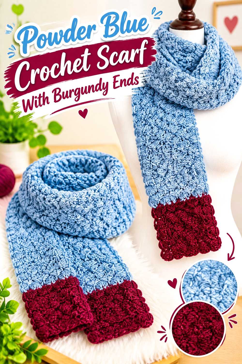
9. Powder Blue Crochet Scarf With Burgundy Ends
 SAVE
SAVEA long scarf provides enough length to use color blocking without making the piece feel fragmented. Powder blue can cover most of the center while burgundy anchors both ends, creating balance when the scarf hangs vertically.
Powder Blue Can Carry Most of the Crochet Scarf Length
Use powder blue through the central section when you want the scarf to remain predominantly light. Keeping this long area consistent can also allow scallops, mesh, ribbing, or another visible stitch texture to stay uninterrupted.
Before deciding where the burgundy begins, consider how the scarf will hang. Very short dark end sections can disappear when wrapped, while larger blocks become a stronger part of the styling.
Burgundy Can Balance Both Ends of a Powder Blue Crochet Scarf
Placing burgundy at both ends gives the scarf visual symmetry without requiring alternating stripes throughout its entire length. The darker color can also emphasize decorative end shaping or edging.
If you add fringe, choose either burgundy or powder blue based on which area you want the fringe to extend visually rather than introducing a third color automatically.
Creator Credit: Hooked by Robin
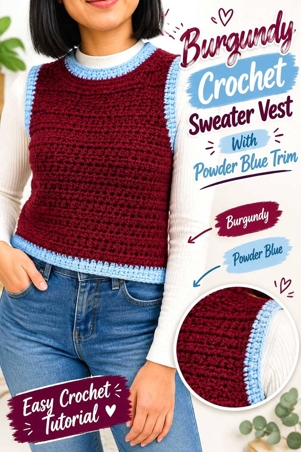
10. Burgundy Crochet Sweater Vest With Powder Blue Trim
 SAVE
SAVEA sweater vest has several useful color boundaries: body panels, armholes, neckline, and lower edging. Burgundy can dominate the body while powder blue highlights those finishing areas, creating a clearly structured two-color garment.
Burgundy Can Keep the Main Crochet Sweater Vest Panels Cohesive
Large burgundy front and back panels give the garment a strong central color direction. This approach is especially useful when the vest construction already includes shaping because fewer internal color changes keep attention on the silhouette.
If the vest is worn over a light neutral shirt, the powder blue trim can become more noticeable without needing to occupy much of the garment.
Powder Blue Can Trace Burgundy Crochet Armholes and Necklines
Powder blue edging around the armholes and neckline gives the darker body crisp color separation at the garment’s openings. Repeating the same blue at the lower edge can make all three finishing zones feel connected.
Check edging tension as well as color. A contrasting border attracts attention, so unevenness may be more visible than it would be in matching burgundy.
Creator Credit: KnitcroAddict
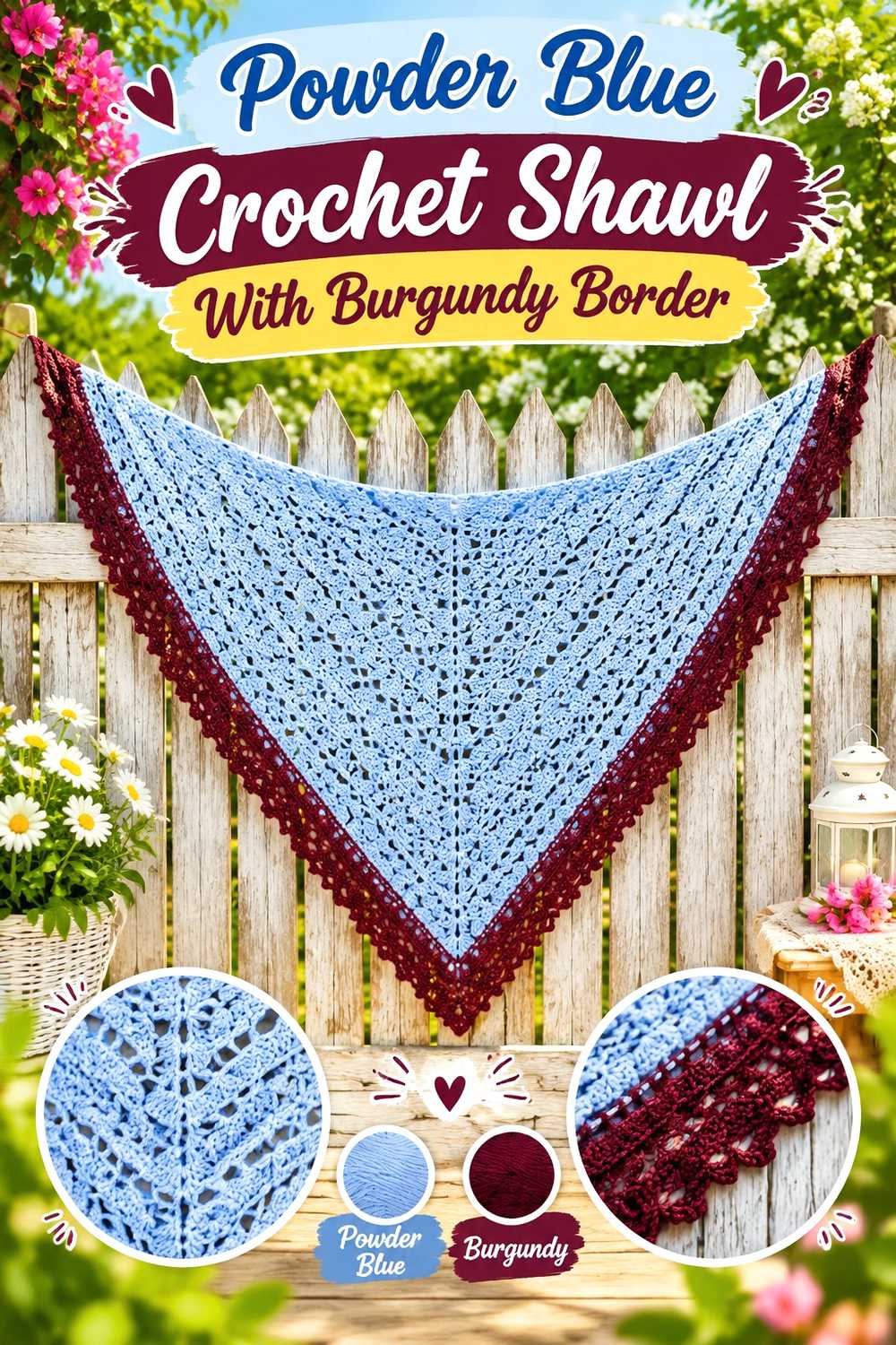
11. Powder Blue Crochet Shawl With Burgundy Border
 SAVE
SAVEFor a shawl, powder blue can carry the expanding body while burgundy arrives near the outer edge. This places the darkest color where the piece reaches its greatest width, allowing a modest amount of burgundy to create a substantial visual finish.
Powder Blue Can Keep the Main Crochet Shawl Pattern Open
Using powder blue across the main shawl surface prevents frequent color changes from interrupting a repeating lace, mesh, or textured pattern. The lighter shade can also make openings and stitch structure easier to distinguish when sufficient value contrast exists within the texture itself.
If you prefer more color interaction, introduce burgundy in a small repeated band before the final border rather than scattering isolated dark sections.
Burgundy Gives a Powder Blue Crochet Shawl a Defined Outer Edge
Because a shawl border can span a long curved or angled perimeter, burgundy naturally becomes prominent even when it occupies relatively few rows or rounds.
Check the full piece from a distance before expanding the dark section. Burgundy can visually pull attention toward the bottom edge, so a narrower border may be enough when the goal is simply definition.
Creator Credit: Bag-O-Day Crochet
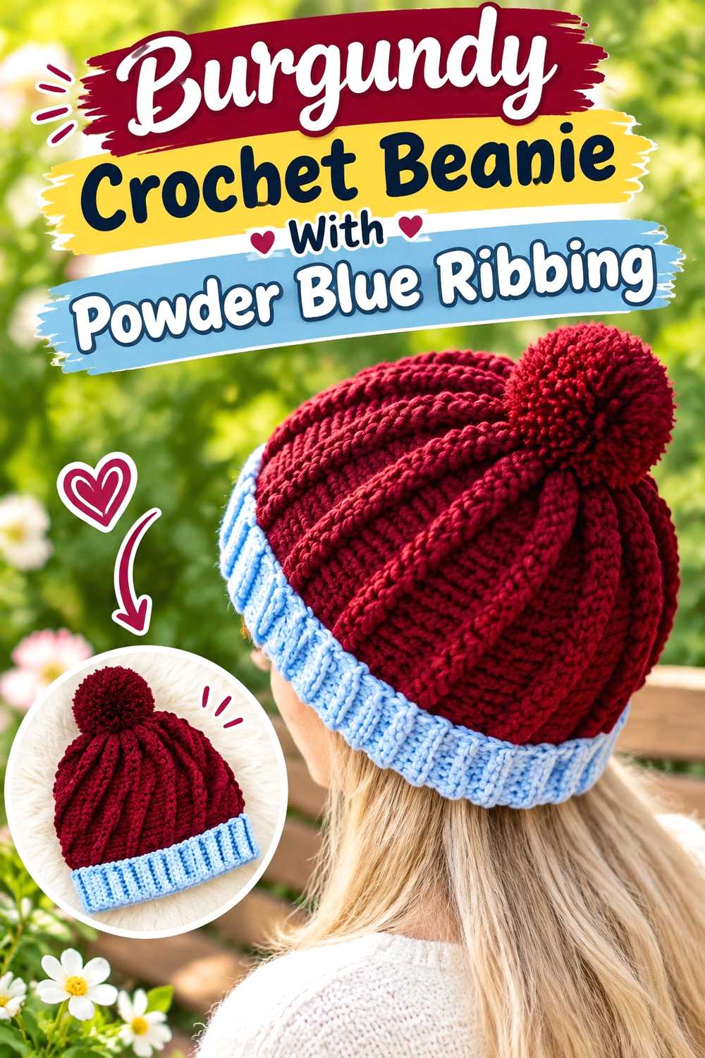
12. Burgundy Crochet Beanie With Powder Blue Ribbing
 SAVE
SAVEA burgundy crown with powder blue ribbing creates one of the clearest two-zone color arrangements in this collection. The dark body keeps the hat visually grounded while the lighter band emphasizes the face-framing lower edge.
Burgundy Can Dominate the Main Crochet Beanie Body
Keeping the upper hat burgundy allows ribbed, post-stitch, or other textured construction to continue without repeated color interruptions. If the stitch texture is subtle, work a small burgundy swatch first to confirm that the yarn does not visually hide the relief more than you want.
A powder blue pom-pom could extend the accent color upward, but it is optional; the brim alone can provide enough contrast.
Powder Blue Can Separate the Burgundy Crochet Beanie Ribbing
Powder blue ribbing creates a lighter band exactly where the construction often changes direction or texture. That makes the cuff a deliberate design feature instead of simply a finishing step.
If the blue cuff looks disproportionately large, reduce its visual depth rather than introducing a third shade. The burgundy-powder blue relationship remains stronger when the hierarchy is obvious.
Creator Credit: Di’s Handicrafts (Crochet and Knitting)
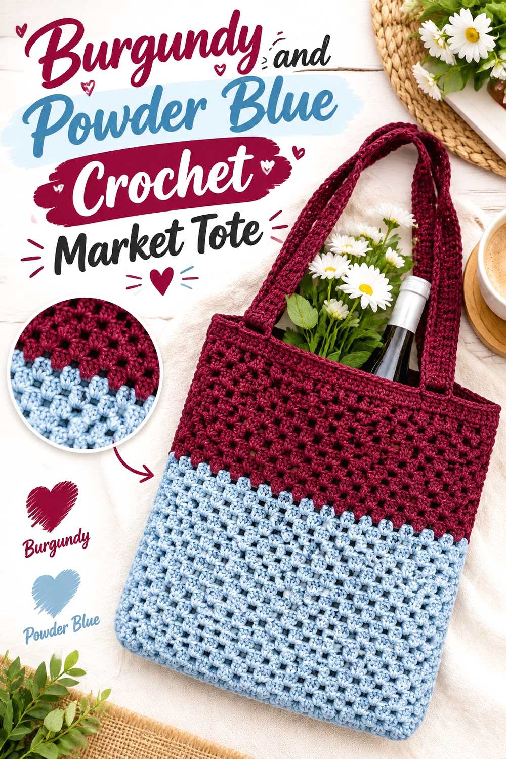
13. Burgundy And Powder Blue Crochet Market Tote
 SAVE
SAVEThis tote direction gives both colors more equal visual responsibility than the earlier powder-blue-led market bag. Burgundy can define repeated lower or side sections while powder blue fills alternating areas, creating a stronger color-block effect across the larger bag surface.
Burgundy Can Reinforce the Visual Base of a Powder Blue Crochet Tote
Placing burgundy toward the bottom gives the tote a darker visual foundation. This is especially effective on a rectangular bag because the color can run across the entire lower width rather than appearing as a small isolated patch.
Repeat burgundy near the handles or upper edge if the base otherwise feels detached from the rest of the design.
Powder Blue Can Break Up Large Burgundy Crochet Tote Sections
Powder blue can occupy the central body area so the dark base and other burgundy details do not dominate the entire bag. If the construction includes mesh or open spaces, compare how the blue looks against whatever may show through the fabric.
Keep color transitions aligned with obvious bag sections when possible. That usually produces a cleaner result than changing colors at arbitrary points in the body.
Creator Credit: TL Yarn Crafts
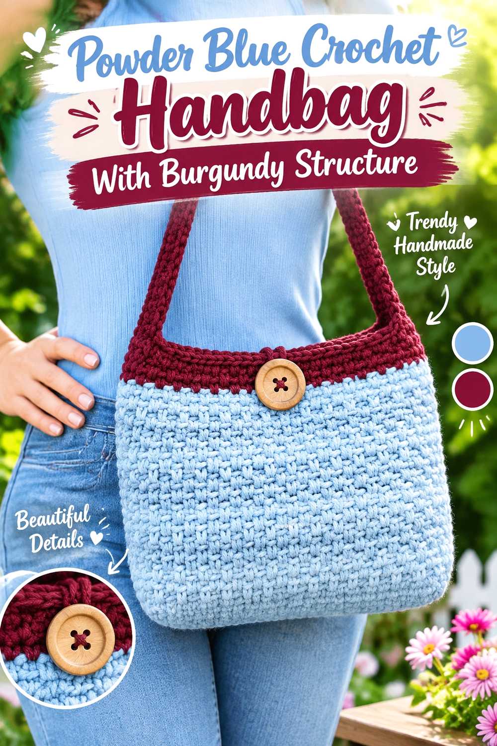
14. Powder Blue Crochet Handbag With Burgundy Structure
 SAVE
SAVEA smaller handbag benefits from clearly defined color roles. Powder blue can cover the main body while burgundy emphasizes areas such as the base, opening, and straps. Because these structural details repeat around the bag, burgundy can remain visually important without occupying half the surface.
Powder Blue Can Keep the Crochet Handbag Body From Looking Too Heavy
A powder blue body gives the bag a lighter overall direction and creates a broad background for burgundy details. Avoid inserting many tiny burgundy stripes unless the stitch pattern naturally supports them; they can make a compact handbag look busier than a larger tote.
If the bag has a strong textured stitch, check a powder blue sample to make sure the chosen yarn shows that texture clearly.
Burgundy Can Connect the Powder Blue Crochet Handbag Base and Straps
Using burgundy at both the base and straps makes the dark color travel visually from bottom to top. That repetition helps the color feel intentional rather than simply added to the handles.
You can also repeat burgundy around the upper opening. Keep the amount controlled so powder blue still reads as the dominant body color.
Creator Credit: naztazia
Choosing Your Burgundy and Powder Blue Crochet Direction
For the darkest overall result, start with the burgundy-led blanket, cardigan, mittens, sweater vest, or beanie. These ideas give burgundy the largest uninterrupted areas and use powder blue mainly for separation or finishing.
For a lighter finished piece, the powder blue poncho, market bag, scarf, shawl, or handbag keeps blue across the largest surfaces and lets burgundy act as a visual frame.
Projects such as the cardigan, tote, and slippers are useful when you want both shades to play more comparable roles. Smaller projects such as the scrunchie and bucket hat are better places to keep the color plan simple because several tiny color changes can quickly compete with the object’s shape.
Conclusion
Burgundy and powder blue can produce very different crochet results depending on which shade controls the largest area. Burgundy-led projects emphasize dark panels, bodies, and main surfaces, while powder-blue-led versions create a lighter field with burgundy used for borders, cuffs, bases, and other defining details.
If stitch or motif visibility matters most, compare the actual yarns before committing to placement. If you primarily want a clear two-color statement, establish a dominant shade and repeat the supporting shade in more than one intentional location.
Use the linked tutorials for the exact construction of each project, then plan the burgundy and powder blue distribution separately so the color arrangement fits the object rather than forcing the same stripe pattern onto every idea.
Frequently Asked Questions
Do burgundy and powder blue work together in crochet?
They can create a clear dark-and-light relationship when the particular yarns have enough value difference. Burgundy usually carries more visual weight, while powder blue can lighten borders, motifs, cuffs, and larger background areas. Compare your actual yarn choices because shades sold under similar color names can differ considerably.
Should burgundy or powder blue be the dominant crochet color?
Either can lead. Choose burgundy when you want a darker overall project and powder blue when you want a lighter one. On garments, think about body panels and sleeves; on bags, consider the body, base, and handles; and on blankets, compare how much total surface each color will occupy.
How can I tell whether burgundy and powder blue have enough contrast?
Place the yarns beside each other and view them from several feet away. A grayscale photo can also help show whether their lightness values are distinct. Stronger separation is particularly useful for small motifs, narrow stripes, lettering, or textured details that need to remain visible.
Can I use equal amounts of burgundy and powder blue?
Yes, but equal amounts are not required. Half-and-half color blocking can work on totes, blankets, and motif-based projects, while garments and small accessories often benefit from a clearer dominant-and-supporting relationship.
Where should I place burgundy on a mostly powder blue crochet project?
Borders, bag bases, handles, cuffs, necklines, brim sections, shawl edging, and scarf ends are useful options because these areas naturally define an object’s shape. Repeat burgundy in at least one additional area when a single dark section feels disconnected.
Where should I use powder blue on a burgundy crochet project?
Powder blue can lighten cuffs, edging, motif centers, blanket bands, borders, or selected panels. Placing it near detailed texture can also increase visual separation when the actual yarn values are sufficiently different.
What should I preserve if I cannot find the exact burgundy or powder blue shade?
Preserve the relationship rather than chasing an exact color name. Choose a deep wine-red shade for the burgundy role and a distinctly lighter, softened blue for the powder blue role. Most importantly, retain the light/dark hierarchy required by your planned color placement.